AMP UP
> Visual Identity
> Bespoke Logo
> Colour Palette
> Typography
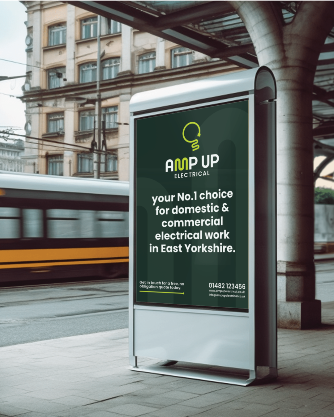
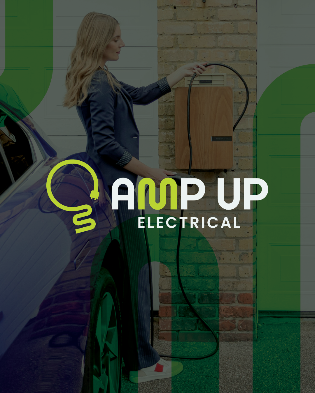
Amp Up Electrical is a newly launched electrical contracting business serving domestic and commercial clients, with a real focus on EV charging installation and sustainable energy work. Kalvan came to me right at the start, before anything existed, with a clear ambition to build something that felt as energetic and forward-thinking as the work he does.
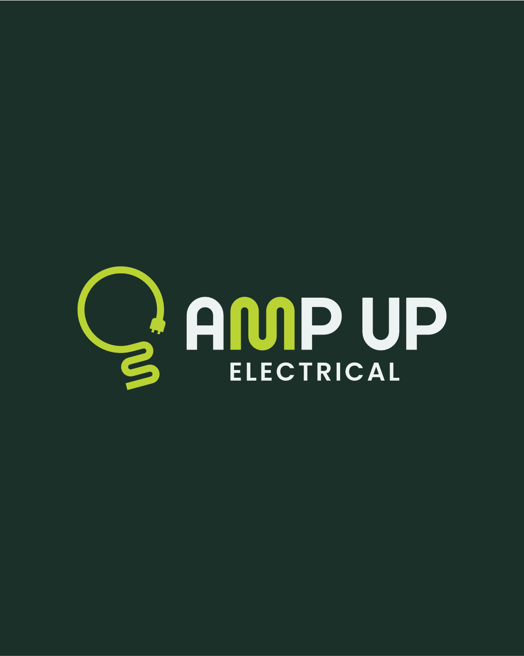
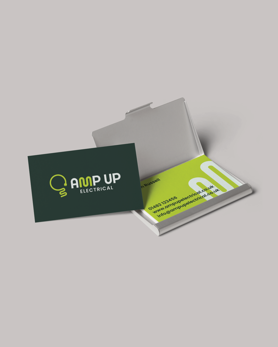
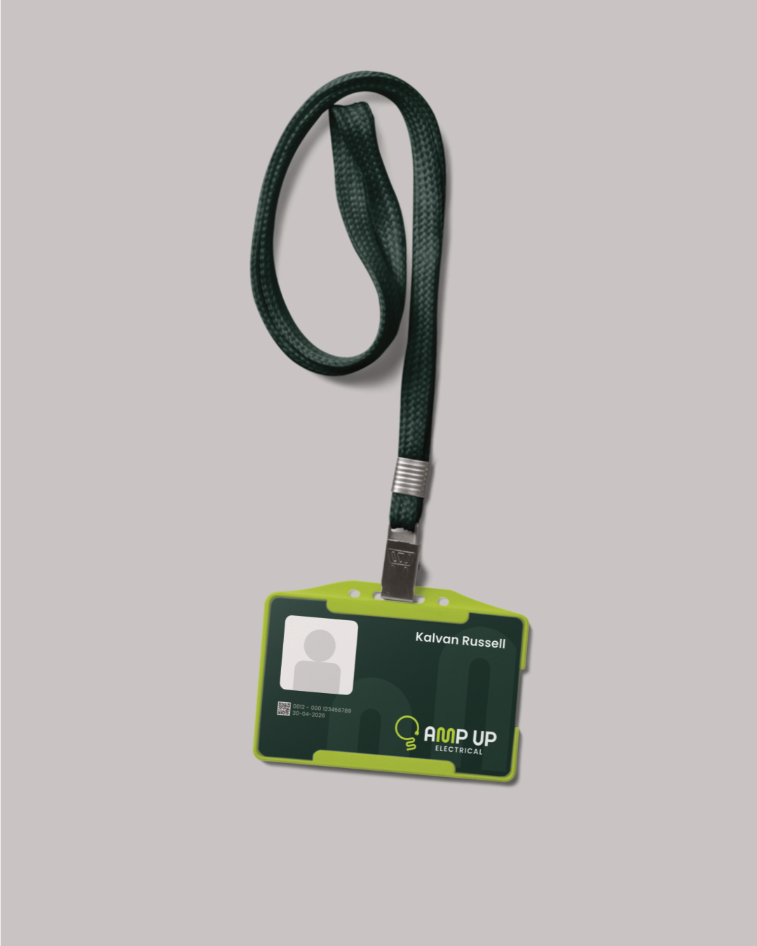
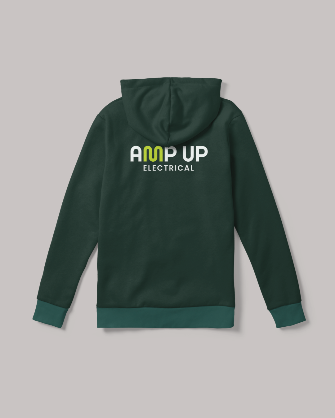
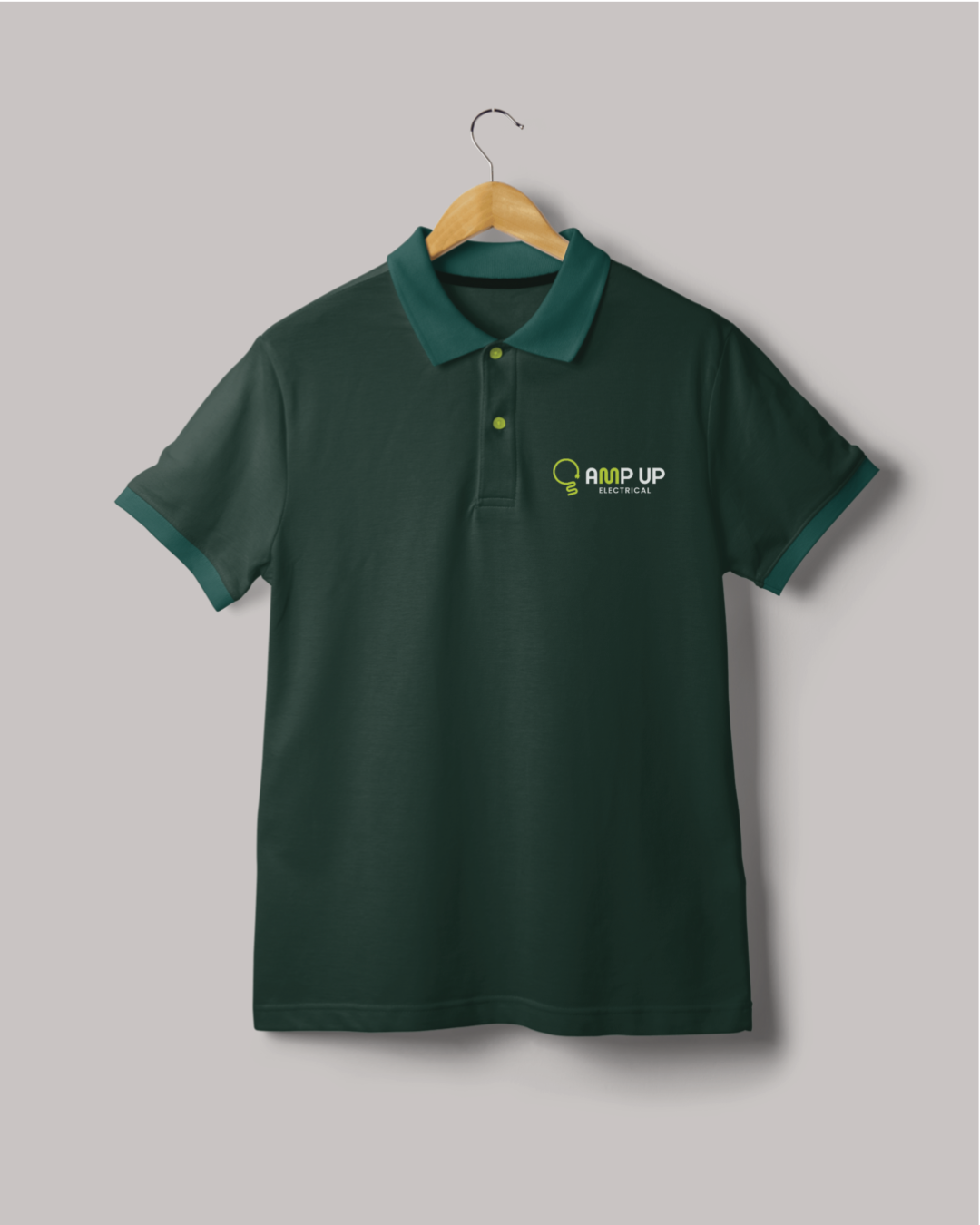
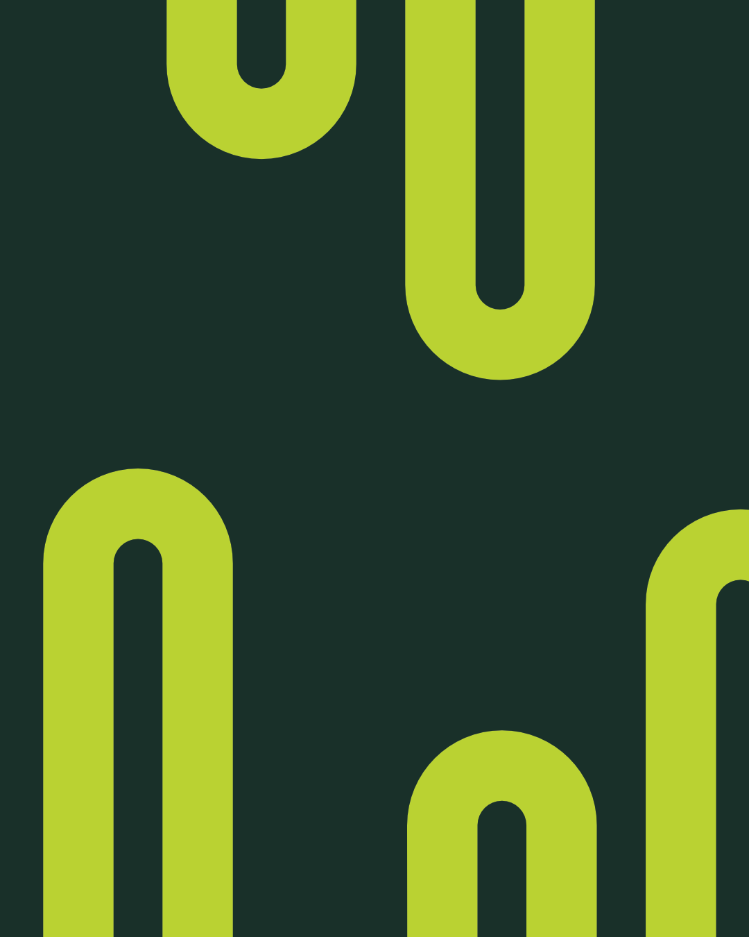
The sine wave became the foundation of everything. The letters AM in Amp sit naturally within a sinusoidal wave form, so I built that directly into the M of a custom wordmark, a detail that rewards a second look without needing to be explained. The mark itself takes an EV charging cable and coils it into the form of a lightbulb, keeping the sustainable energy side of the business present without making it the whole story. A bold lime green alongside two deep forest tones carries that natural, environmental undertone through every application.
Kalvan now has an identity that gives his new business an immediate and confident presence, ready to work across uniform, print and social from day one.
TESTIMONIAL
“Very professional, easy to work with and delivered a high quality logo for us. We would highly recommend and be sure to use Michael again for future needs. Thanks again.”
– Kalvan Russell, Amp Up Electrical