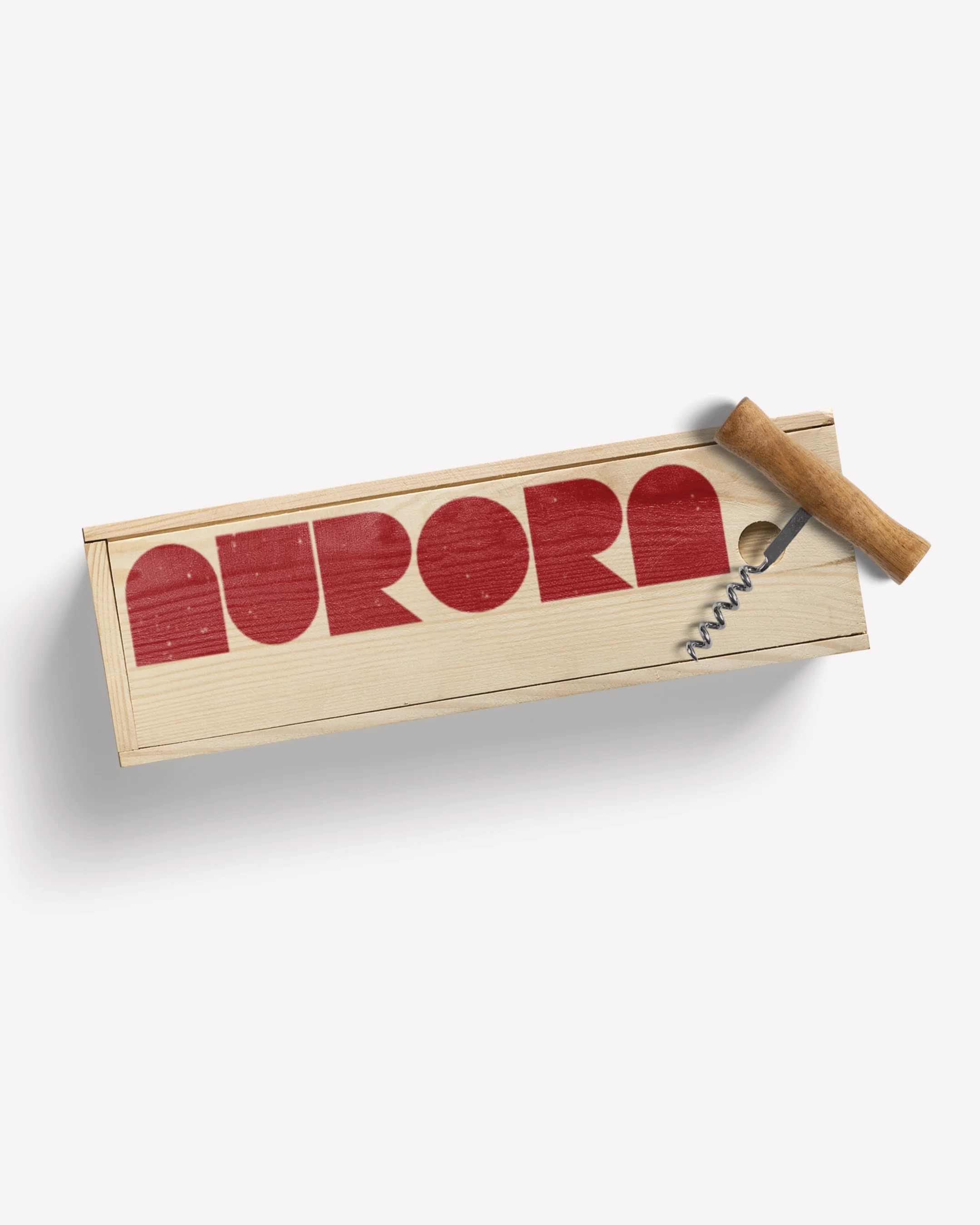
AURORA
> Bespoke Logo
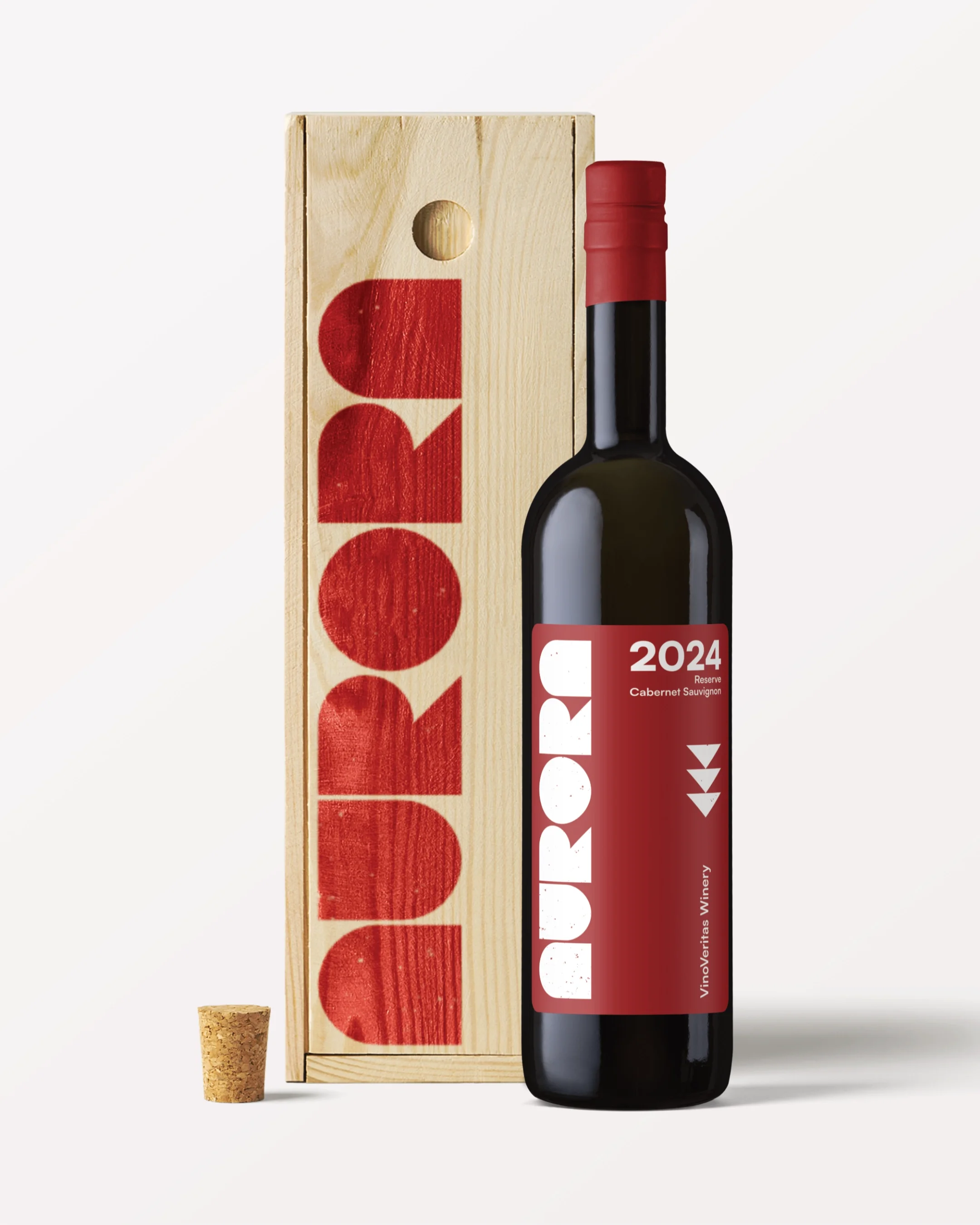
> Packaging
> Art Direction
> Label Design
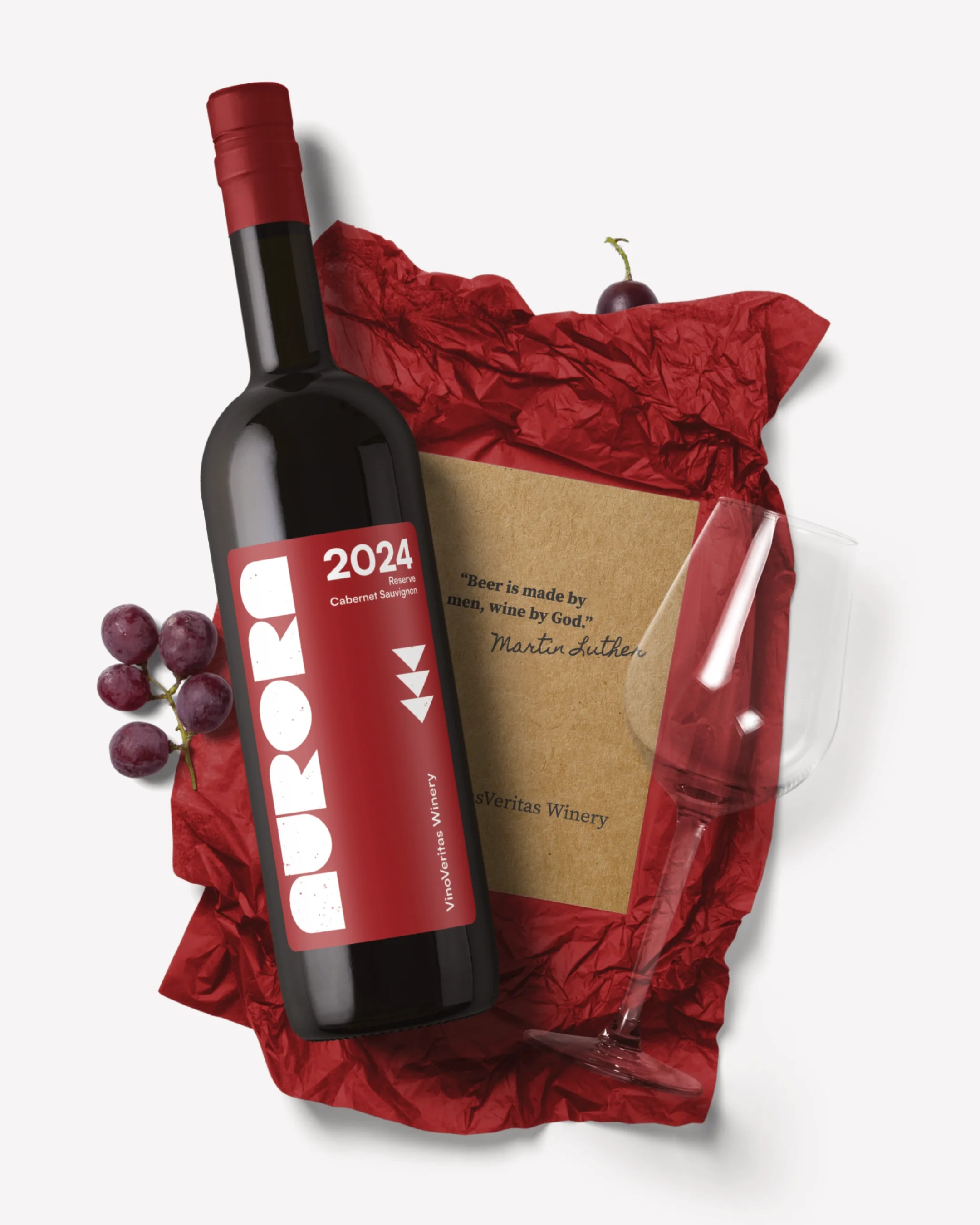
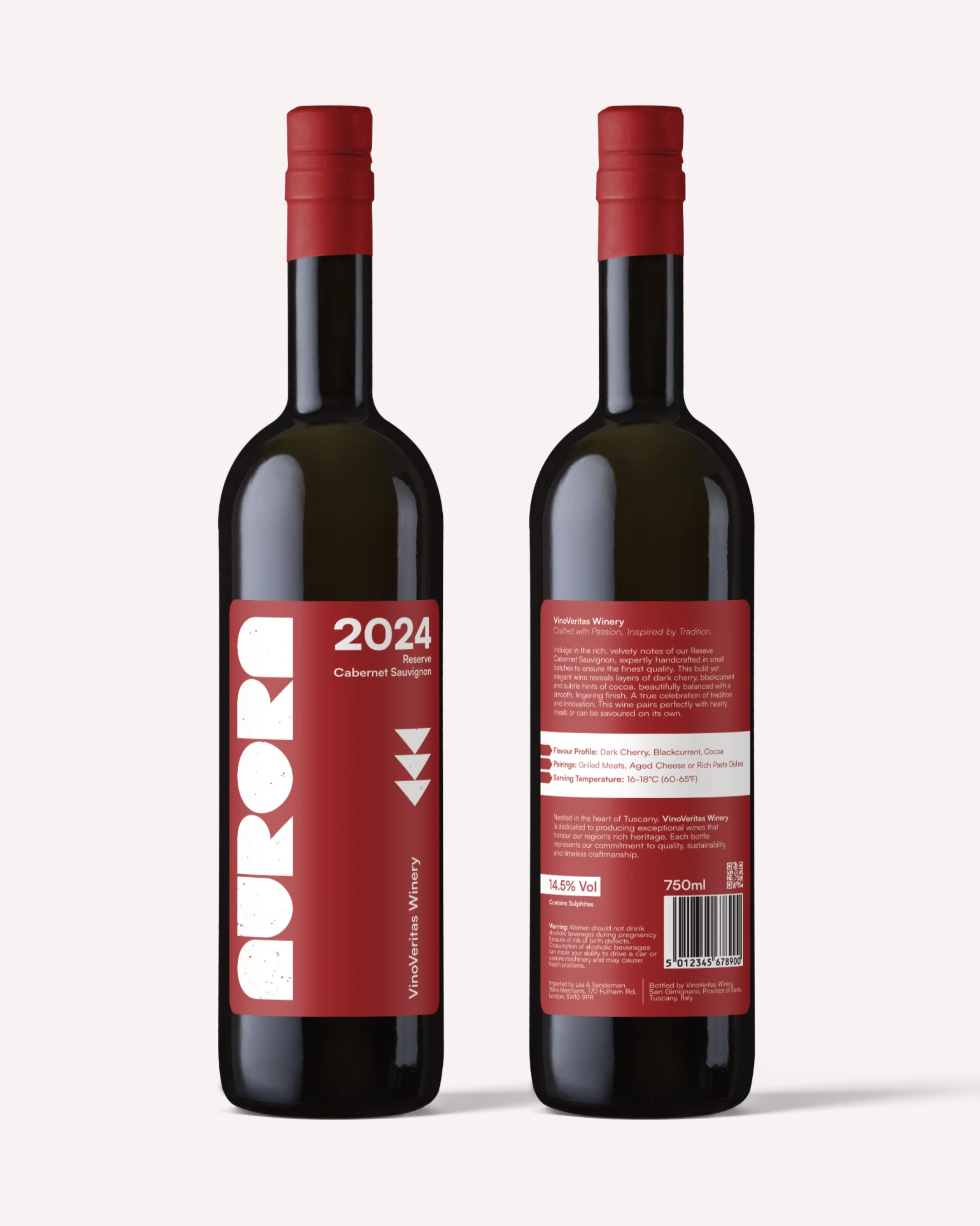
Aurora is a concept project for a premium reserve Cabernet, designed for a modern wine audience. I created this to explore how a wine brand could achieve a high-end positioning without reaching for the crests, scripts and ornate borders that dominate the category.
The strategy was built entirely around restraint. The wine industry has a long history of busy, traditional packaging, Aurora needed to feel like a confident step away from all of that. If the product is premium, the design doesn't always need to shout.
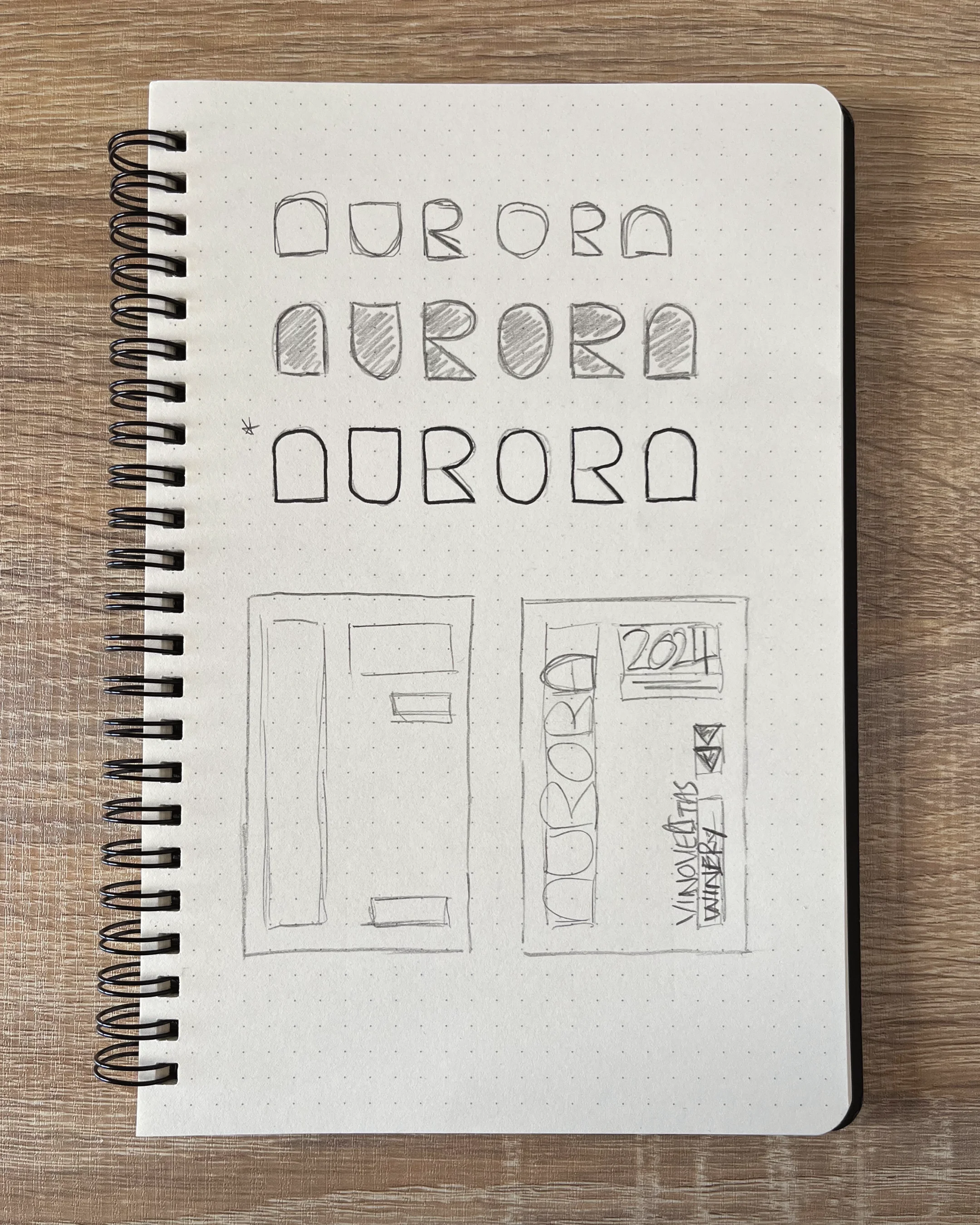
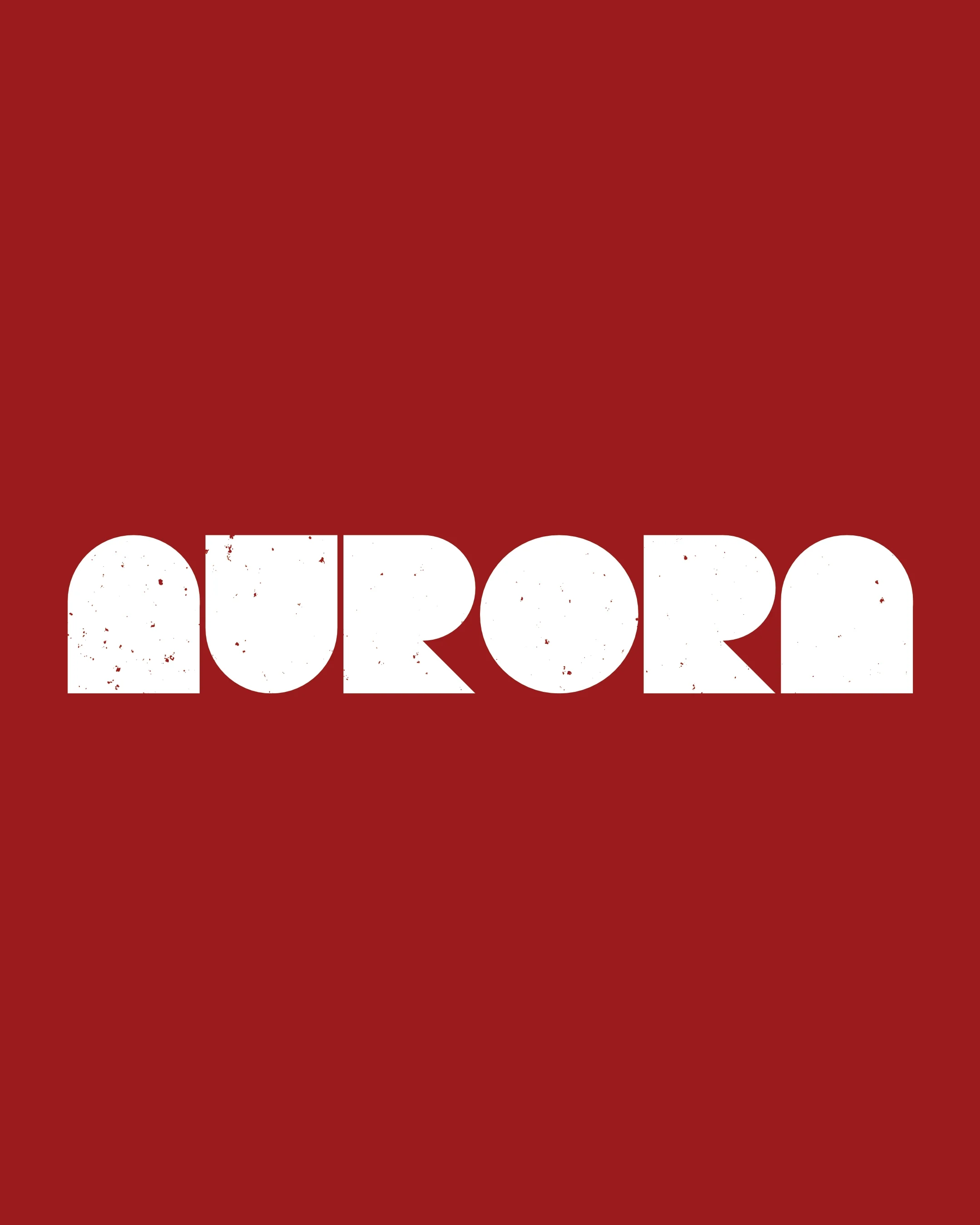
At the heart of the identity is a custom logotype built from bold, geometric block letters, paired with a limited colour palette and refined typography that keeps the focus firmly on the product.
The result is a concept that shows restraint and premium aren't just compatible, but that sometimes less, really is a powerful choice a brand can make.