FRITH FARM
> Brand Strategy
> Visual Identity
> Bespoke Logo
> Colour Palette
> Typography
> Messaging
> Marketing
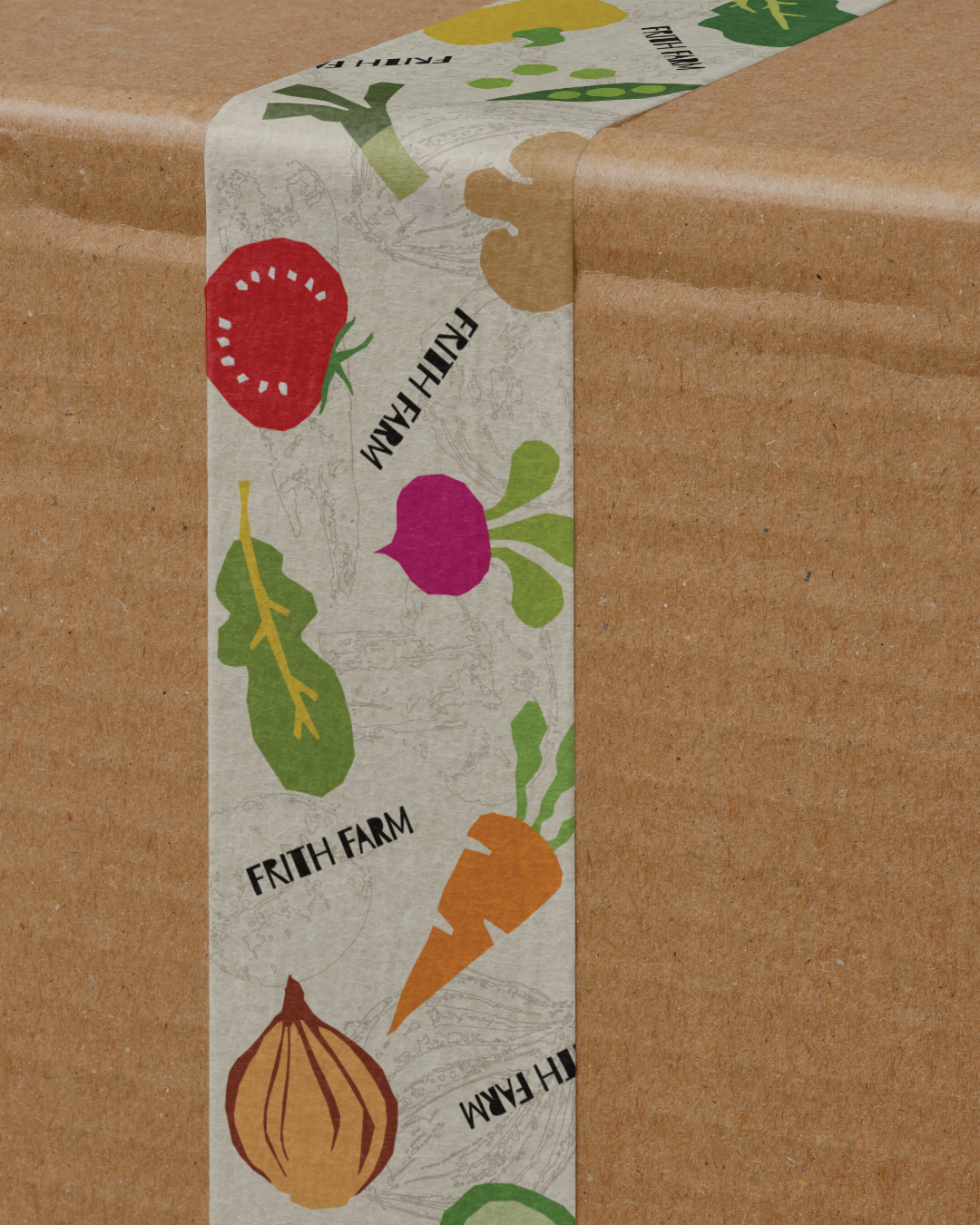
> Packaging
Frith Farm is a regenerative market garden in Beverley, East Yorkshire, running a Community Supported Agriculture scheme where members share directly in the harvest. Despite doing genuinely exceptional work, their brand was fragmented across two separate websites, visually generic and failing to communicate anything that made them different. This was a self-initiated project exploring what a considered rebrand could do for a business like this.
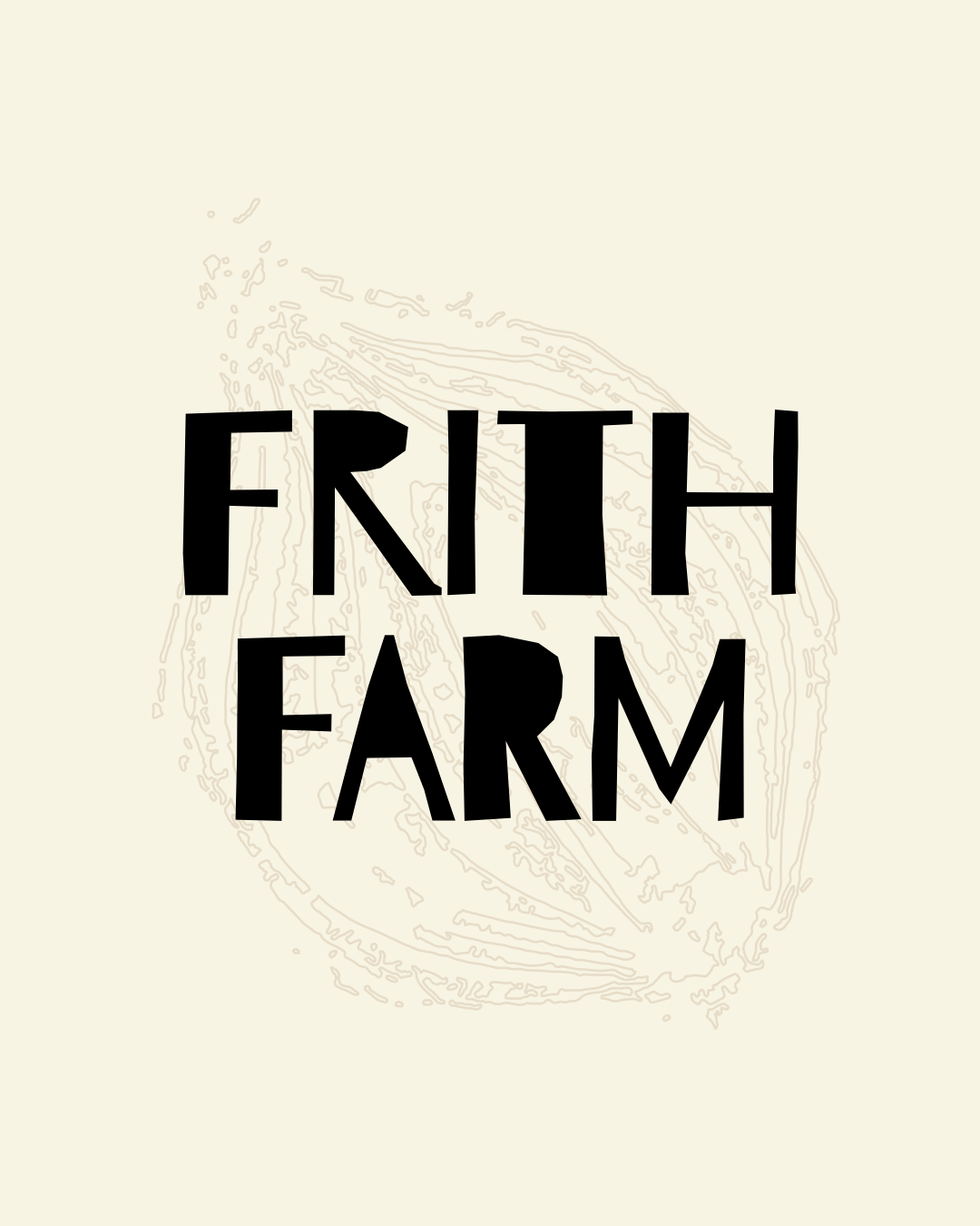
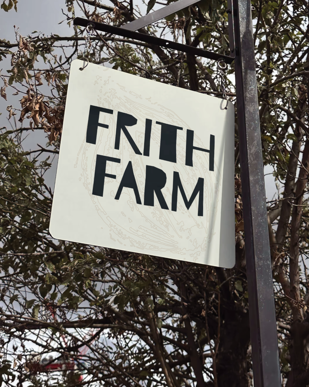
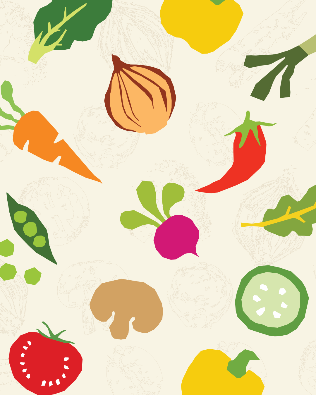
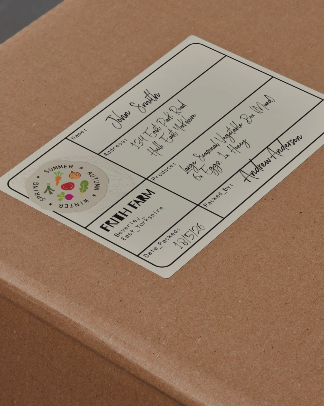
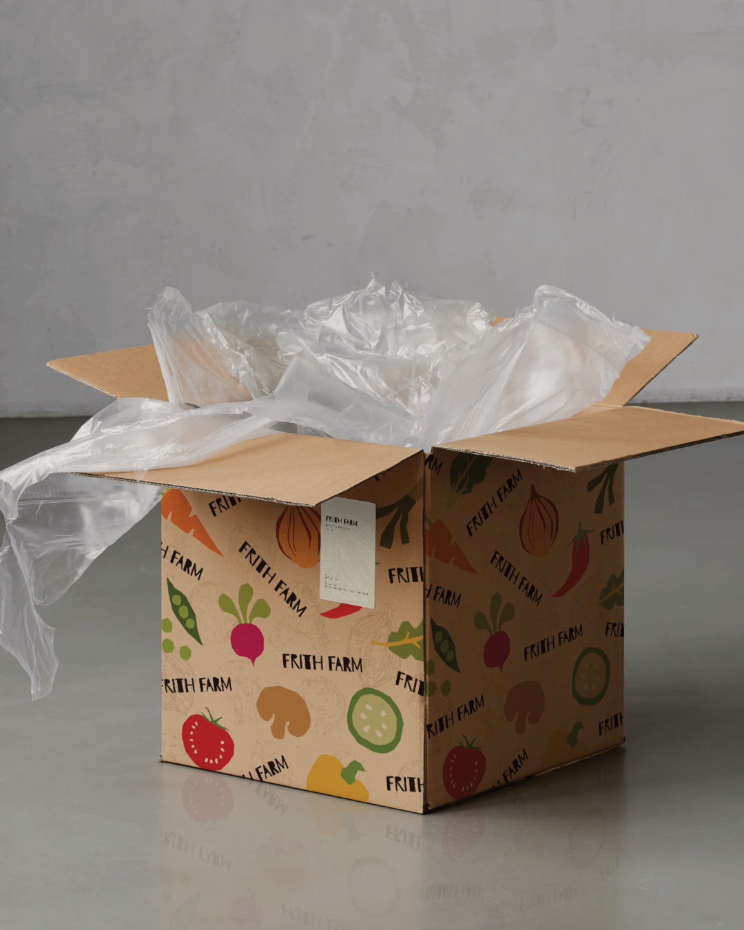
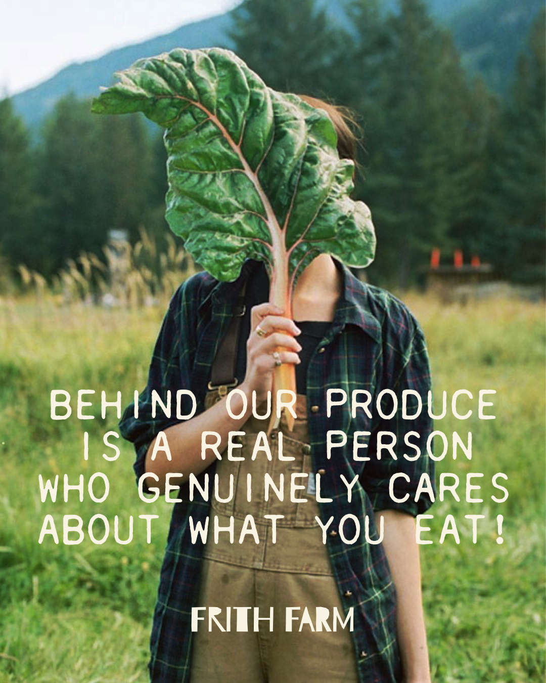
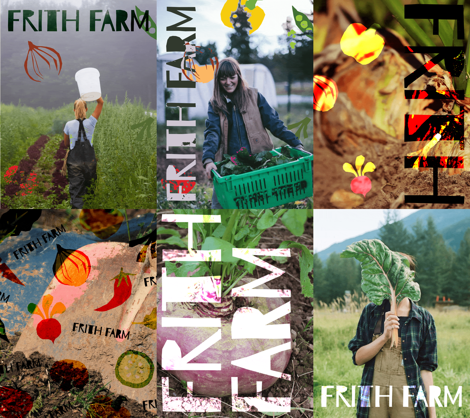
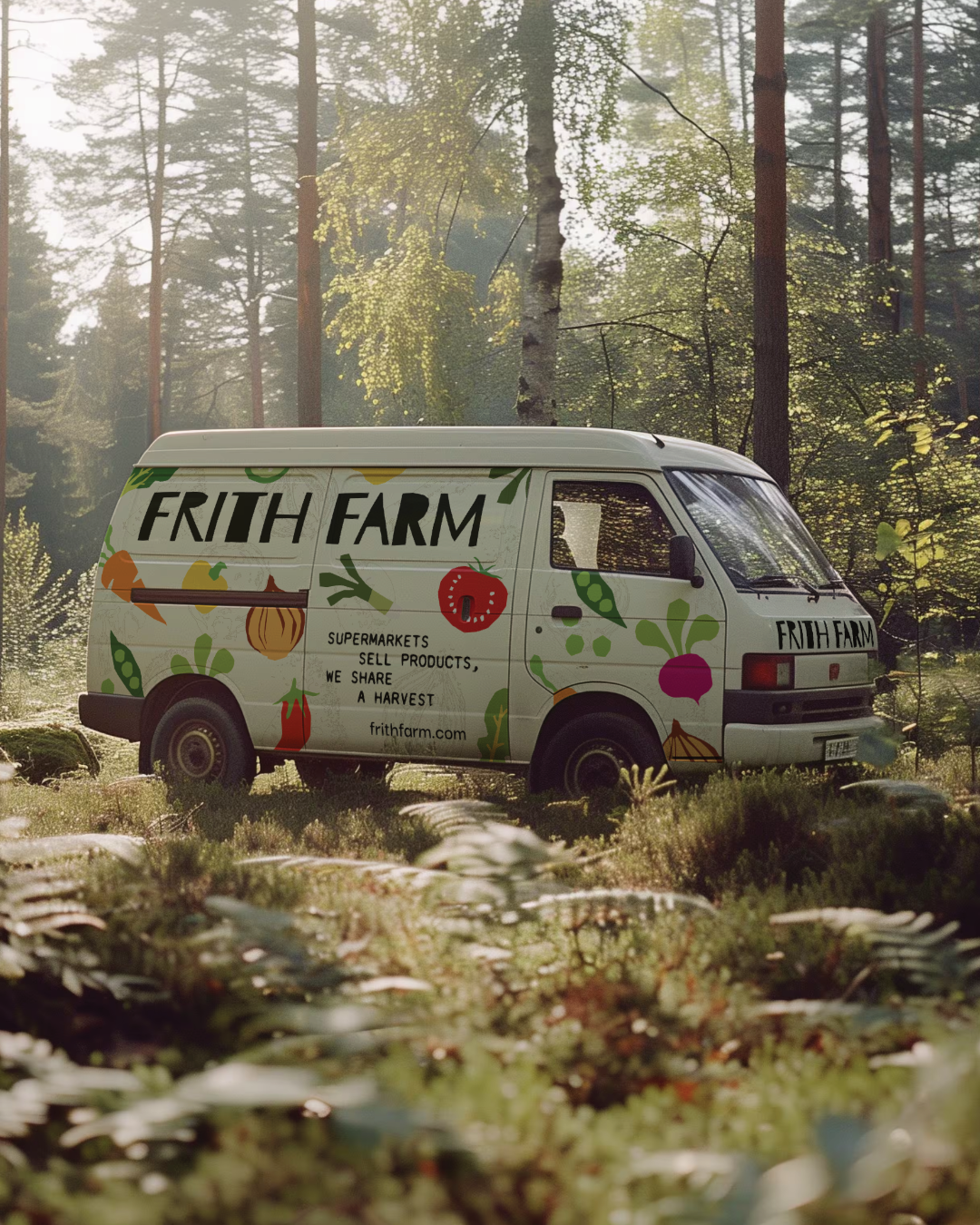
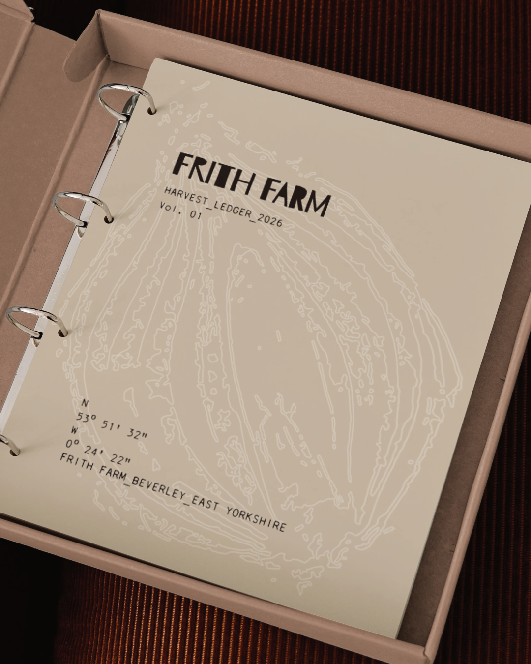
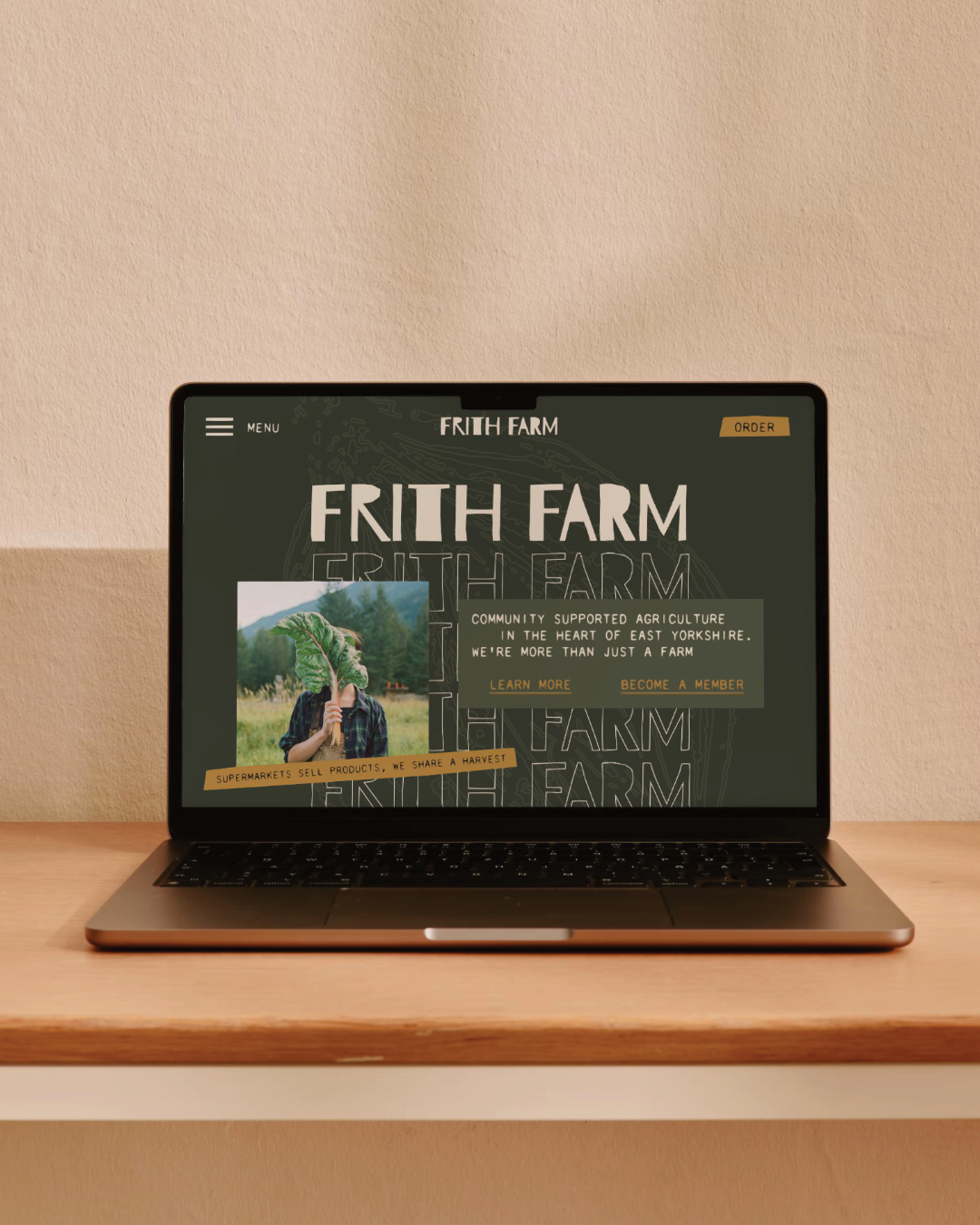
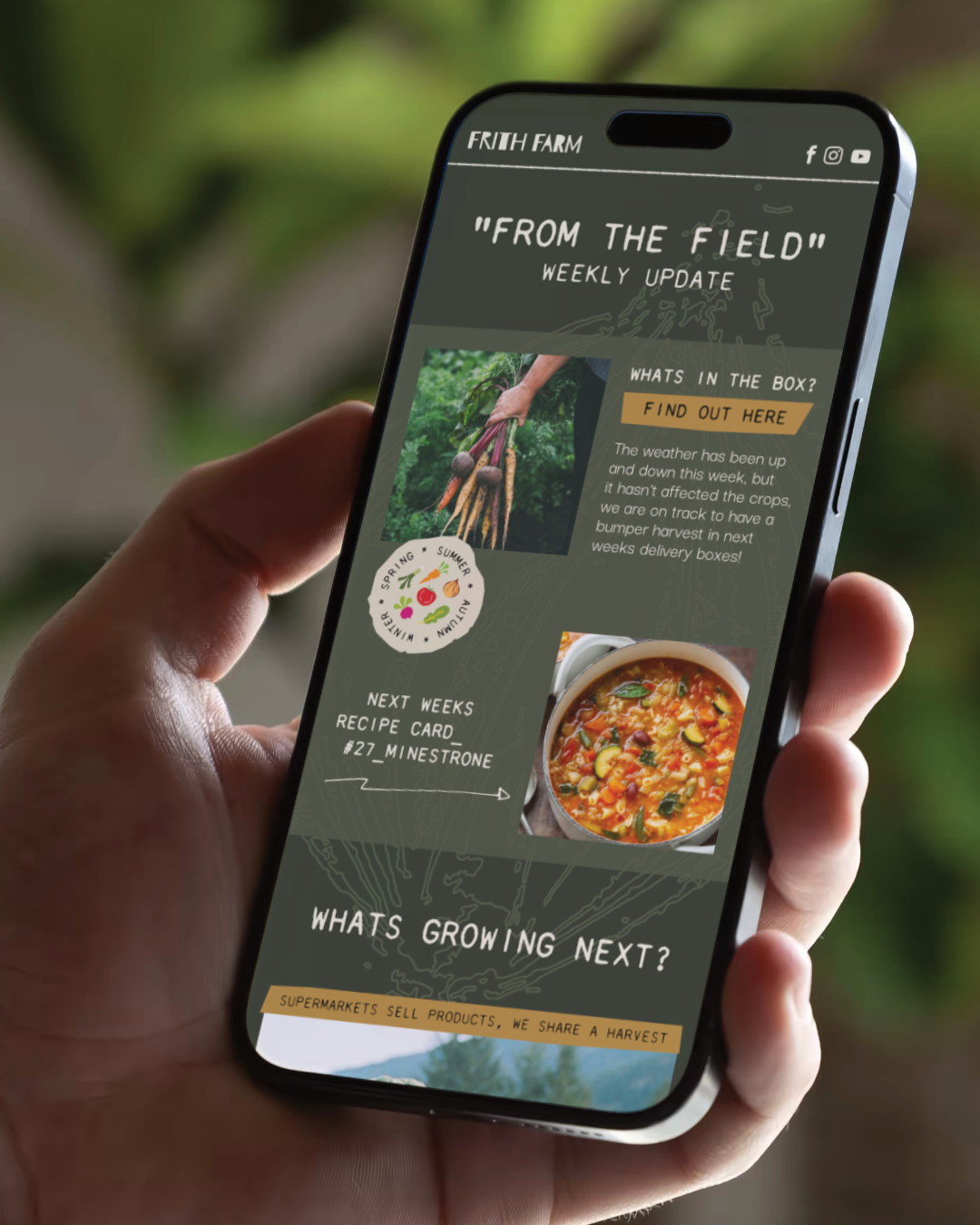
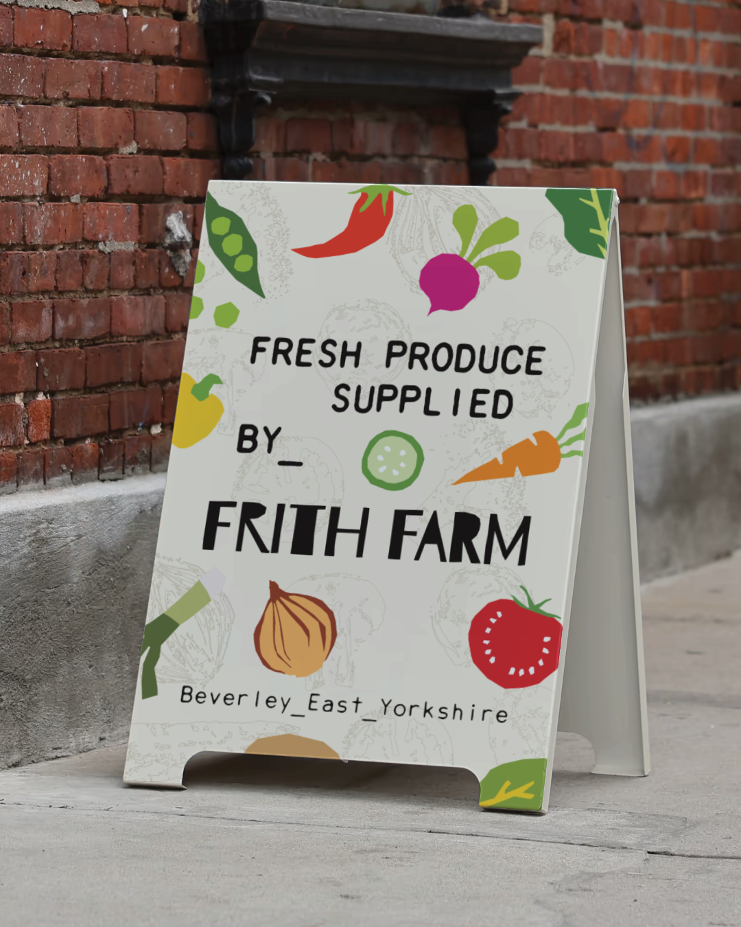
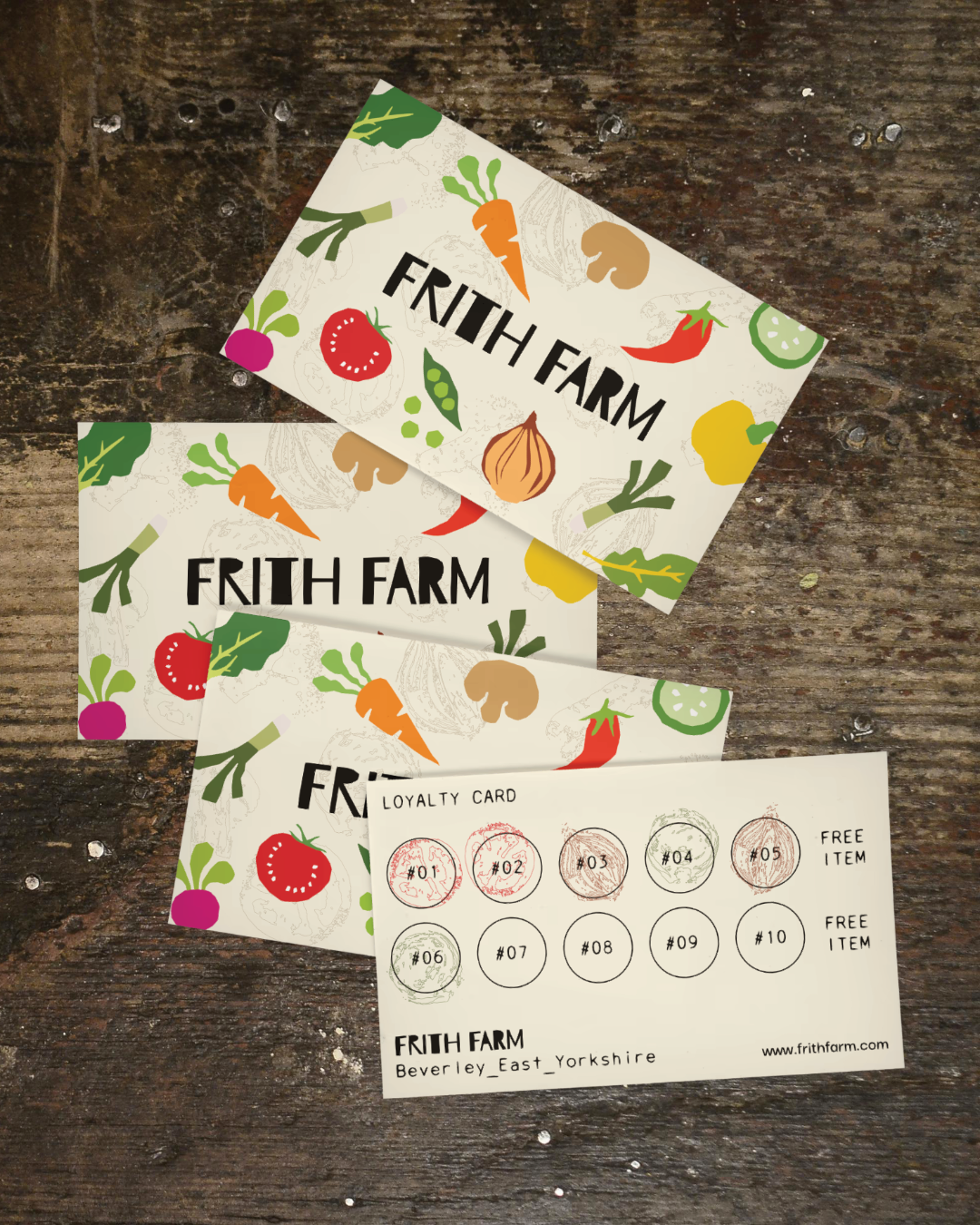
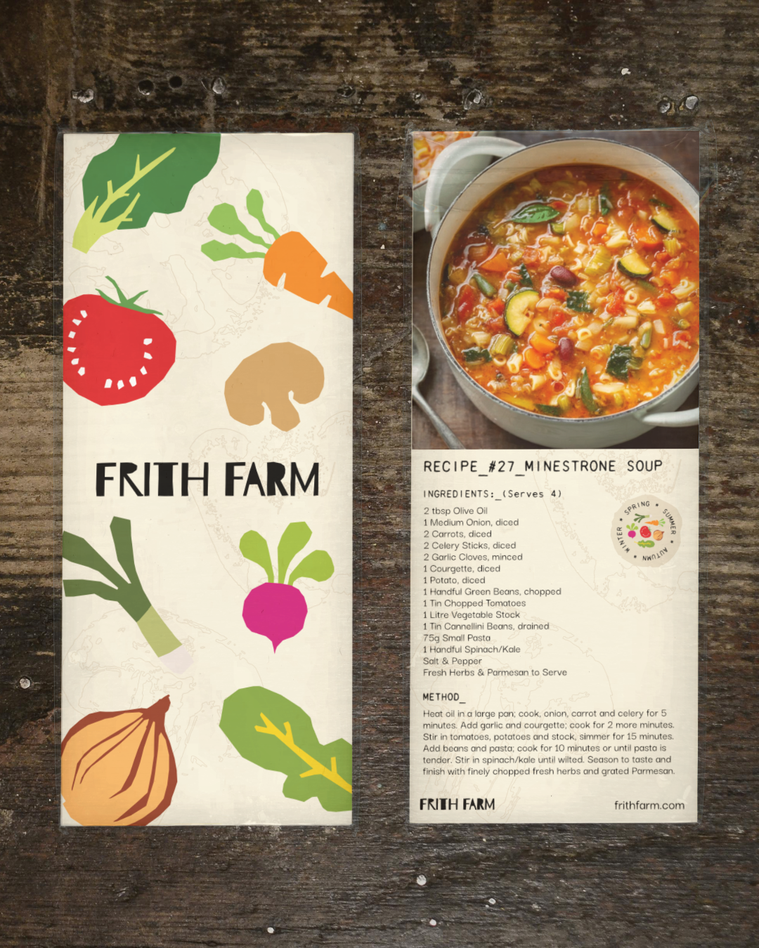
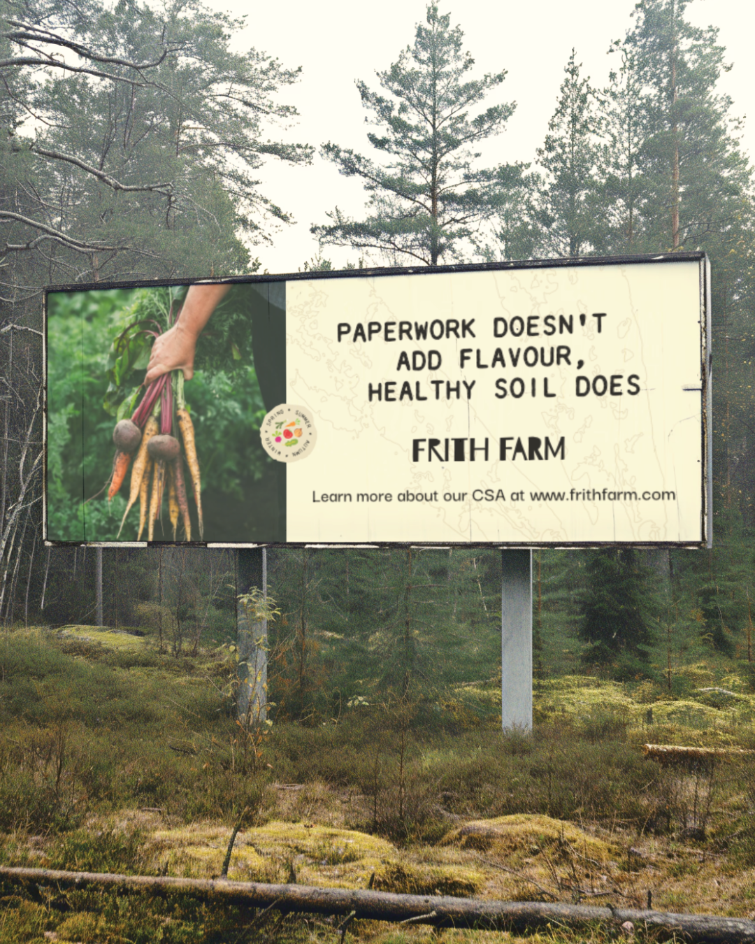
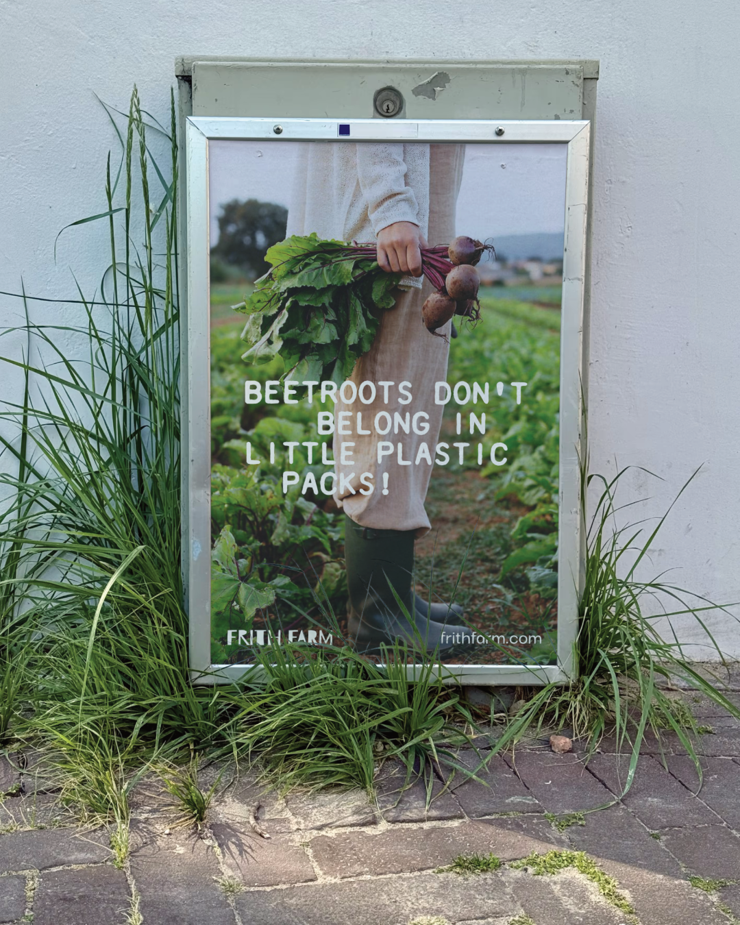
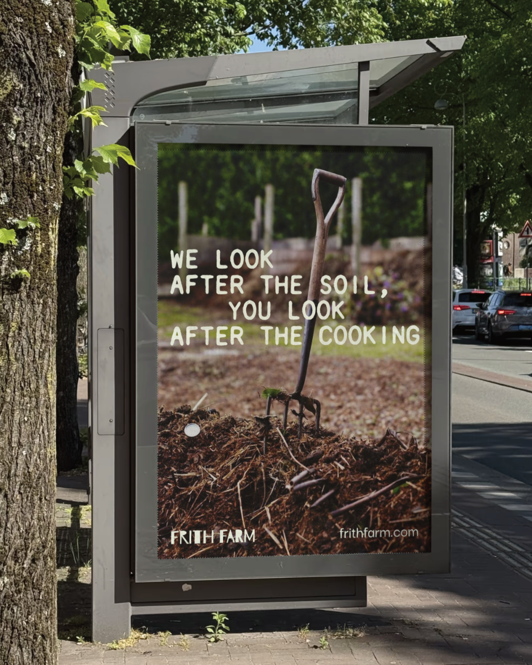
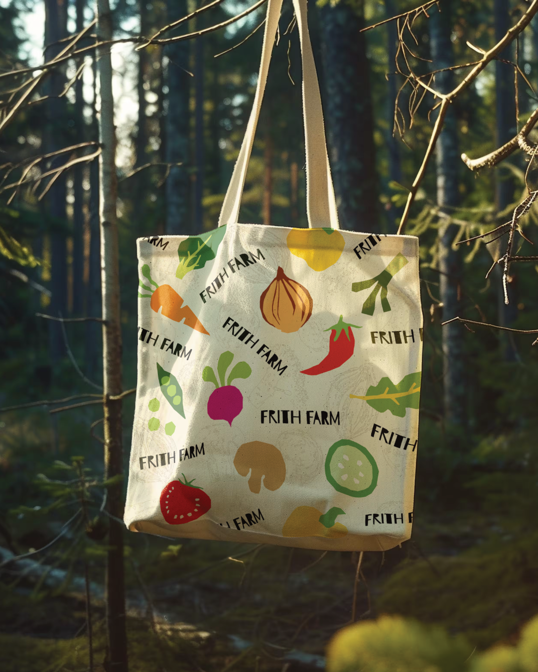
The starting point was strategy. Research into the farm's history, values and competitive landscape revealed a clear gap: no local or regional competitor was owning the space of hands-on, community-focused craftsmanship. The word 'Frith' itself, an Old English word meaning sanctuary and protection, gave the brand a much deeper story to tell. That story shaped everything. A custom logotype built on deliberate imperfection, hand-stamped vegetable illustrations developed away from the screen as physical prints, an earthy grounded palette and a challenger tone of voice were all developed to reflect the farm's no-dig farming methods and the community at its heart.
For a business like Frith Farm, a brand identity that actually matches the quality of what it produces is not a nice-to-have. It is the difference between being overlooked and being chosen. A strong, cohesive identity gives them the confidence to compete with national names, attract new members and communicate clearly why what they do matters.