OTTO
> Brand Identity
> Visual Identity
> Bespoke Logo
> Print Design
> Colour Palette
> Typography
> Illustration
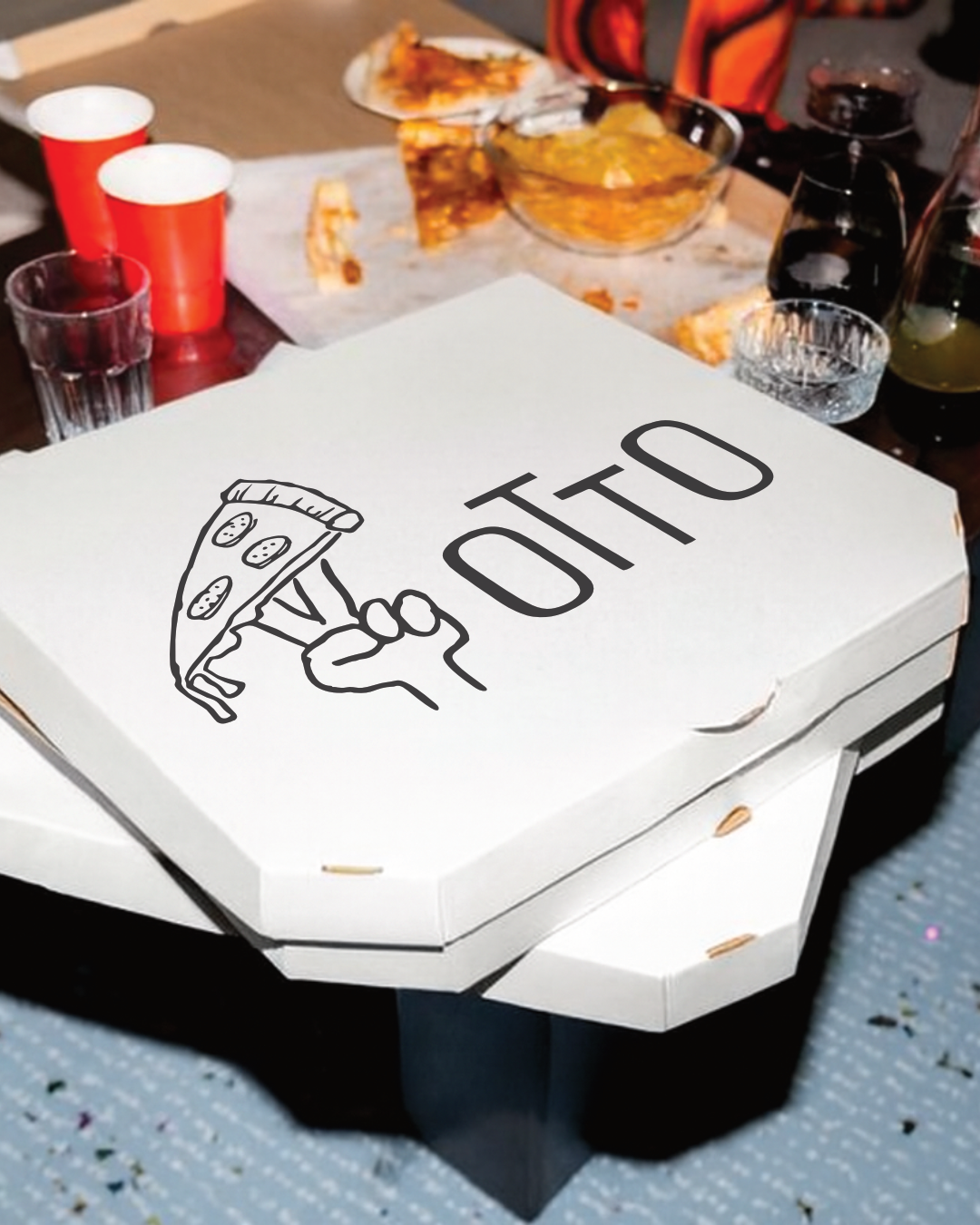
> Packaging
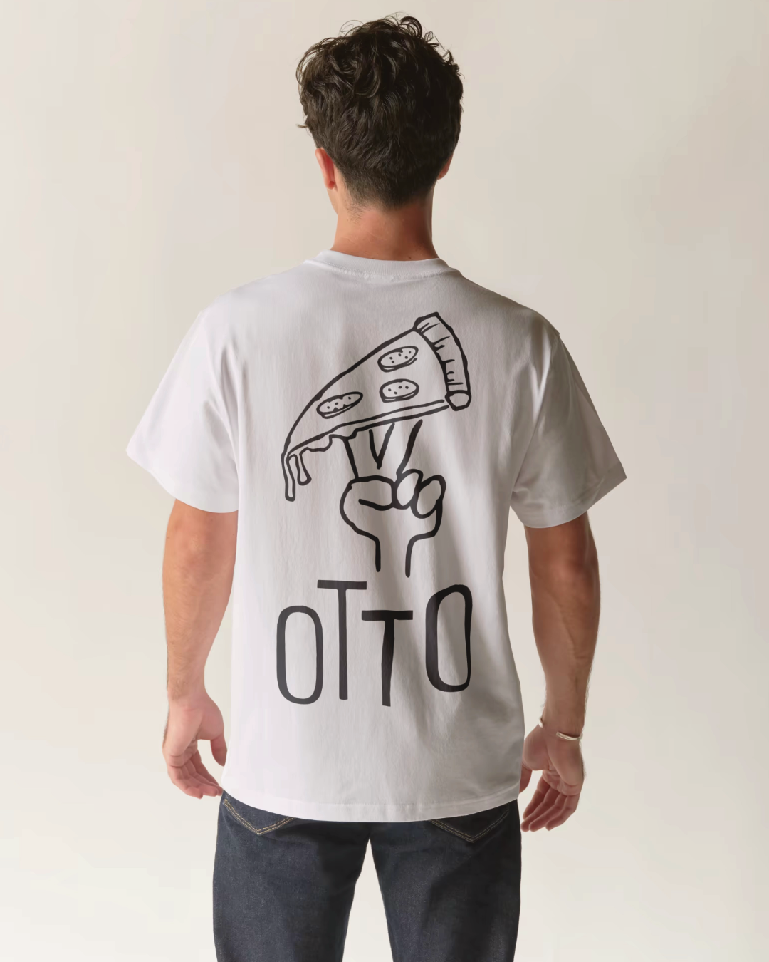
> Art Direction
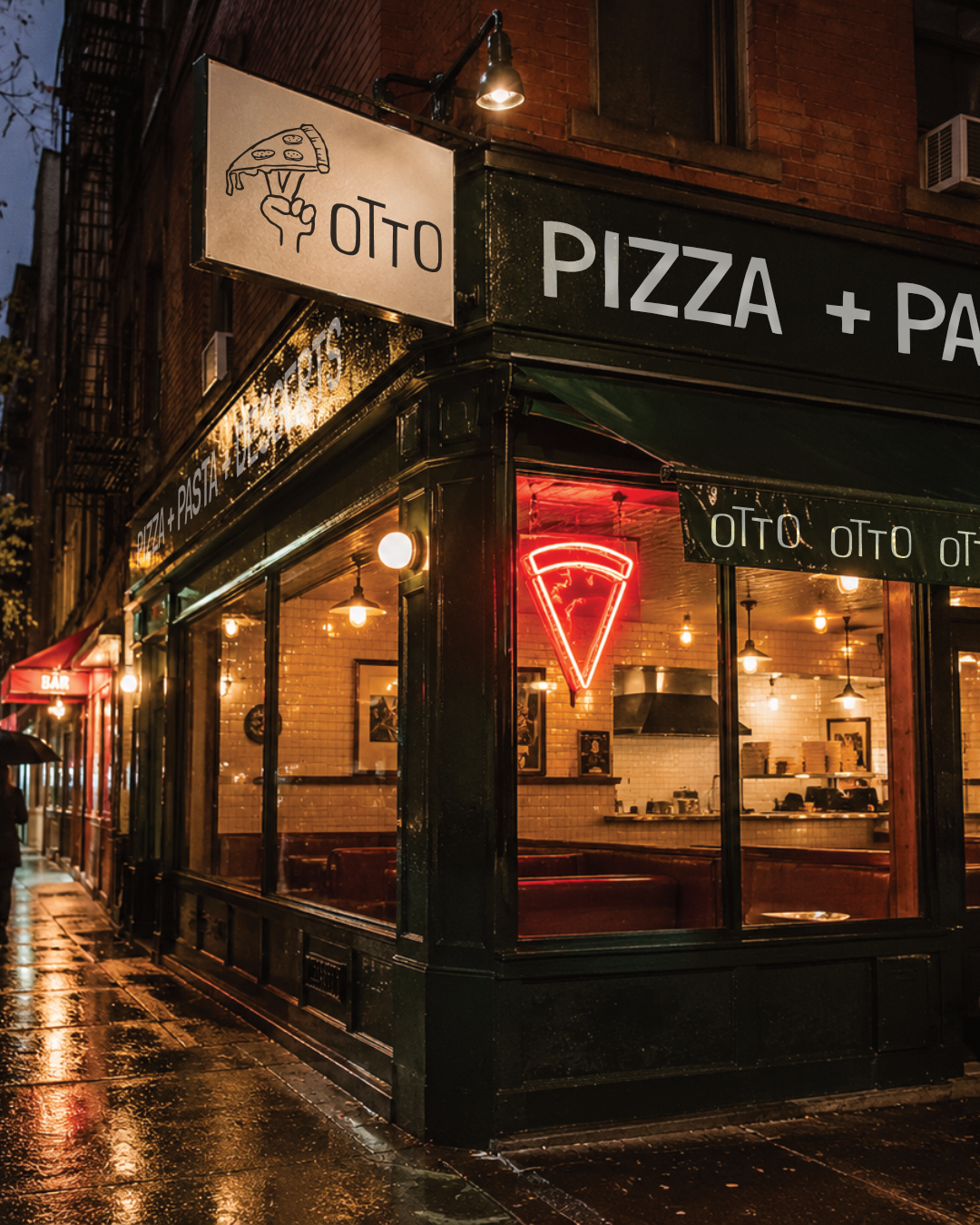
Most pizza brands in the UK fall into one of two camps. Either they lean into tired Italian clichés, or they try to look premium in a way that strips out all the personality. Neither feels right for the kind of place where the pizza is genuinely good, the vibe is loose, and people actually want to be there. Otto started as a personal project, built out of a genuine love of pizza and a long-standing admiration for the independent scene in New York, with a simple ambition: create the kind of pizza brand the UK rarely see’s.
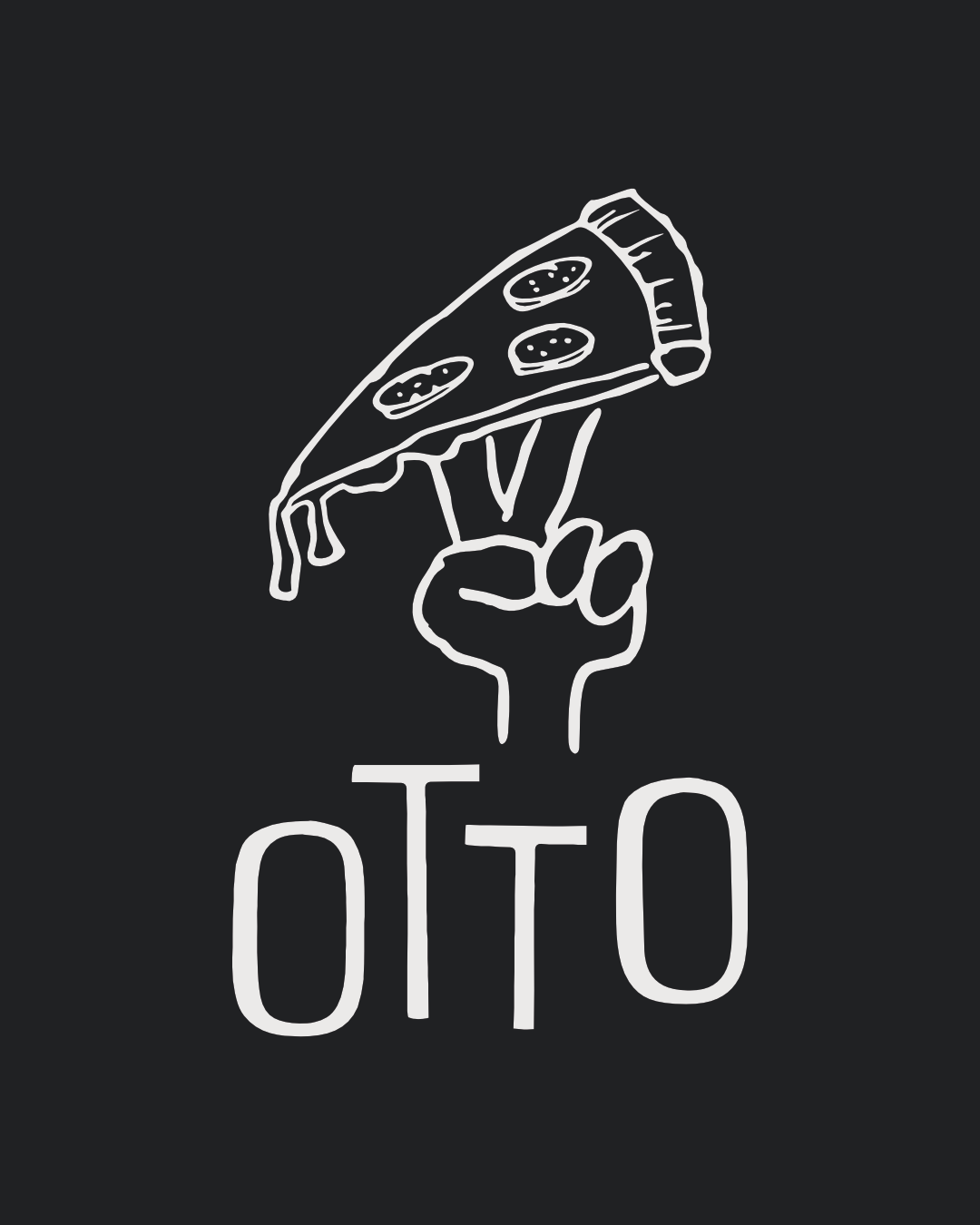
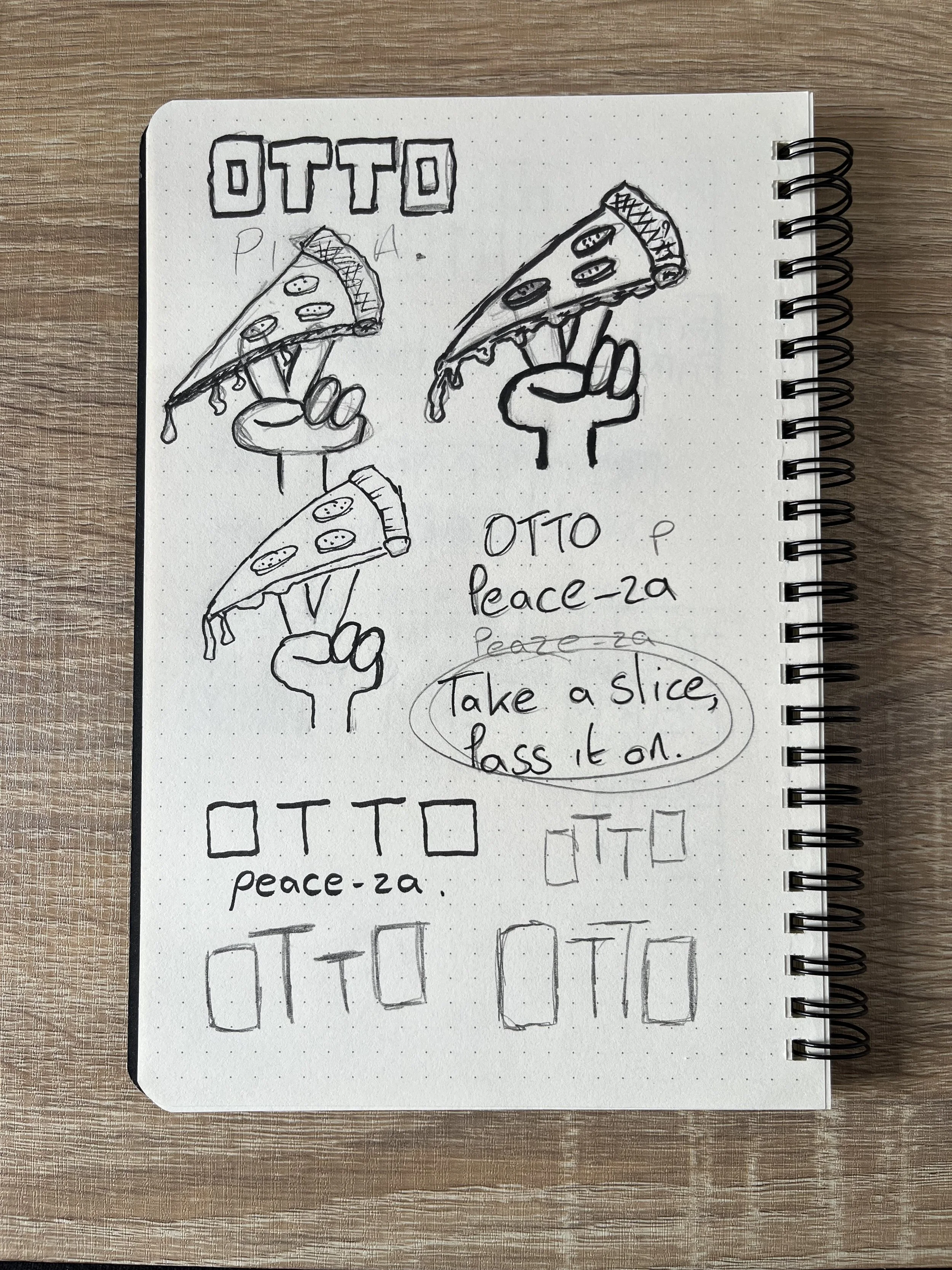
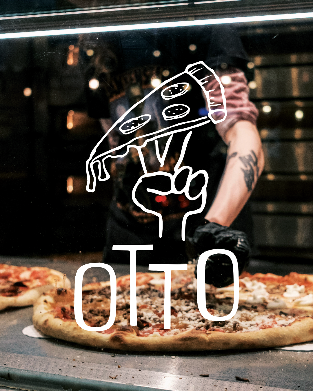
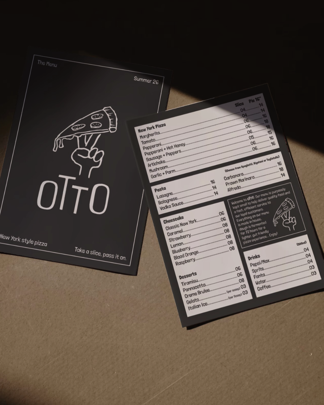
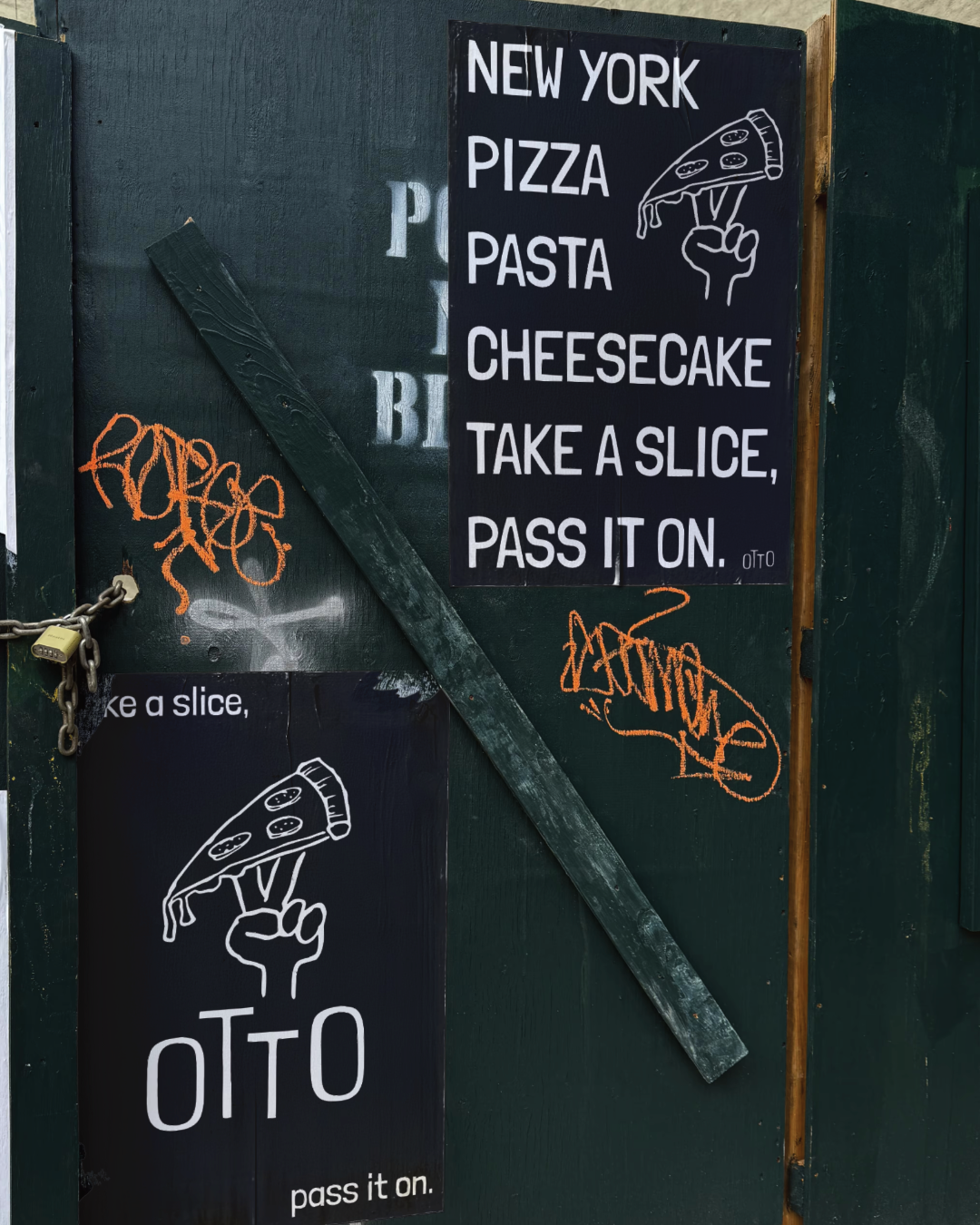
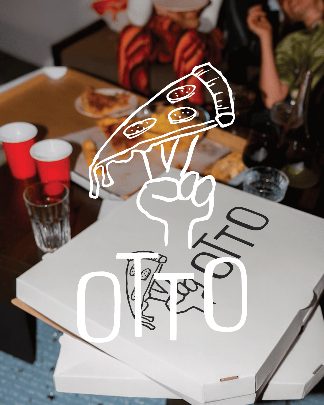
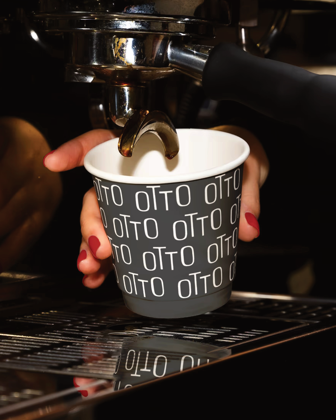
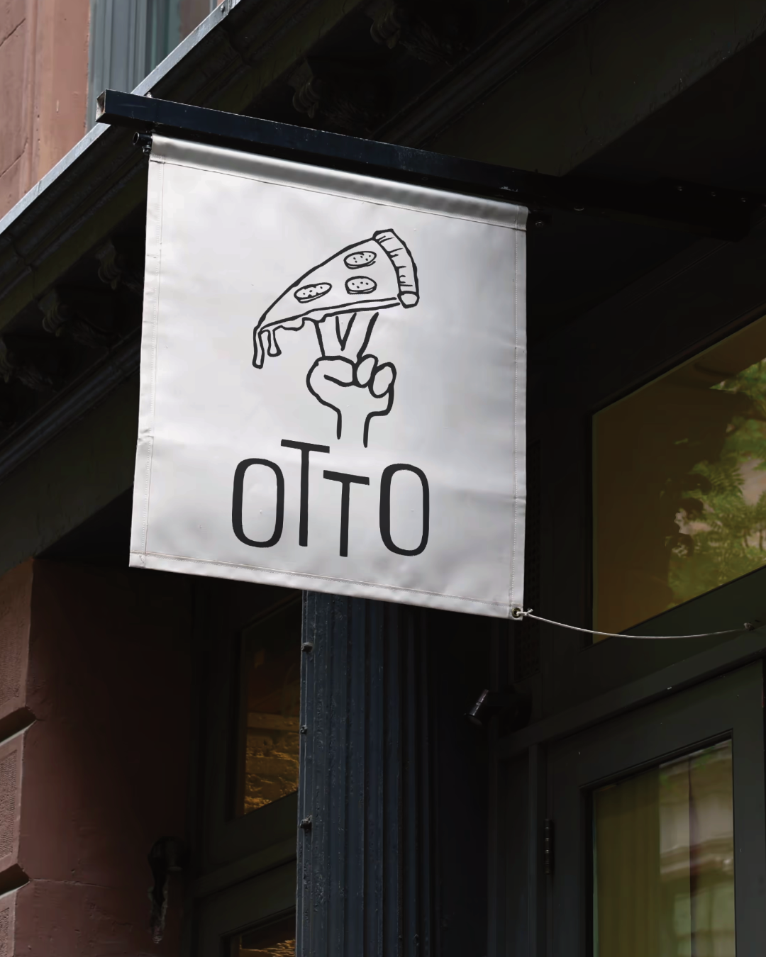
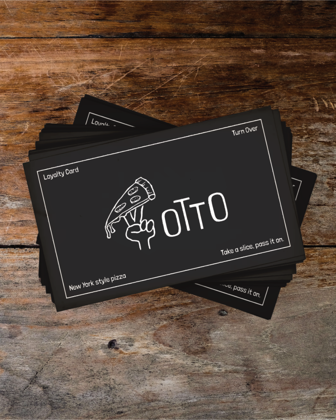
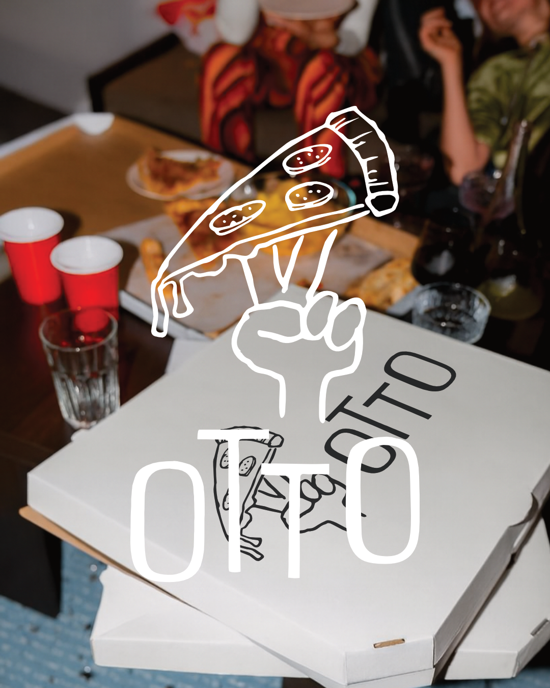
The identity centres on a raised fist holding a dripping slice, two fingers up in a peace sign. It's a nod to the generosity and community that make the best independents worth returning to. That spirit feeds directly into the tagline, "Take a slice, pass it on." From sketchbook to final mark, the illustration was always meant to feel handmade and full of attitude without tipping into gimmick. The wordmark pairs a low-key geometric sans with the illustration to give the brand real range, from a chalk board to a pizza box to an outdoor sign.
The work was built to stretch across a full touchpoint system, and that's where it proves its worth. Menu, loyalty card, packaging, espresso cup, staff tee and shopfront signage all hold together and feel like the same place. Otto exists as a concept, but the thinking behind it is the same thinking I'd bring to a real brief. If there's a founder with the right space and the appetite for it, this is the kind of brand worth building properly.