THE DEEP
> Brand Identity
> Bespoke Logo
> Visual Identity
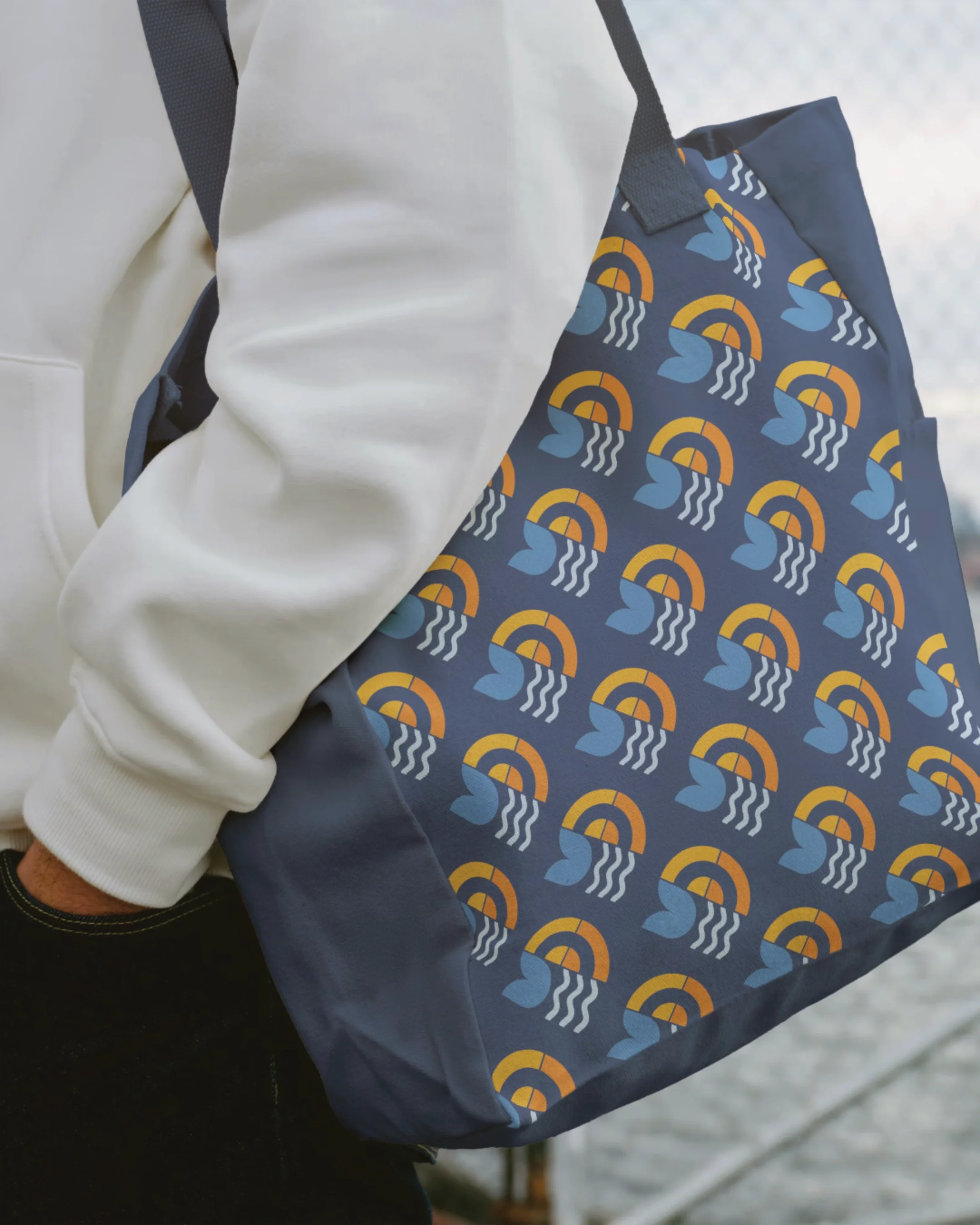
> Colour Palette
> Typography
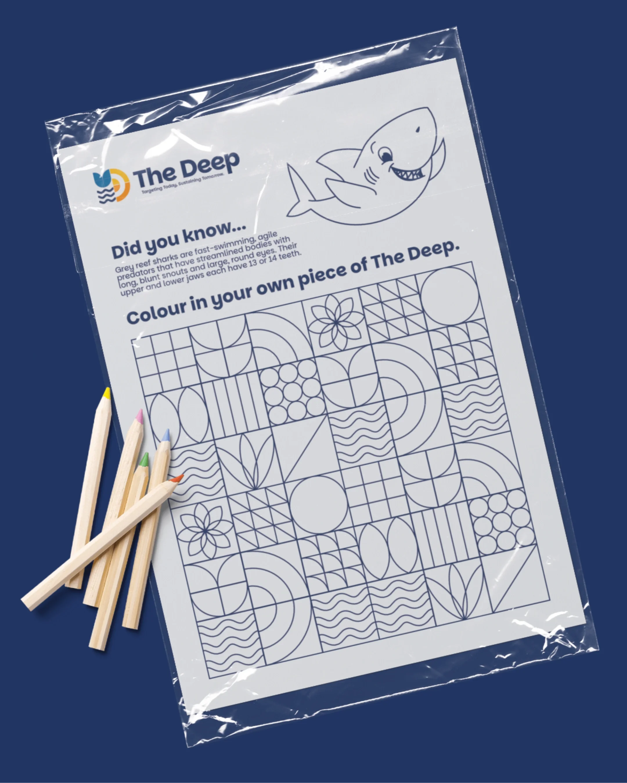
> Iconography
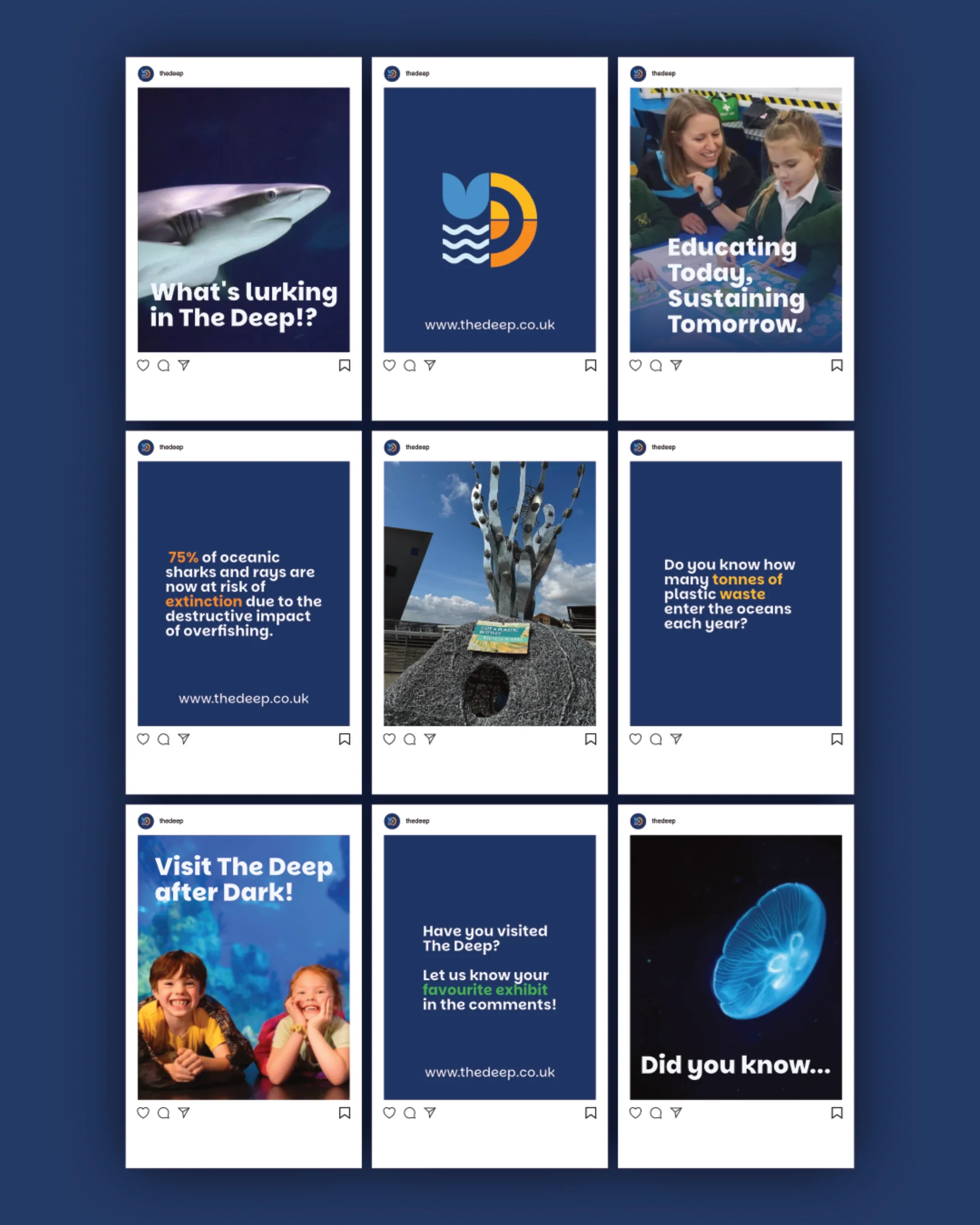
> Marketing
> Messaging
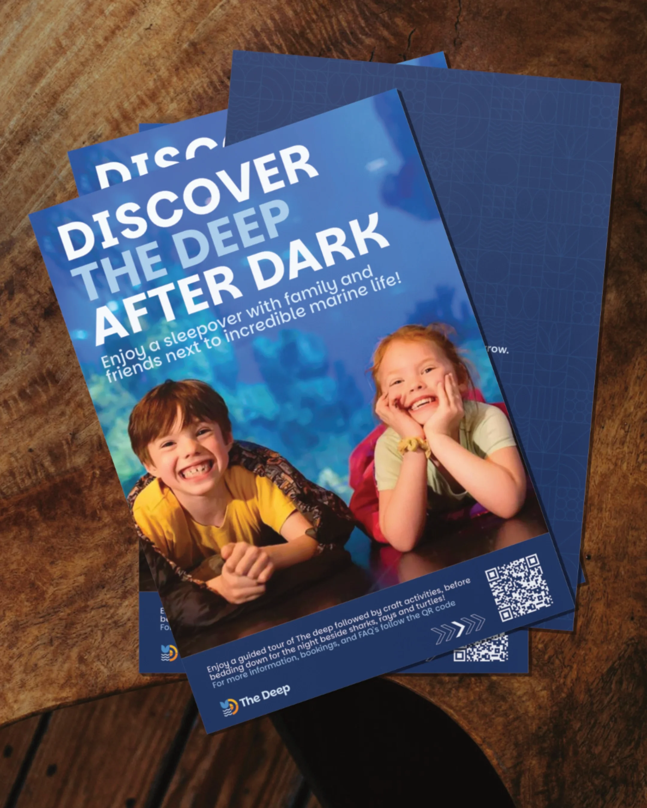
> Print Design
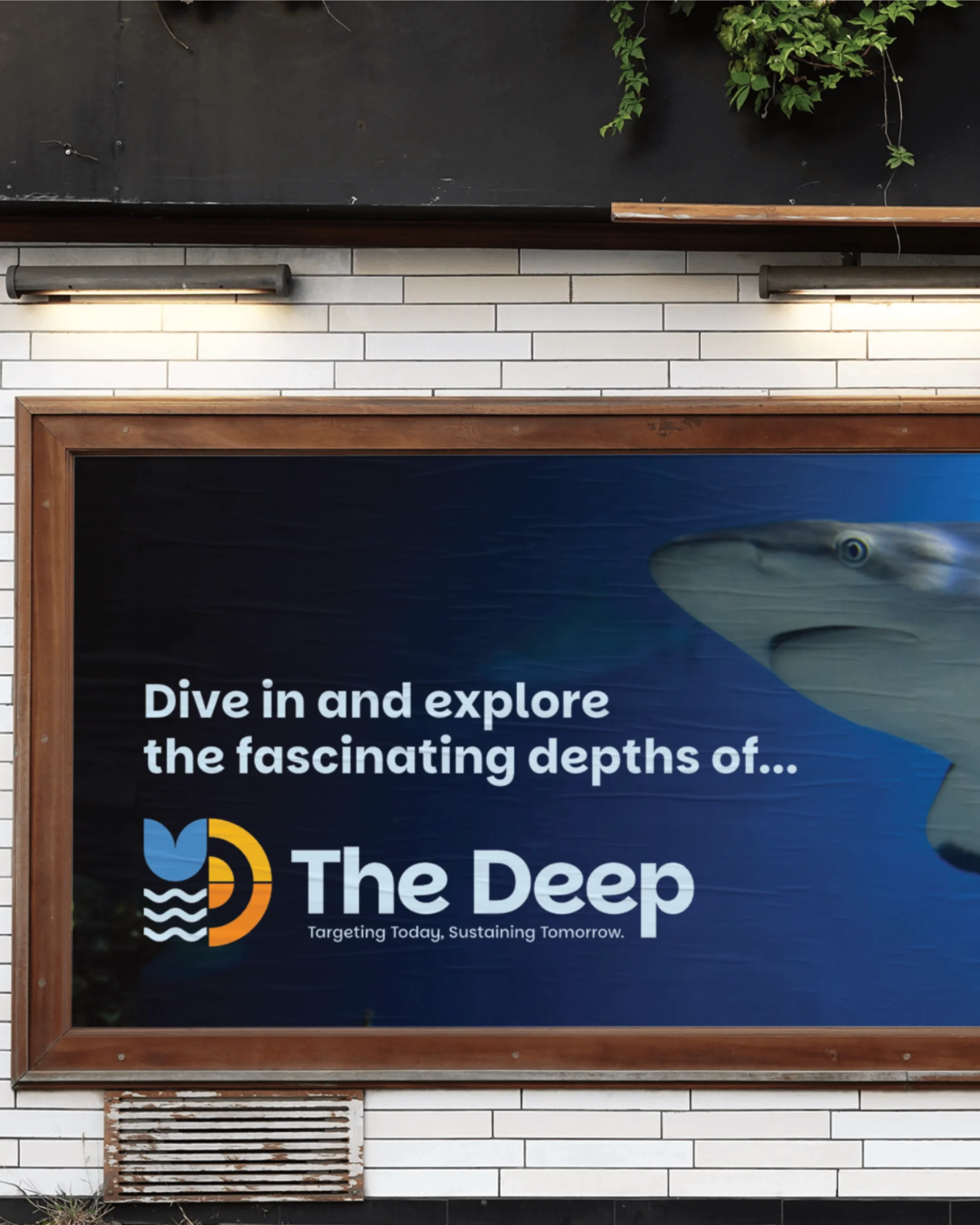
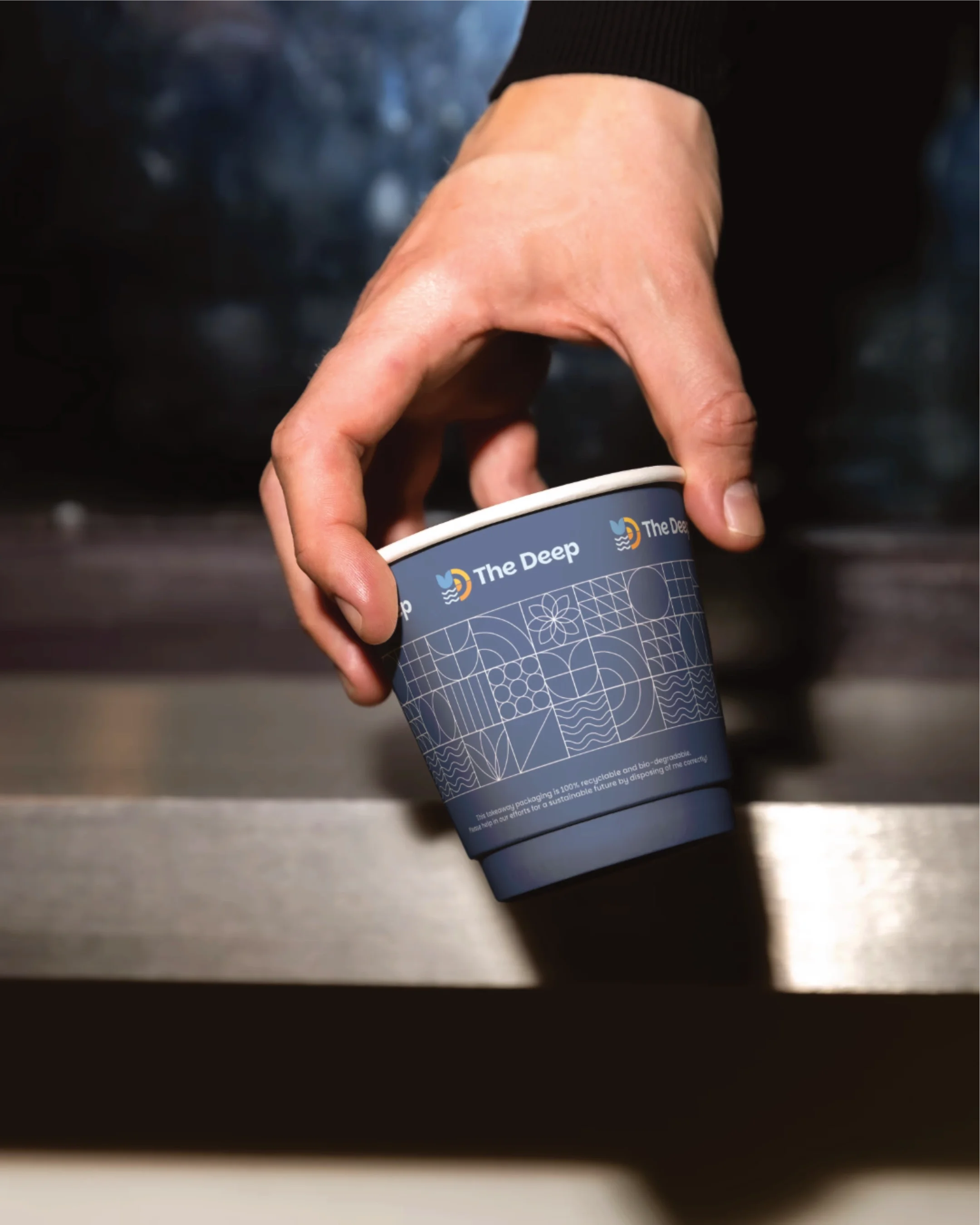
The Deep is a popular aquarium and landmark in Hull. For a university project, I chose to rebrand the organisation after feeling its existing identity didn't do justice to what it represents as one of the UK's most iconic waterfront buildings and a genuine force for marine conservation.
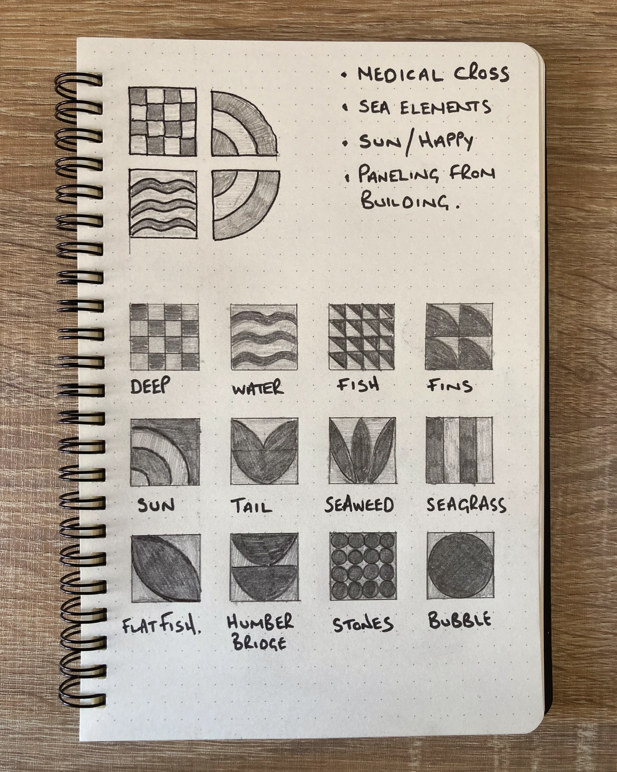
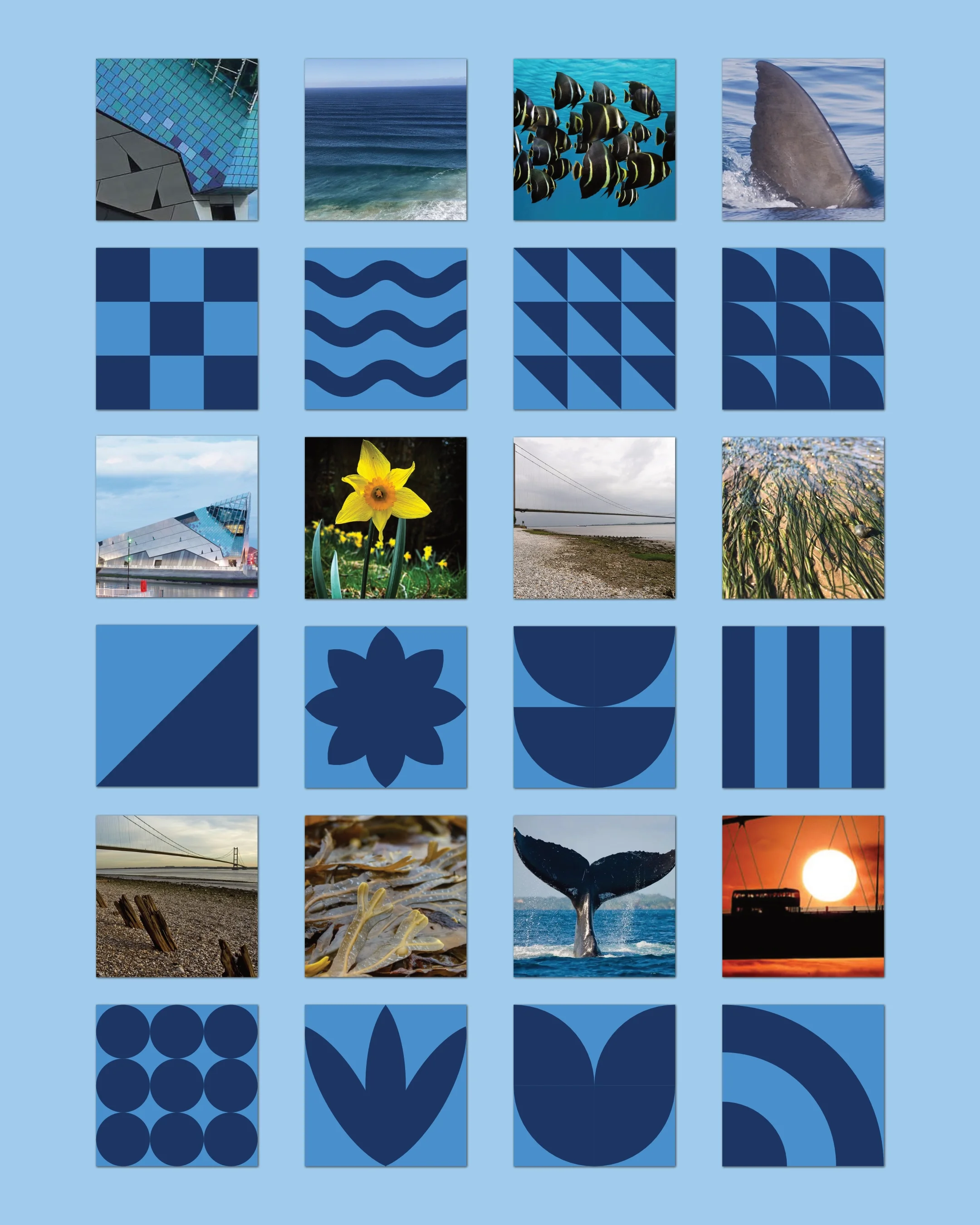
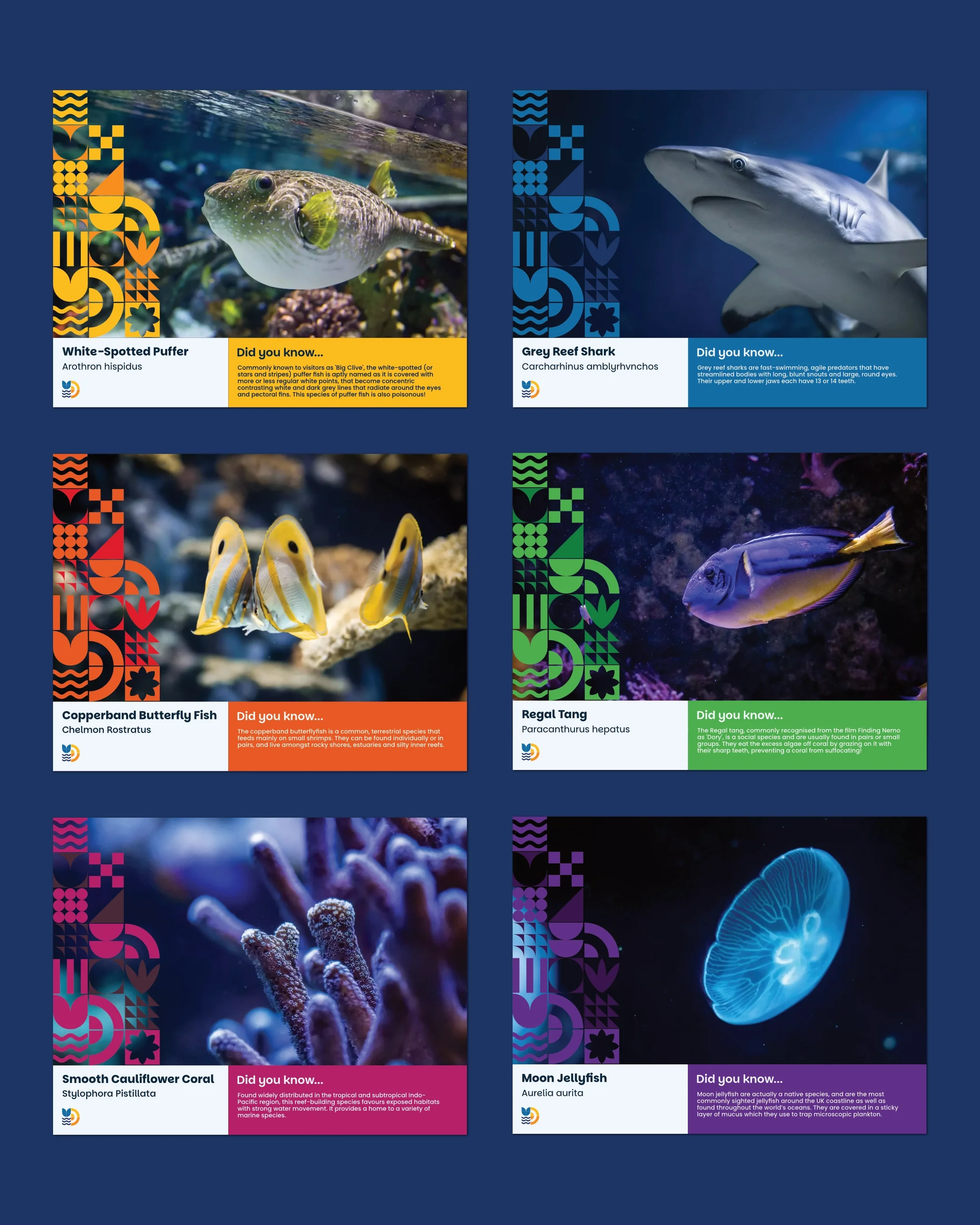
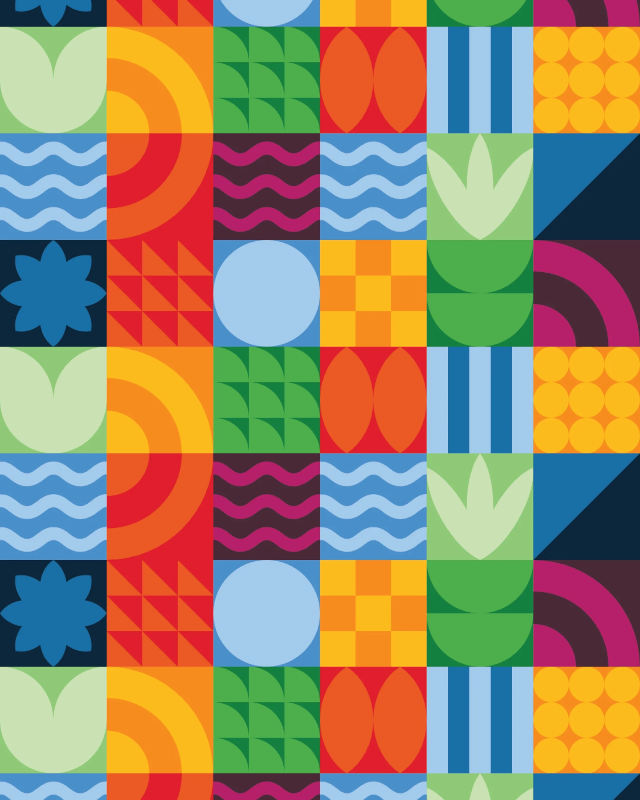
Taking inspiration from the Humber coastline and the building's striking architecture, I built the identity around a set of geometric icons that could form a flexible system across both print and digital.
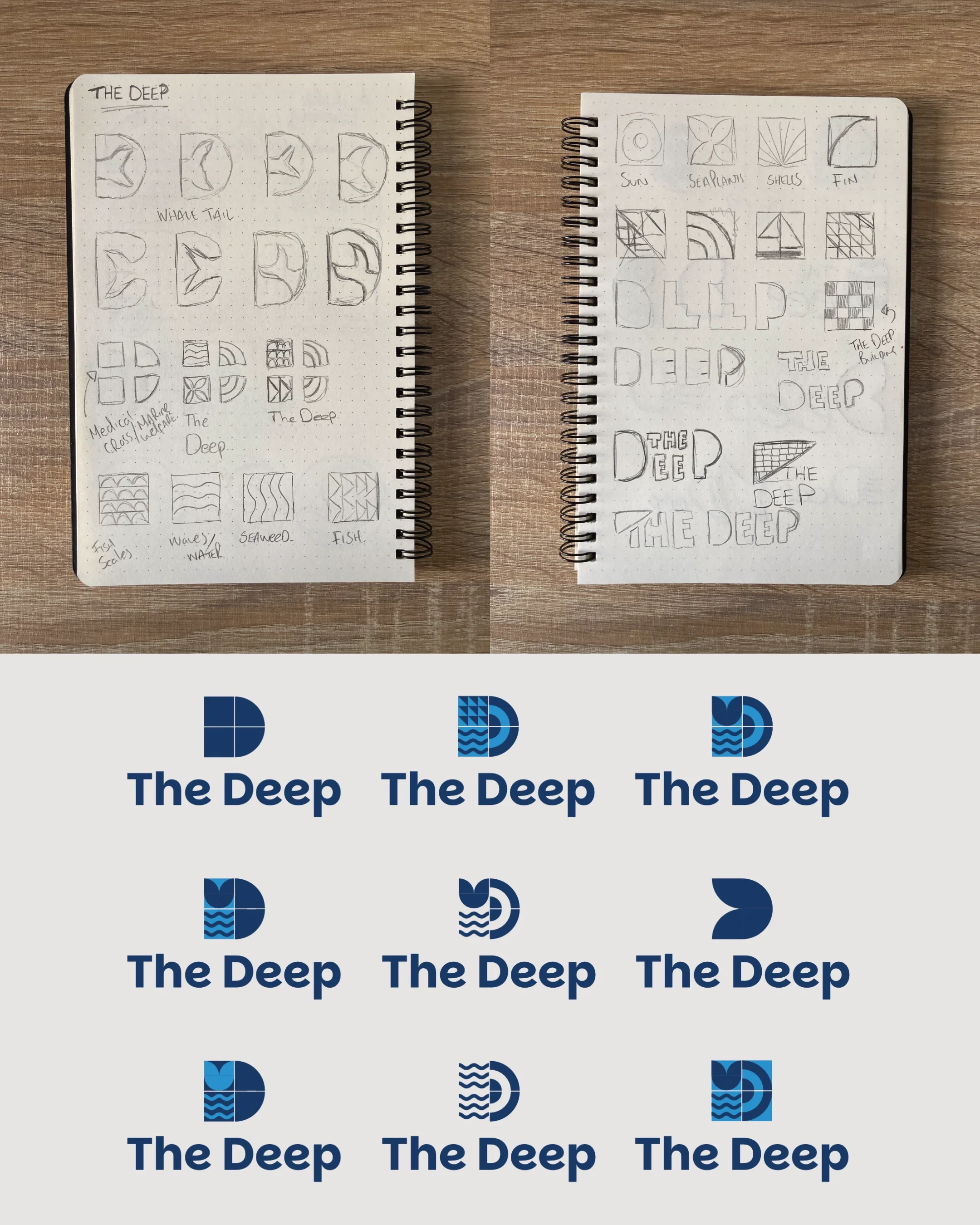
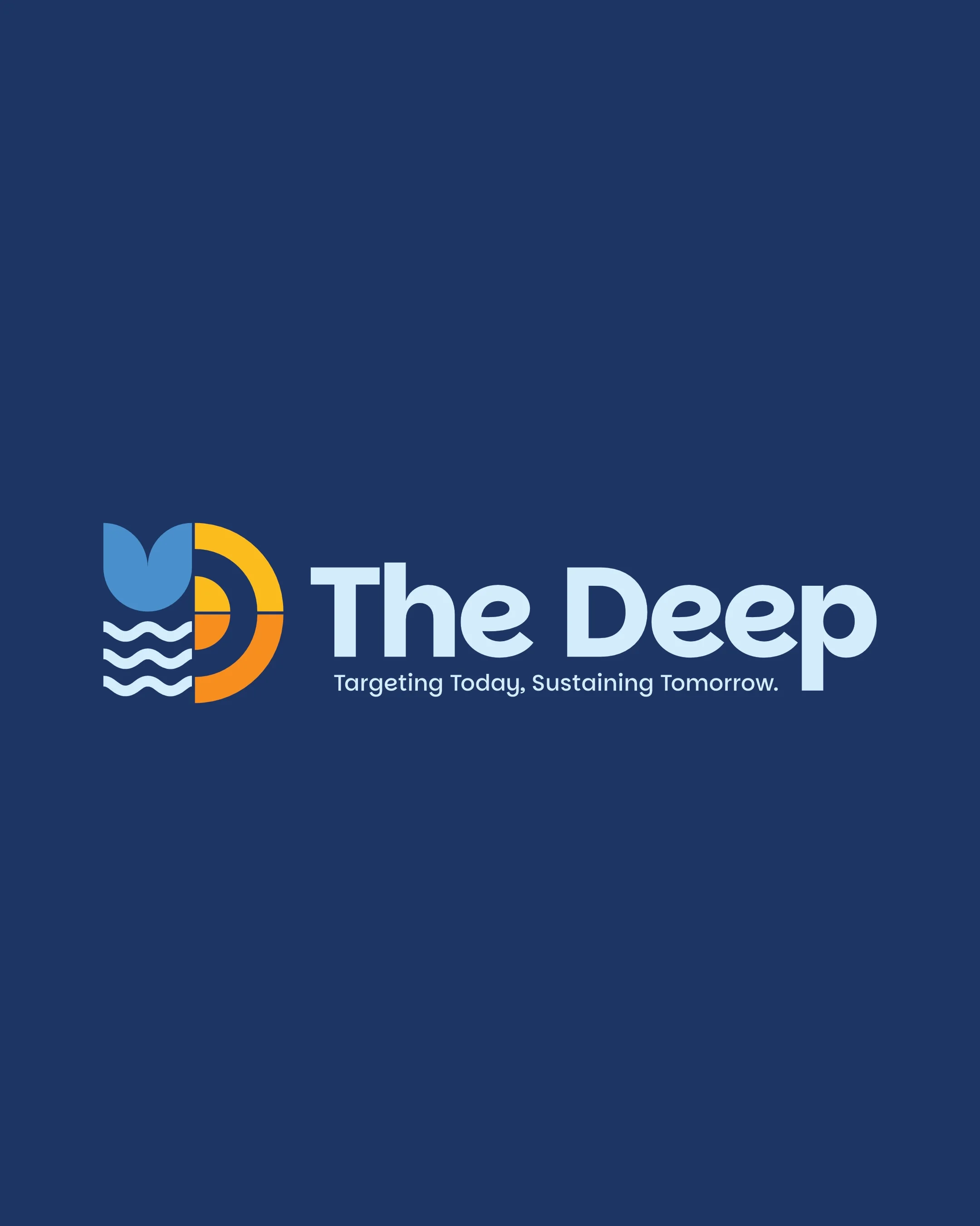
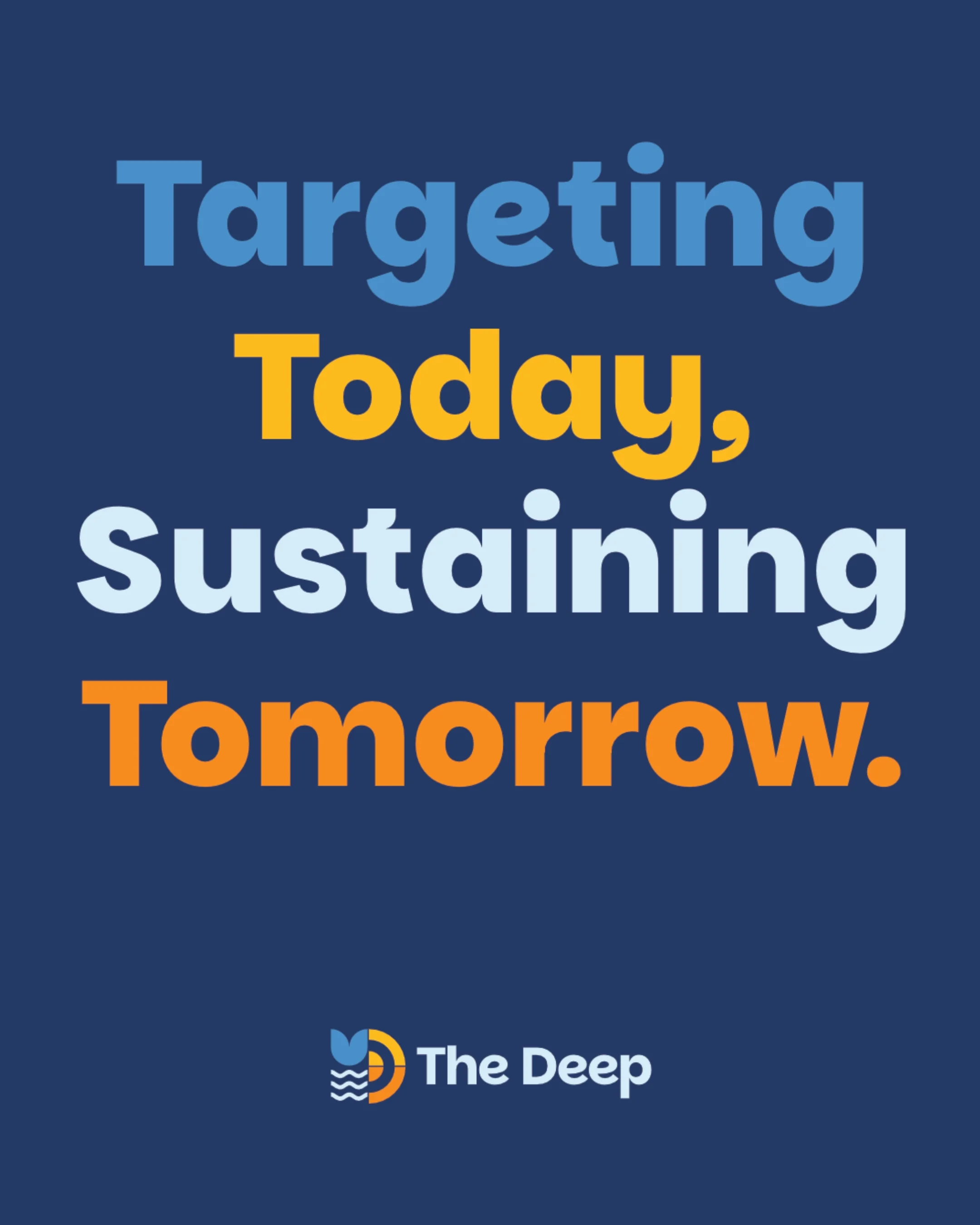
The tagline "Targeting Today, Sustaining Tomorrow" was introduced to bring The Deep's conservation mission to the front of the brand, giving the organisation a voice that felt as purposeful as the work they do. The logo mark itself is built from icons representing water, a fish tail, a target and the sun, each element chosen to tell that same story of marine life and a brighter future.
A palette of deep blues alongside brighter, more inviting tones helps distinguish different areas of the attraction and brings energy to a younger audience, while the typography was chosen to feel modern and stay legible at any scale.
The result is a brand system that feels as landmark as the building itself, more memorable, more focused, and more connected to the people who visit it.