
AURORA
Bold and refined elegance
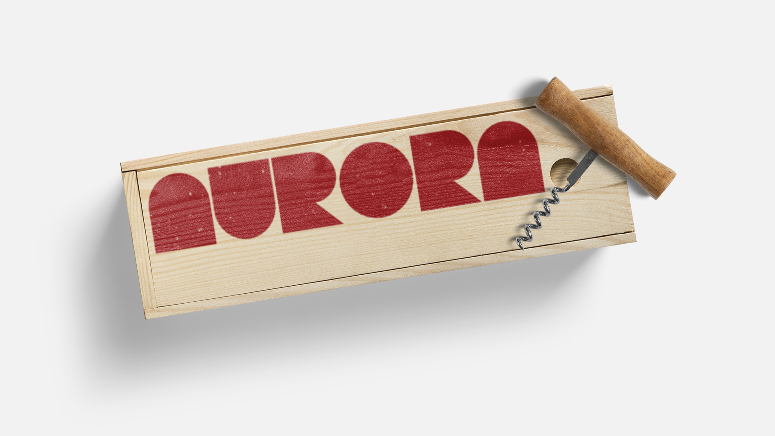
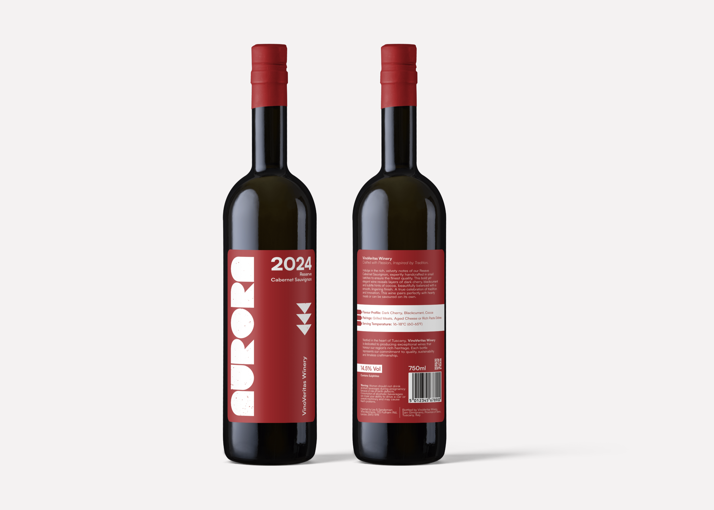
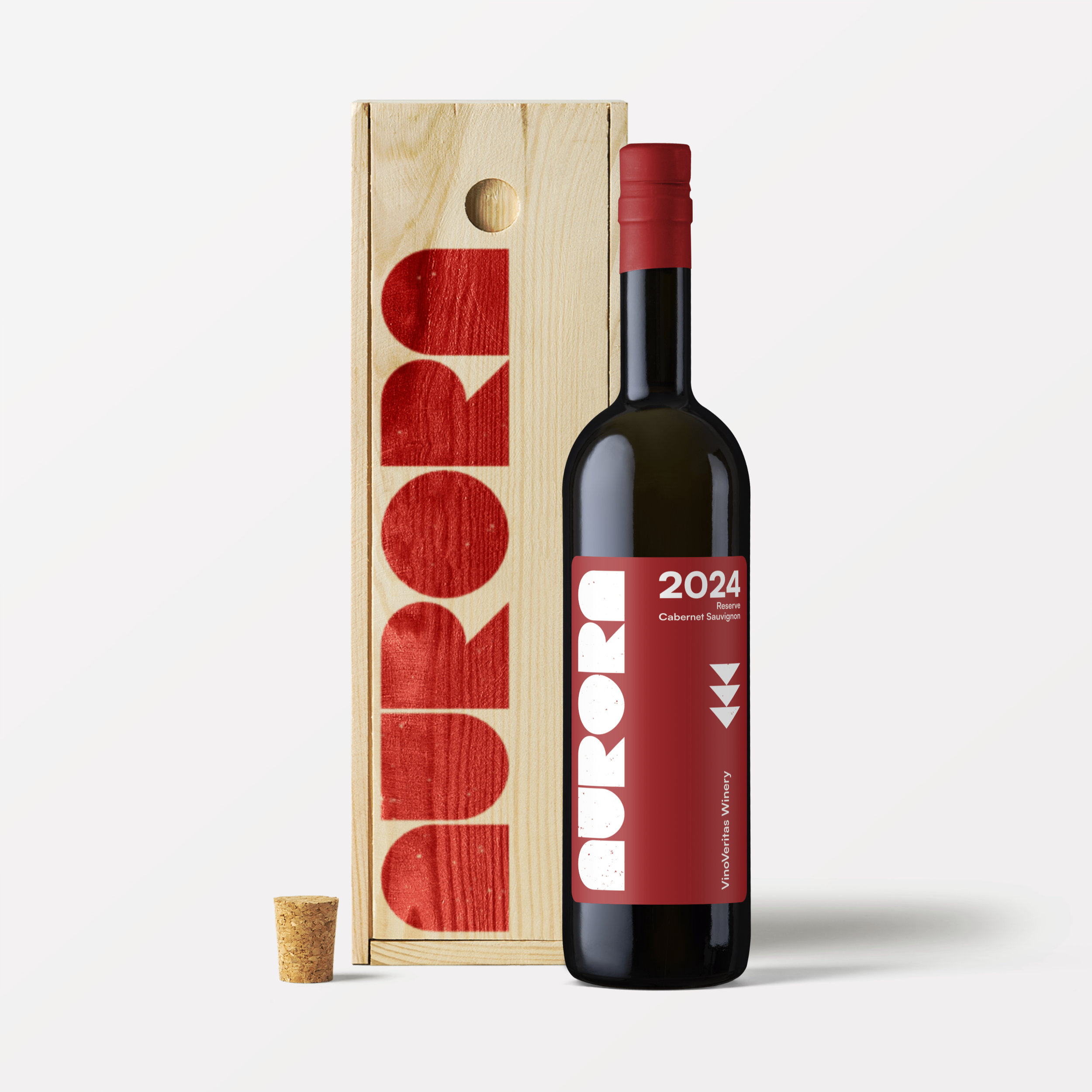
Aurora is a concept project for a premium reserve Cabernet, designed for a modern wine audience. The goal was to explore a visual identity and packaging system that communicates the wine’s depth, clarity, and bold character, while maintaining elegance, restraint, and a contemporary, minimalist aesthetic.
The concept identity features a custom typographic logo with bold, geometric block lettering, giving the brand a strong and recognisable presence. The design system embraces minimalism, with clean layouts, a limited colour palette, and restrained typography, allowing the product to take centre stage. Every element was designed to communicate quality, modernity, and confidence, while avoiding traditional wine tropes.
This concept demonstrates how a minimalist, design-led approach can create a premium wine identity that feels confident, refined, and contemporary. While conceptual, the project highlights strategy-led thinking, attention to detail, and a clear understanding of how to position a brand for a modern audience.
Visual Identity | Packaging


Ready to work together?
Get in touch