From the Ground Up: How Brand Identity Can Transform a Local Food Business
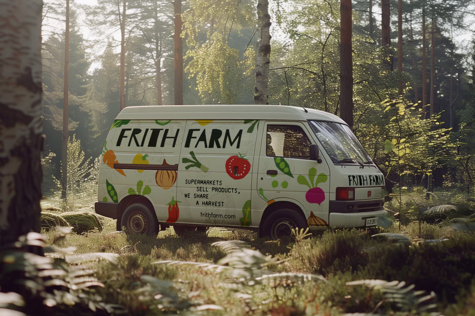
There is a moment in every independent food business when the product stops being the problem. The food is good. The ethos is right. The people behind it genuinely care. But something is still not working. New customers are hard to find, the loyal ones are difficult to hold onto and the business feels invisible against bigger, louder competitors. More often than not, the problem is not the product. It is the brand.
This is the situation I found myself thinking about when I came across Frith Farm during research into local businesses that deserved better branding. Frith Farm is a regenerative market garden in Beverley, East Yorkshire, running a Community Supported Agriculture scheme where members subscribe to a share of the harvest rather than simply buying from a shelf. The food is exceptional. The ethos is genuine. The community around it is real. But the brand was fragmented, generic and doing nothing to communicate any of that.
So I set out to change it.
The Problem With Generic
Walk into any supermarket, open any food delivery app or scroll through Instagram and you will see the same visual language repeated endlessly. Green palettes, clean sans serif type, friendly illustrations of vegetables and taglines about freshness and provenance. It all blurs into one. For large corporations this sameness is a safe choice. For an independent food business it is a slow death.
When everything looks the same, customers cannot tell the difference. And if they cannot tell the difference, they default to convenience and price, which is exactly where independent businesses cannot compete with supermarkets and national brands.
The answer is not to shout louder. It is to be unmistakably yourself.
Story First, Design Second
The first thing I did with Frith Farm was not open a design application. It was research. Understanding the history of the farm, the meaning behind its name and the values driving every decision on the land. That research changed everything.
The word 'Frith' is Old English for sanctuary and protection. In Anglo-Saxon times, to be in Frith meant you were safe within a protected boundary. Beverley Minster, just down the road from the farm, holds an ancient stone Frith stool dating from the 7th century, a chair that granted sanctuary to anyone who reached it. That history, sitting quietly behind a local market garden, gave the brand a story no competitor could replicate.
This is what separates great brand identity from decoration. Anyone can choose a nice colour palette and a clean typeface. Finding the story that belongs only to your business and building a visual language around it is something else entirely.
Making It Physical
One of the most important decisions in the Frith Farm project was to step away from the screen early in the process. The farm's identity is rooted in physical, hands-on work. No heavy machinery, no shortcuts, just people working the land carefully and patiently. The brand needed to reflect that.
Vegetables were cut in half and used as physical ink stamps, pressed onto paper and scanned before being developed into a library of illustrations. The resulting textures echo topographic maps, connecting the visual system directly to the land and the sanctuary concept at the heart of the brand. Every mark carries the evidence of how it was made.
This matters because authenticity is increasingly difficult to fake. In an era where AI can generate a logo in seconds and branding templates are available for next to nothing, the things that cannot be algorithmically produced are becoming more valuable. A brand built on genuine process, real materials and a true story is not something a competitor can replicate with a few clicks.
The Challenger Stance
Frith Farm refuses to pay for organic certification despite working entirely to organic principles. They describe the annual fee as a tax on doing the right thing. Rather than hiding this position, the rebrand puts it front and centre.
This is what challenger brand thinking looks like in practice. Instead of trying to compete on the same terms as larger, more established players, Frith Farm leans into the things that make it different. Short, confident lines of copy do the work: 'Paperwork doesn't add flavour. Healthy soil does.' 'Supermarkets sell products. We share a harvest.' This tone of voice gives the brand a personality that no supermarket could authentically adopt, and that is exactly the point.
For any independent food or hospitality business, the challenger stance is one of the most powerful tools available. Your size is not a weakness. Your independence, your story and your refusal to compromise are the things a customer cannot get anywhere else. The brand just needs to say so clearly.
What a Strong Identity Actually Does
A well-considered brand identity does several things at once. It builds immediate recognition, so customers know who you are before they have read a single word. It communicates values, so the right people feel drawn to you and the wrong fit moves on. It creates consistency, so every touchpoint from packaging to social media to signage feels like it belongs to the same business. And it builds trust, because a brand that looks considered signals a business that cares about the details.
For Frith Farm, a cohesive identity means the confidence to compete with national names like Riverford and Abel & Cole, the clarity to attract new members to the CSA scheme and the tools to communicate why what they do genuinely matters to the community around them.
For any local food or hospitality business sitting on a genuinely good product and a real story, the same is true. The brand should be as good as what you sell. When it is, everything else gets easier.
Interested in what a considered brand identity could do for your business? Get in touch at studio@bullamore.co