From the Ground Up: Building a Brand Identity for Frith Farm
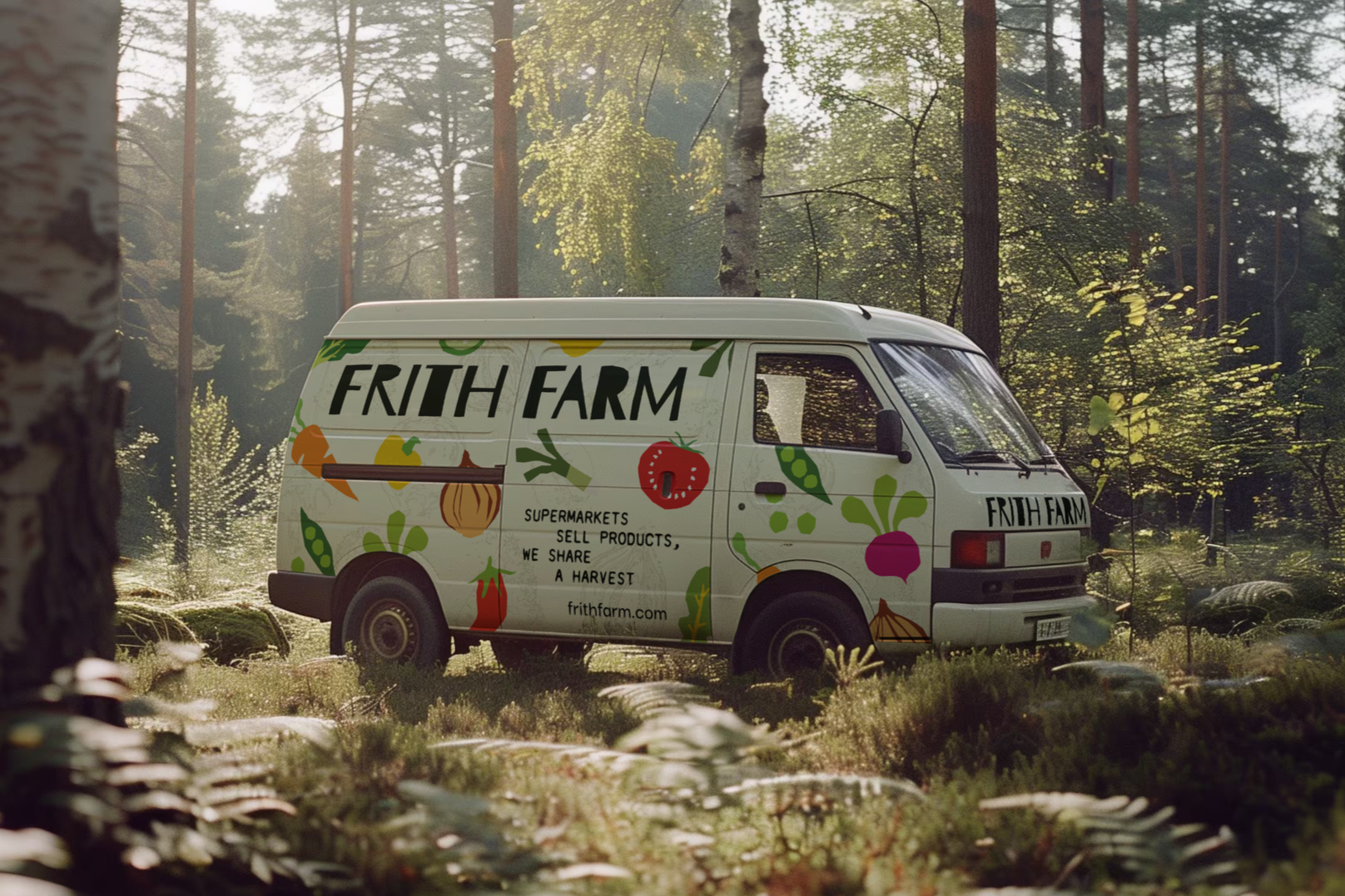
Good food businesses often have plenty to say. The challenge is making sure people can see it.
Frith Farm is a regenerative market garden in Beverley, East Yorkshire, running a Community Supported Agriculture (CSA) scheme where members subscribe to a share of the harvest. The business has a strong story around farming, community and doing things differently. The challenge was finding a visual identity that communicated those qualities rather than relying on the familiar visual language of the food and farming sector.
Originally developed as part of my graphic design degree, this project explored how research, storytelling and physical design could shape a distinctive brand identity for a regenerative market garden.
The problem with looking like everyone else
Look at branding across food, farming and sustainability businesses and certain ideas appear again and again: green colour palettes, clean sans serif type, illustrations of vegetables, natural textures and messaging around freshness, provenance and sustainability.
None of these things are inherently wrong. The problem is what happens when everyone relies on the same visual cues.
For an independent business, looking broadly like the rest of the category makes it harder to communicate what actually makes the business different. The answer isn't necessarily to be louder or more unconventional. It's to find something that genuinely belongs to the business and build from there.
The story came first
The first step wasn't opening a design application. It was research.
I looked at the history of Frith Farm, the meaning behind its name and the ideas that shaped the business. That research uncovered something particularly useful: the word Frith has Old English roots connected to sanctuary and protection.
That connection also has a local link. Beverley Minster, just a short distance from the farm, is home to a historic Frith stool associated with the idea of sanctuary.
Suddenly, there was a much stronger foundation for the identity than simply choosing colours and typefaces that looked appropriate for a market garden.
This is one of the reasons I believe research matters in brand design. The most useful ideas aren't always obvious at the beginning of a project. They can come from a business's name, history, location, beliefs or the way it operates.
The job is to find them before you start designing.
Making the identity physical
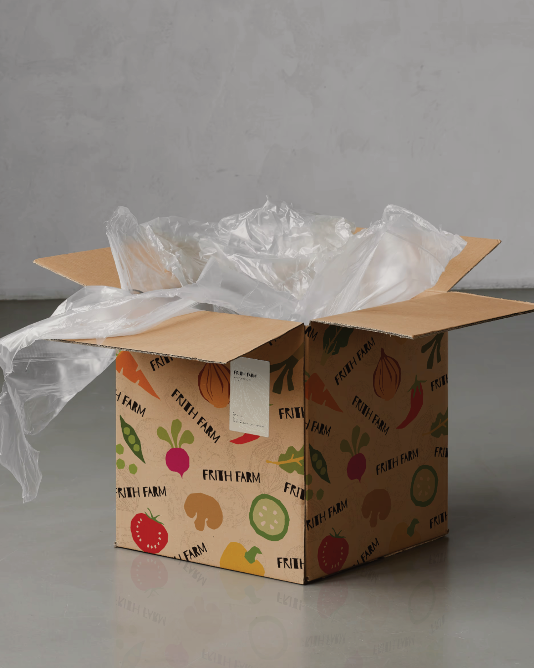
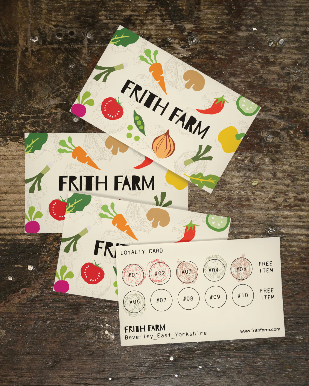
Rather than creating every graphic element digitally, I experimented with vegetables as physical stamps, cutting them in half, pressing them onto paper and then scanning the resulting marks.
Those marks became part of a wider library of organic textures and illustrations. The irregularity of the prints was intentional. They carried evidence of the physical process that created them, rather than looking like perfectly constructed digital graphics.
The resulting visual language also drew on the shapes and textures of topographic maps, connecting the identity back to the land itself.
The process gave the identity something that a collection of generic stock illustrations or pre-made graphics couldn't provide: a visual language developed specifically for the concept.
Giving the brand a point of view
Frith Farm also has a clear position on organic certification. Although the farm works according to organic principles, it chooses not to pay for organic certification, describing the annual cost as a tax on doing the right thing.
Rather than hiding that position, the identity gives it room to be expressed.
Lines such as:
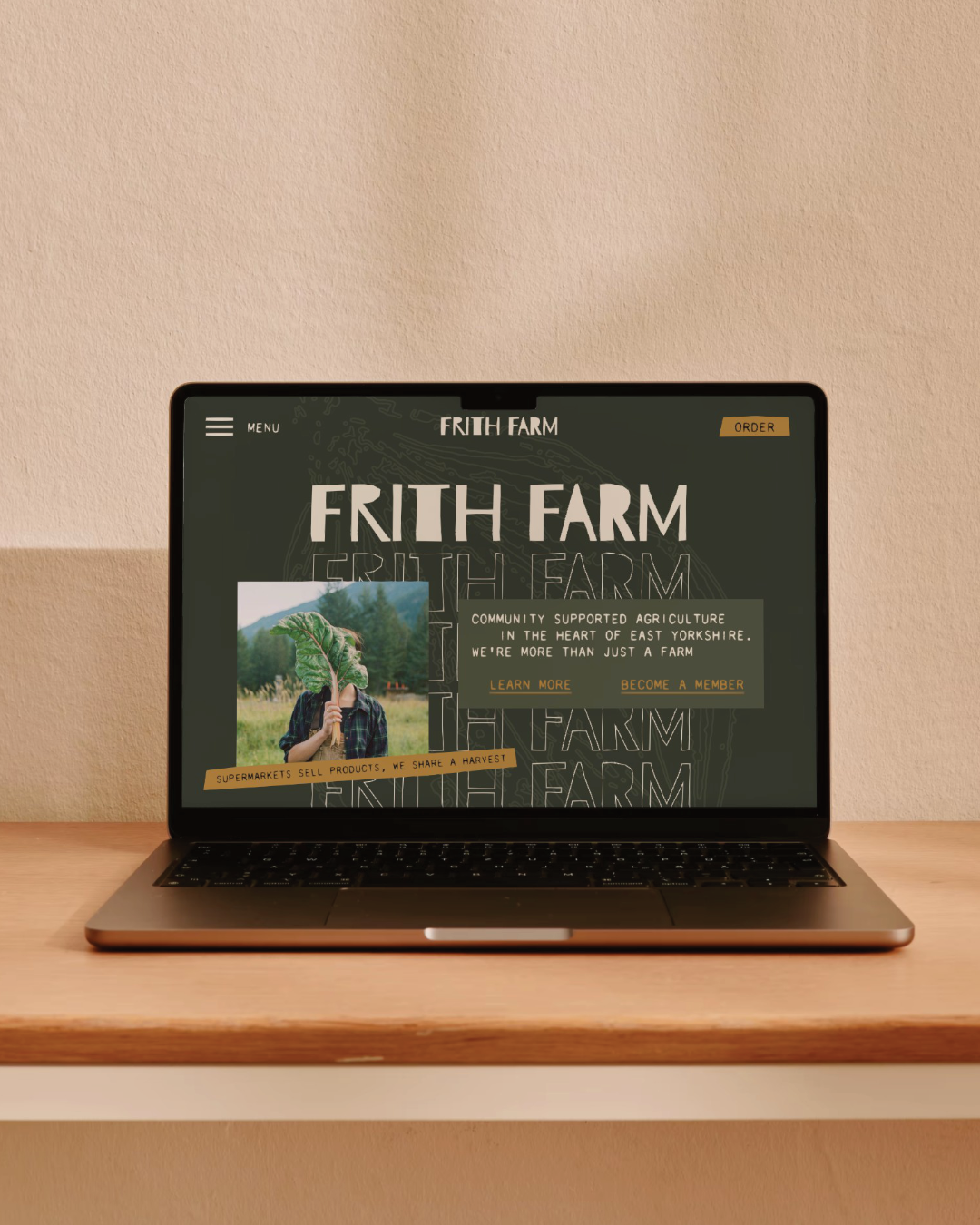
“Paperwork doesn't add flavour. Healthy soil does.” and “Supermarkets sell products. We share a harvest.”
give the brand a clear point of view.
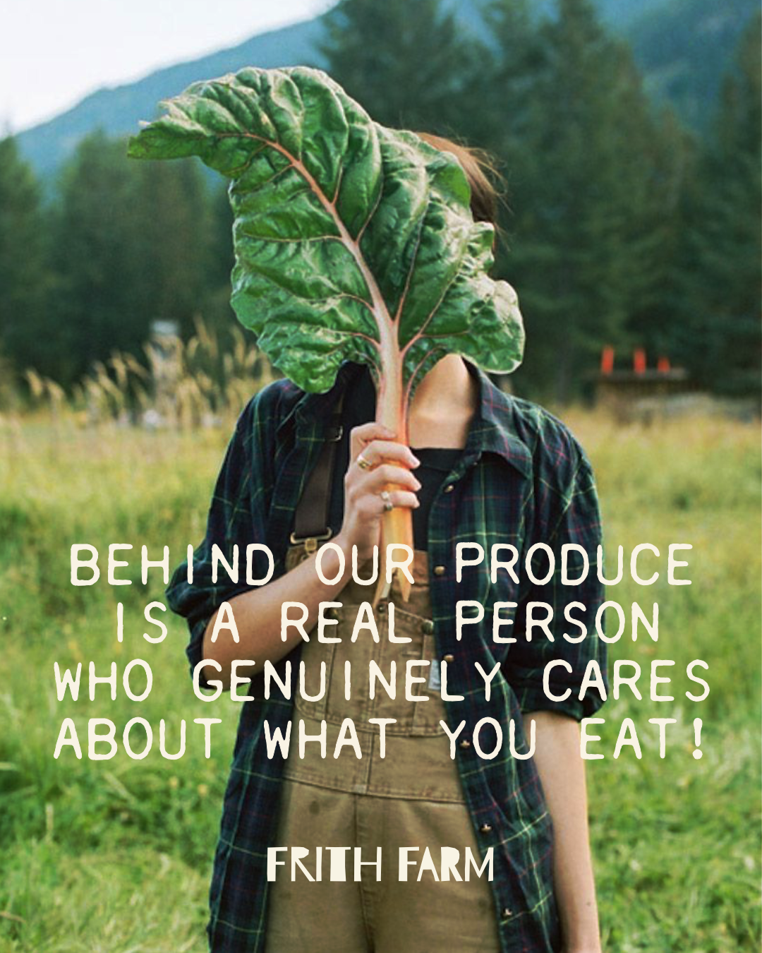
The important thing isn't trying to manufacture a rebellious personality. It's recognising where the business already has something worth saying and giving it a confident way to say it.
For an independent business, that can be far more useful than trying to imitate the tone of larger competitors.
What the identity needed to do
The final identity wasn't just about creating a logo.
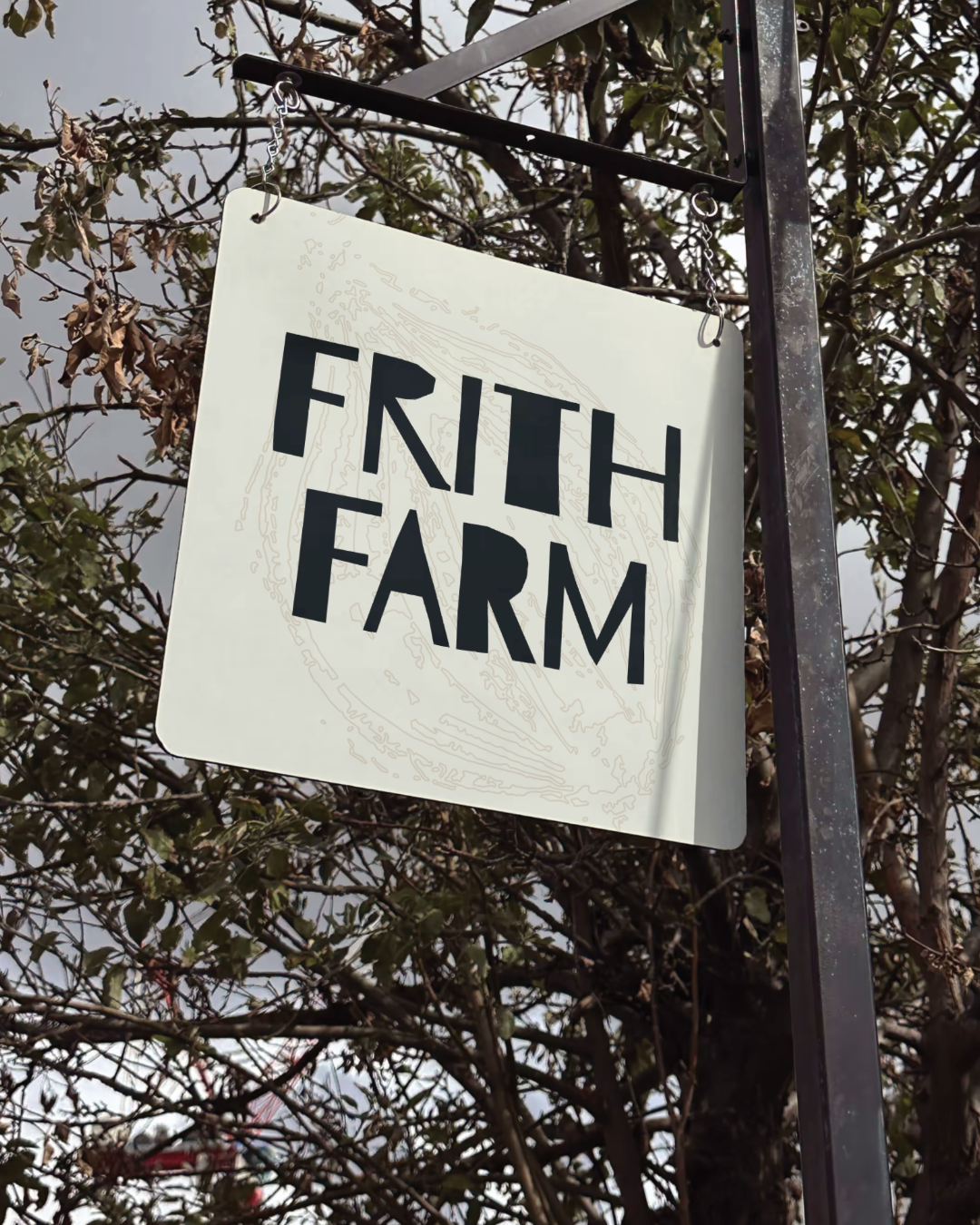
It brought together the logo, typography, colour, illustration, physical textures and tone of voice into a wider visual system. The idea was for those elements to work together across packaging, print, signage, social media and other communications.
That's an important distinction.
A logo can identify a business, but an identity gives you a way to consistently communicate it.
A good identity should also make future design decisions easier. Once the underlying system is clear, creating the next piece of communication doesn't have to mean starting from scratch.
The bigger lesson
The strongest ideas in this project came from looking beyond the obvious.
Instead of starting with what a market garden should look like, the process started with what made Frith Farm specific: its name, its local history, its relationship with the land, its approach to farming and its position within the food system.
That doesn't mean every brand needs a complicated story or an elaborate visual concept. It means the design should have a reason to look the way it does.
And that's what good brand design should do. Not simply make a business look different, but give the design a reason to be different.
Have a brand that needs more clarity?
If your business has grown but the brand hasn't kept up, take a look at my brand identity service or get in touch to start a conversation.