FRITH FARM
Logo, Brand Identity
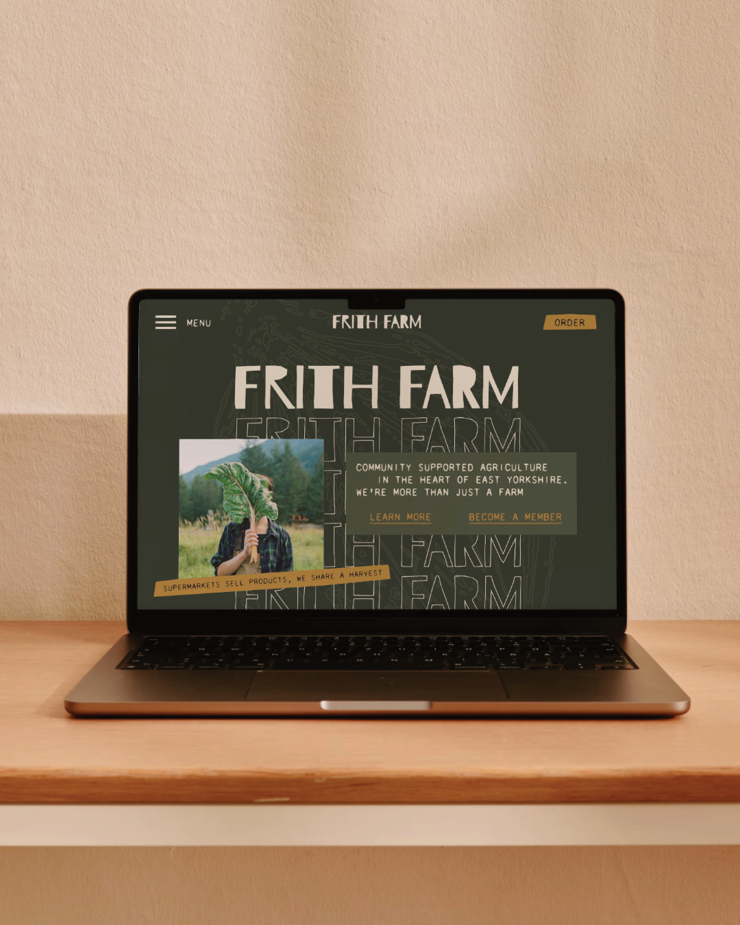
Frith Farm is a regenerative market garden in Beverley, East Yorkshire, running a Community Supported Agriculture scheme where members share directly in the harvest. The work is genuinely exceptional, but the brand wasn't telling that story, split across two separate sites and looking like any other small farm.
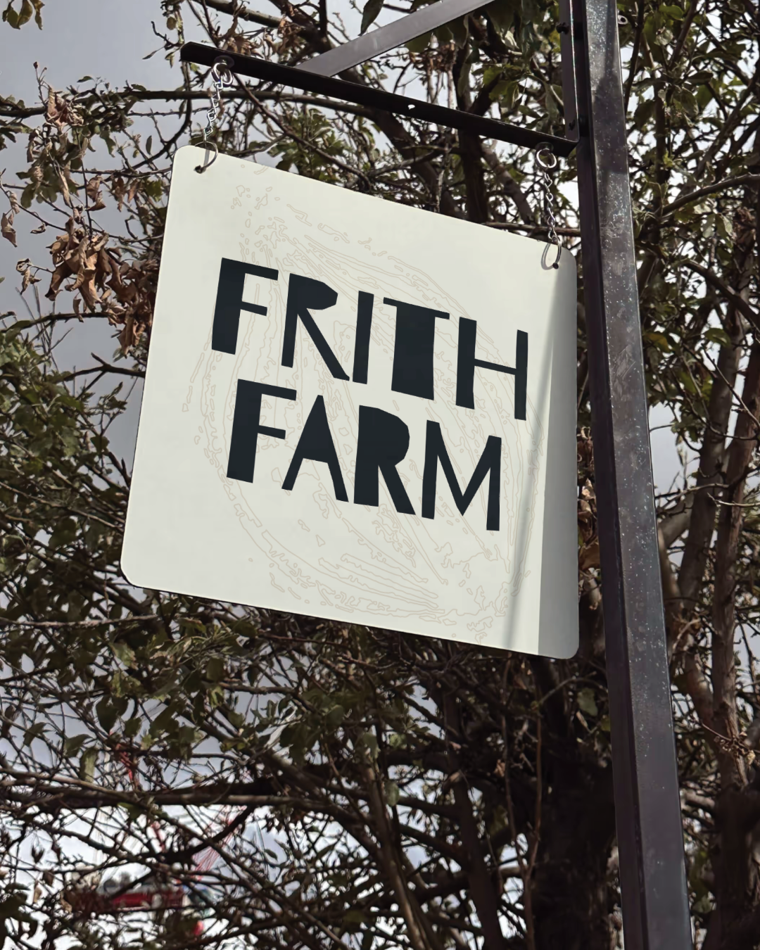
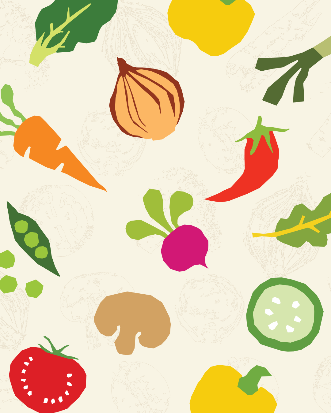
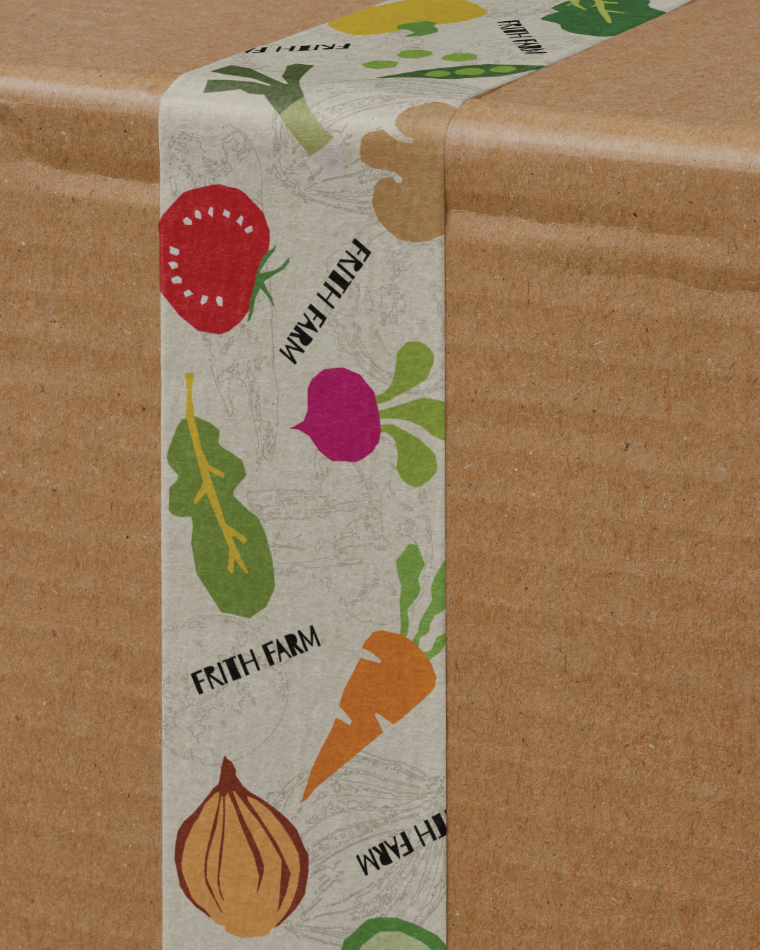
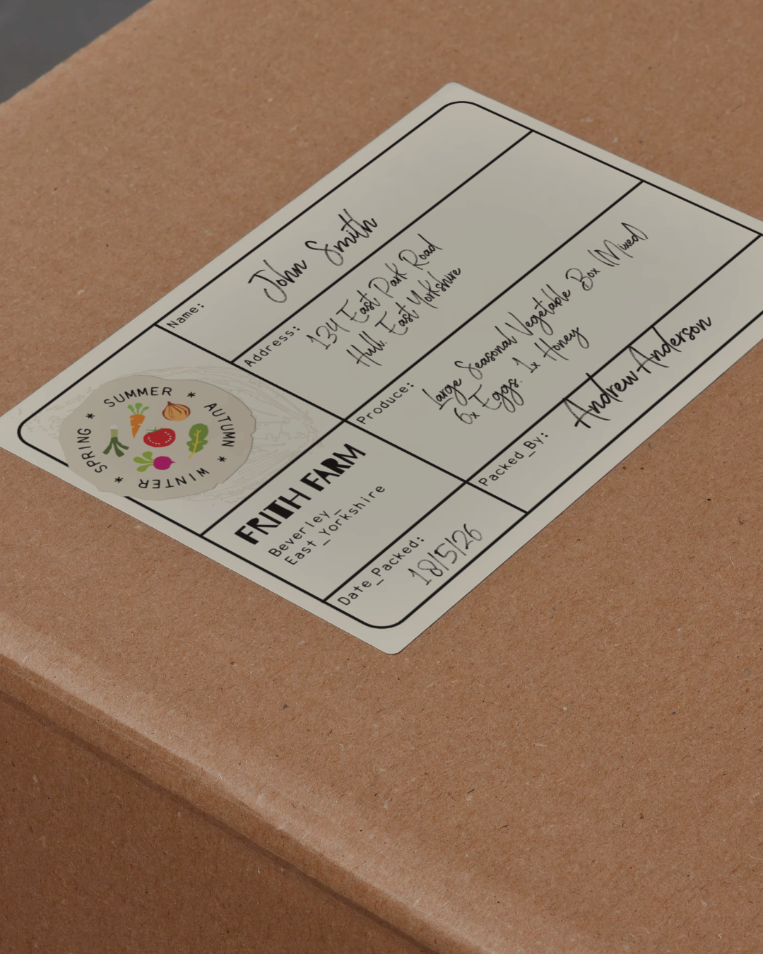
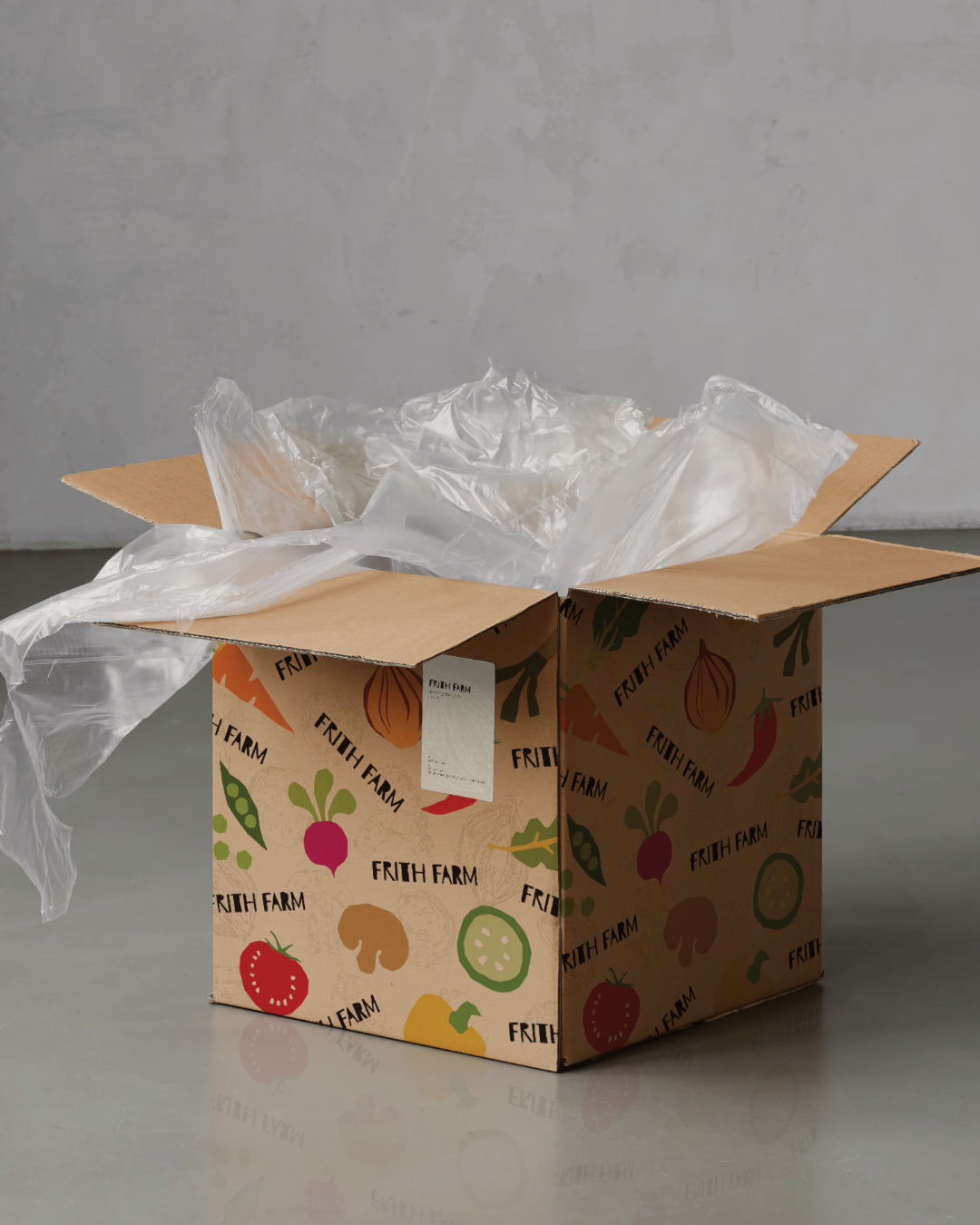
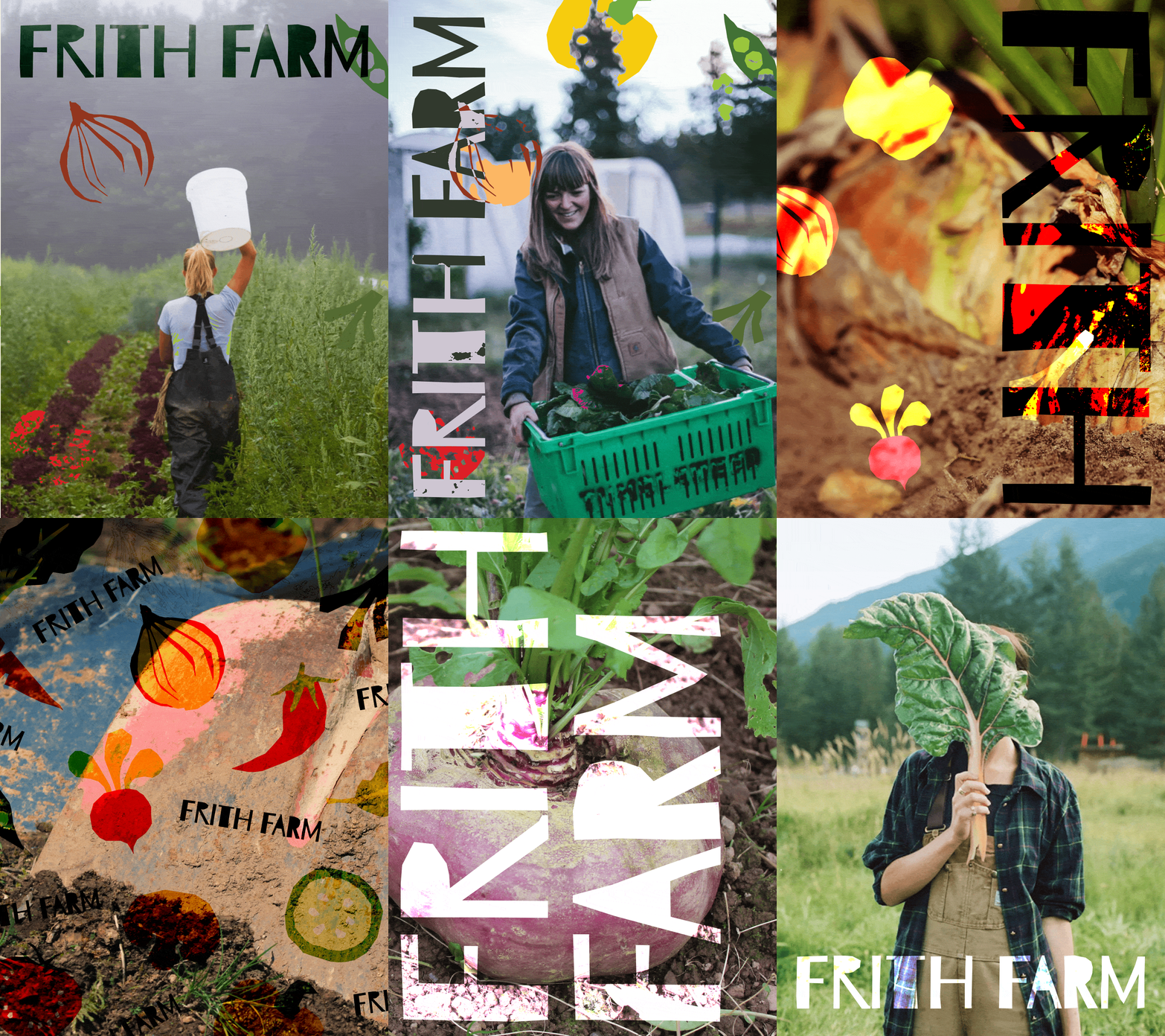
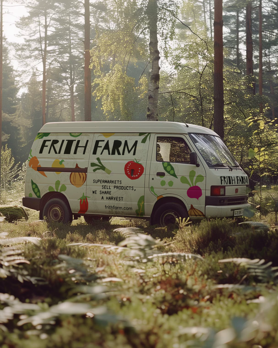
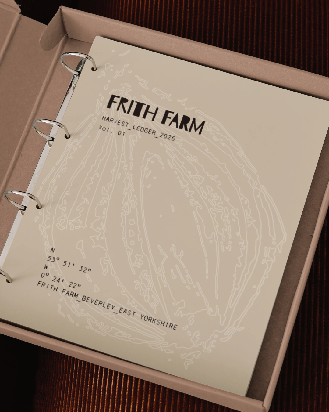
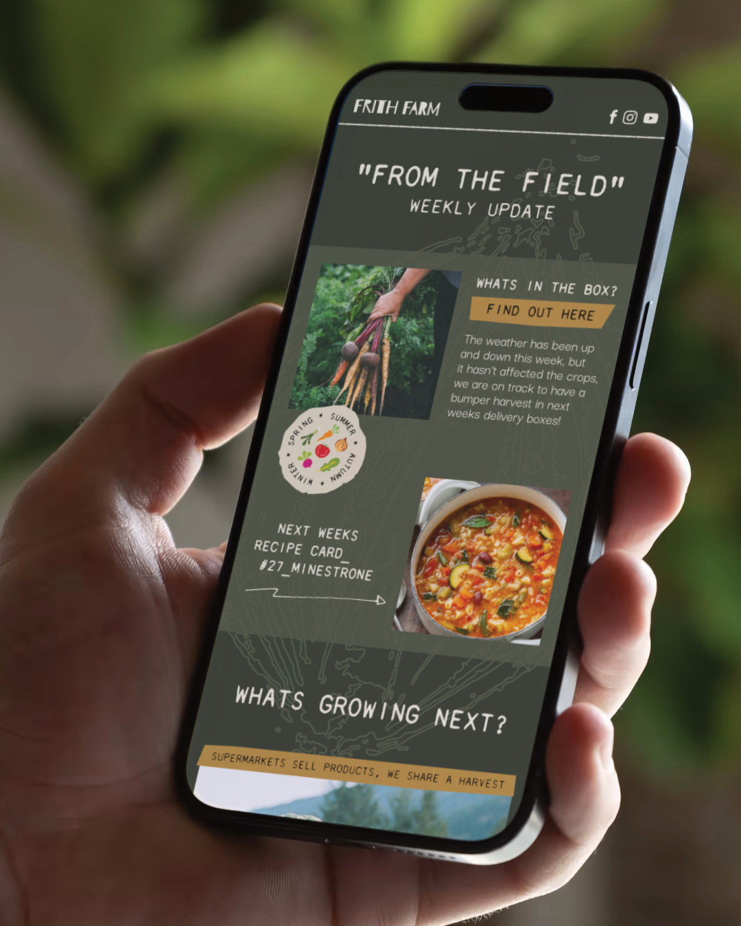
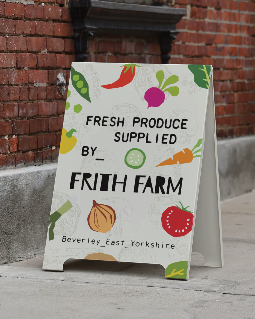
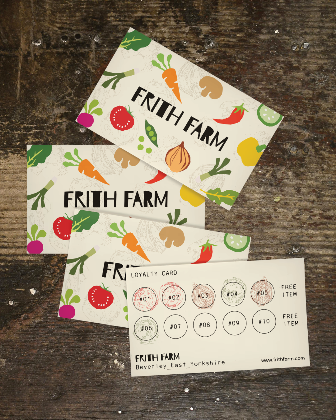
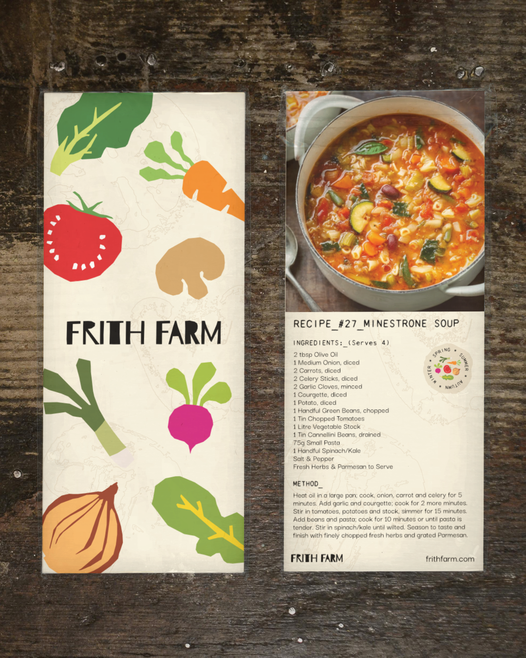
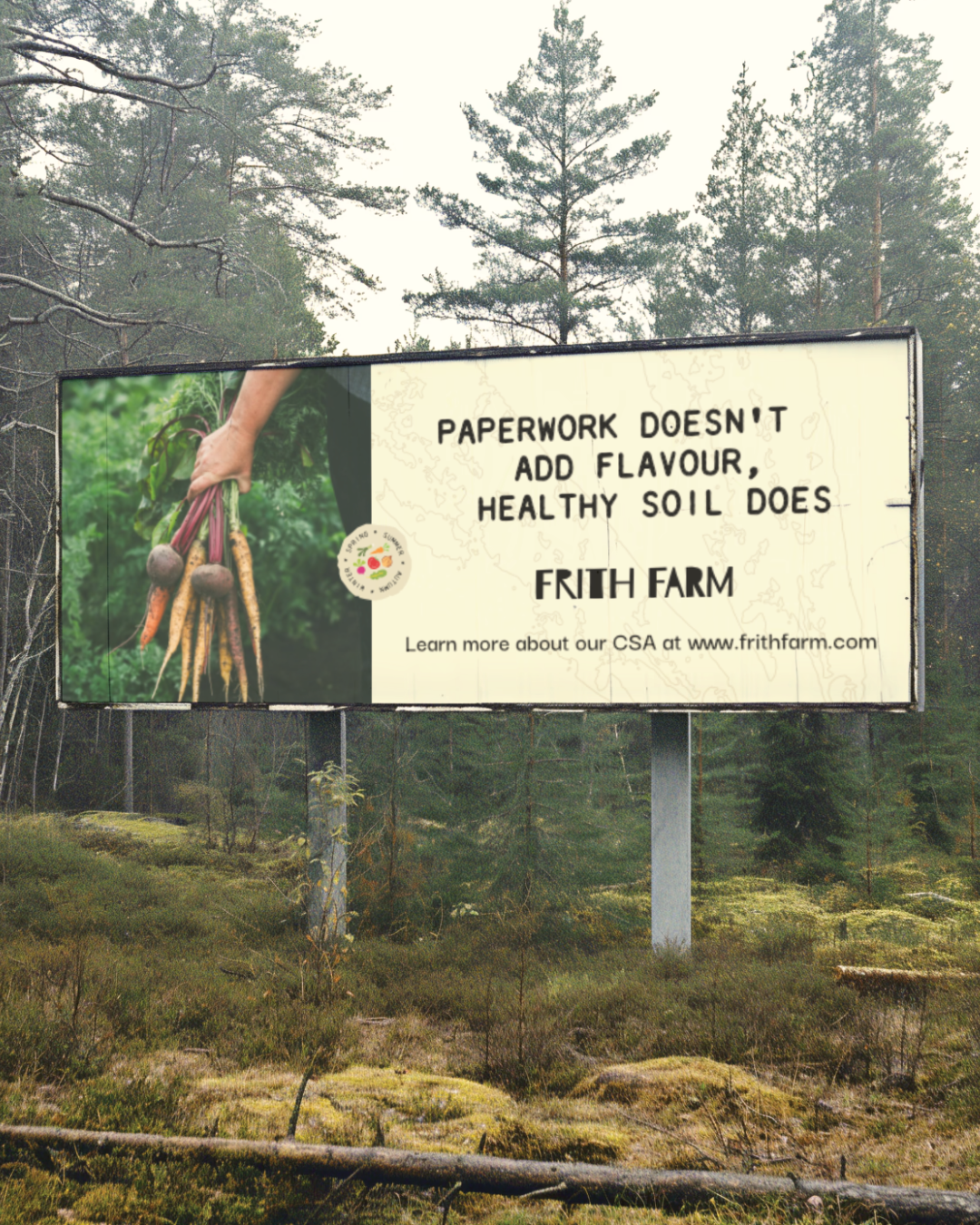
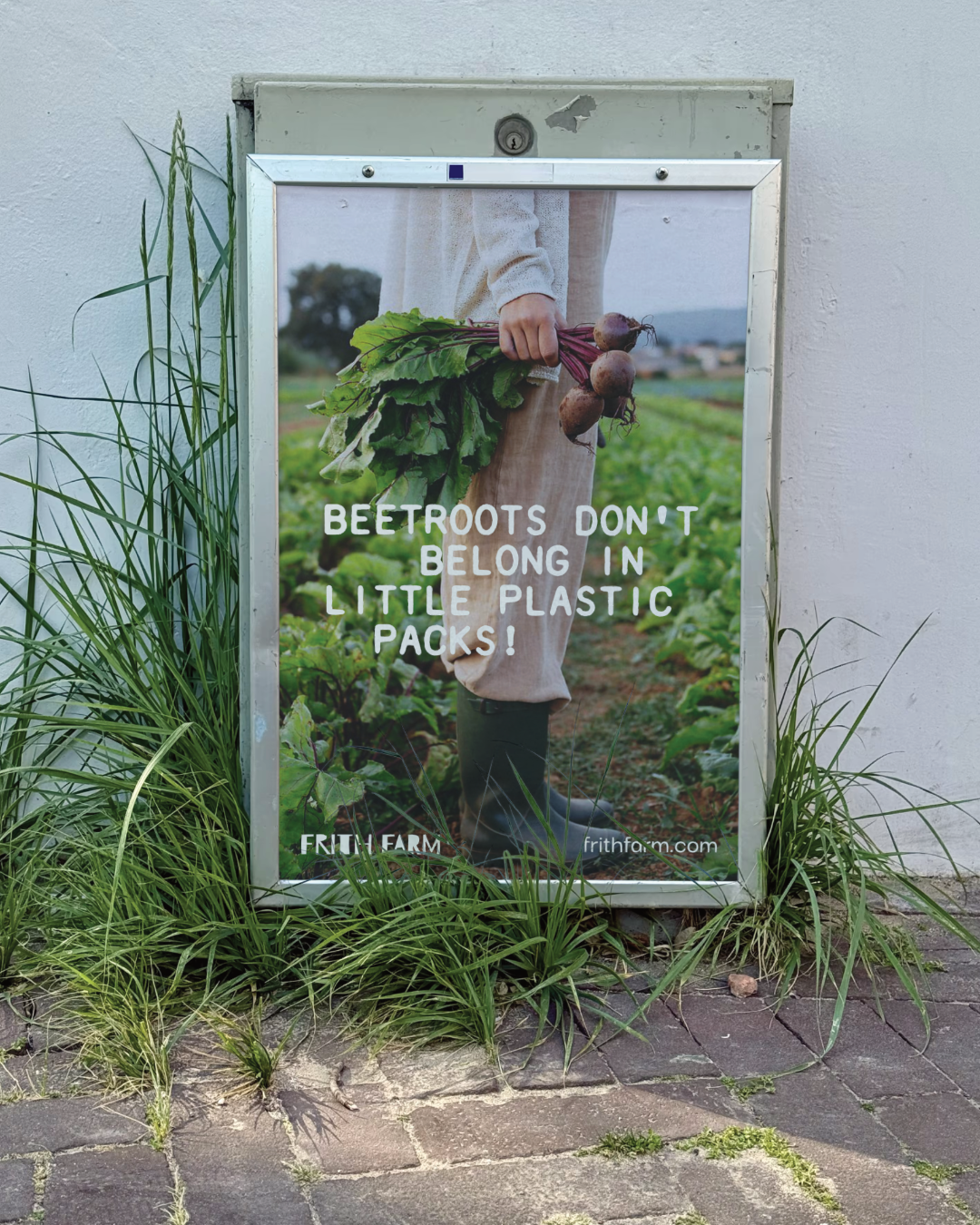
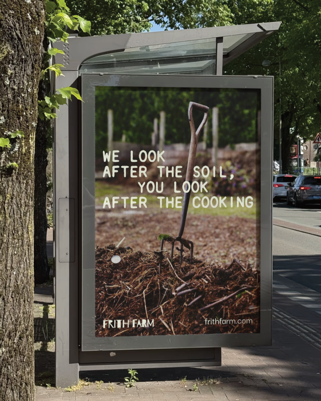
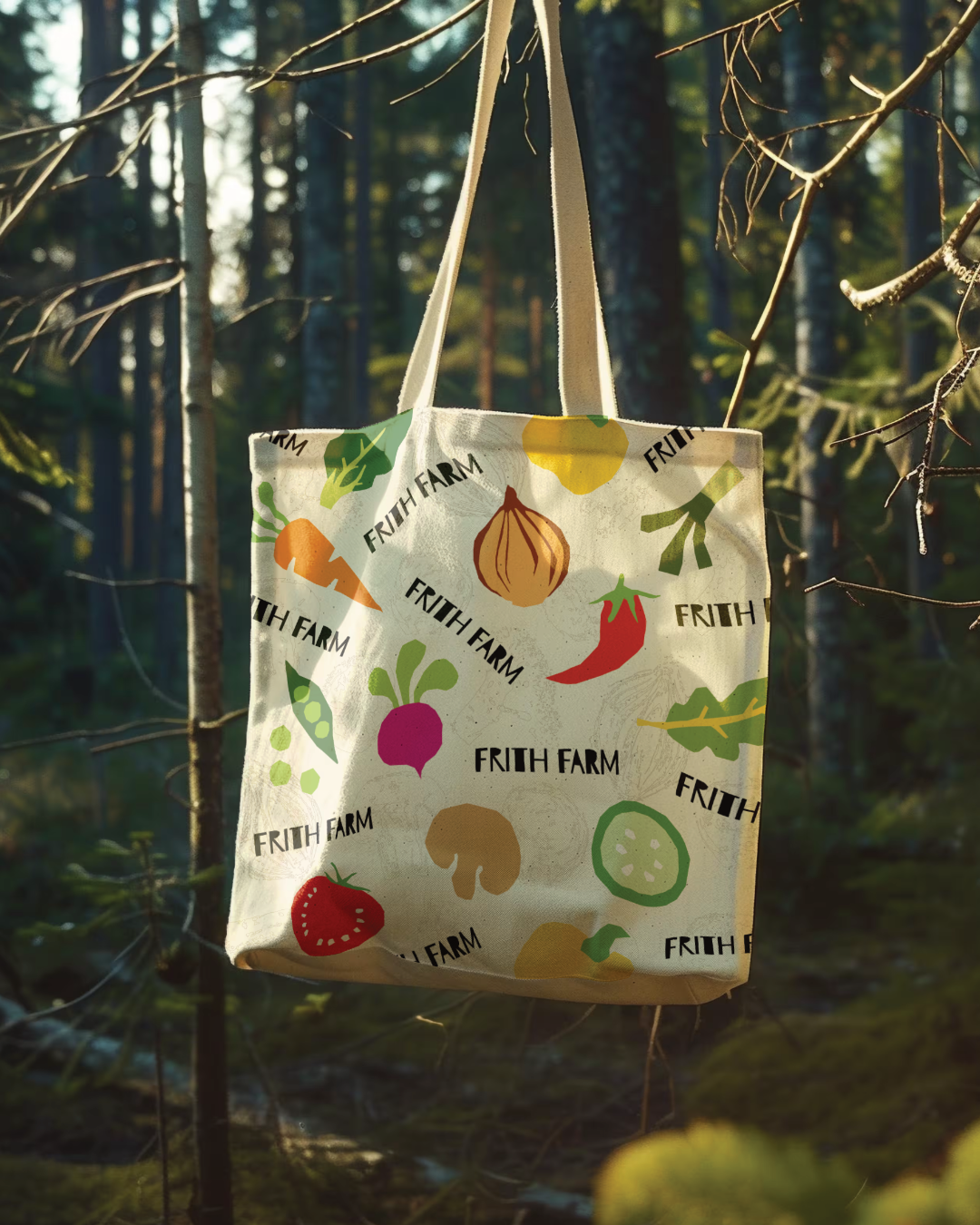
The name gave the strategy its anchor. Frith is Old English for sanctuary and protection, and that idea shaped everything that followed: a custom logotype built on deliberate imperfection, hand-stamped vegetable illustrations developed away from the screen as physical prints, an earthy palette, and a challenger tone of voice, all reflecting the farm's no-dig methods and the community behind them.