Otto
Logo, Visual Identity
Otto is a concept pizza brand built on a love of the craft and years of admiring New York’s independent scene. Everything starts from one simple idea: a pizza place with real personality.
CHALLENGE.
Personality is something the UK’s pizza brands rarely get right. Too many lean on the same clichés, and too few feel like somewhere you’d want to go back to. Otto needed real character without relying on any of the familiar tropes.
APPROACH.
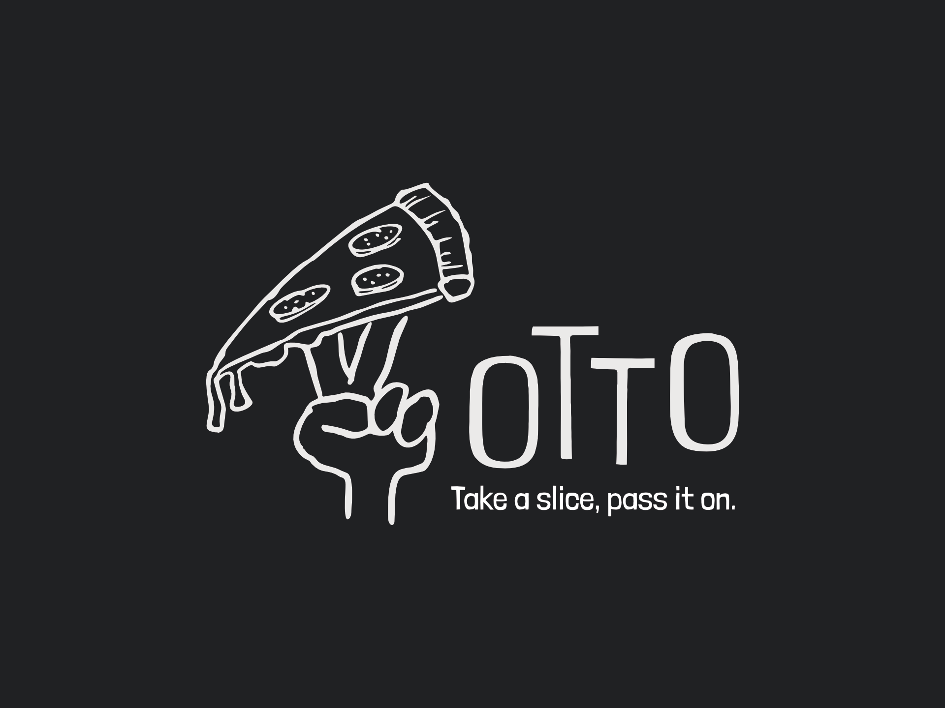
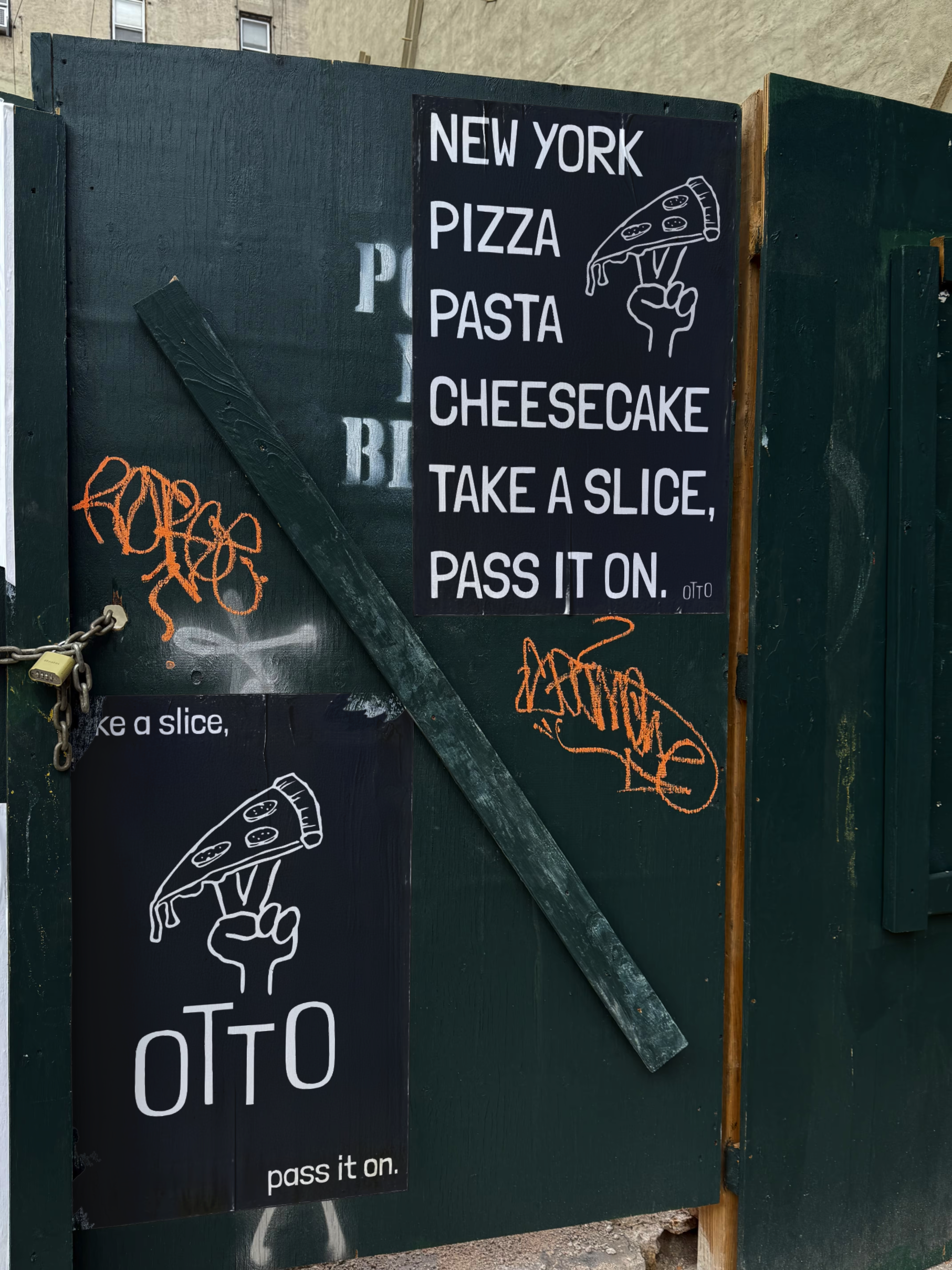
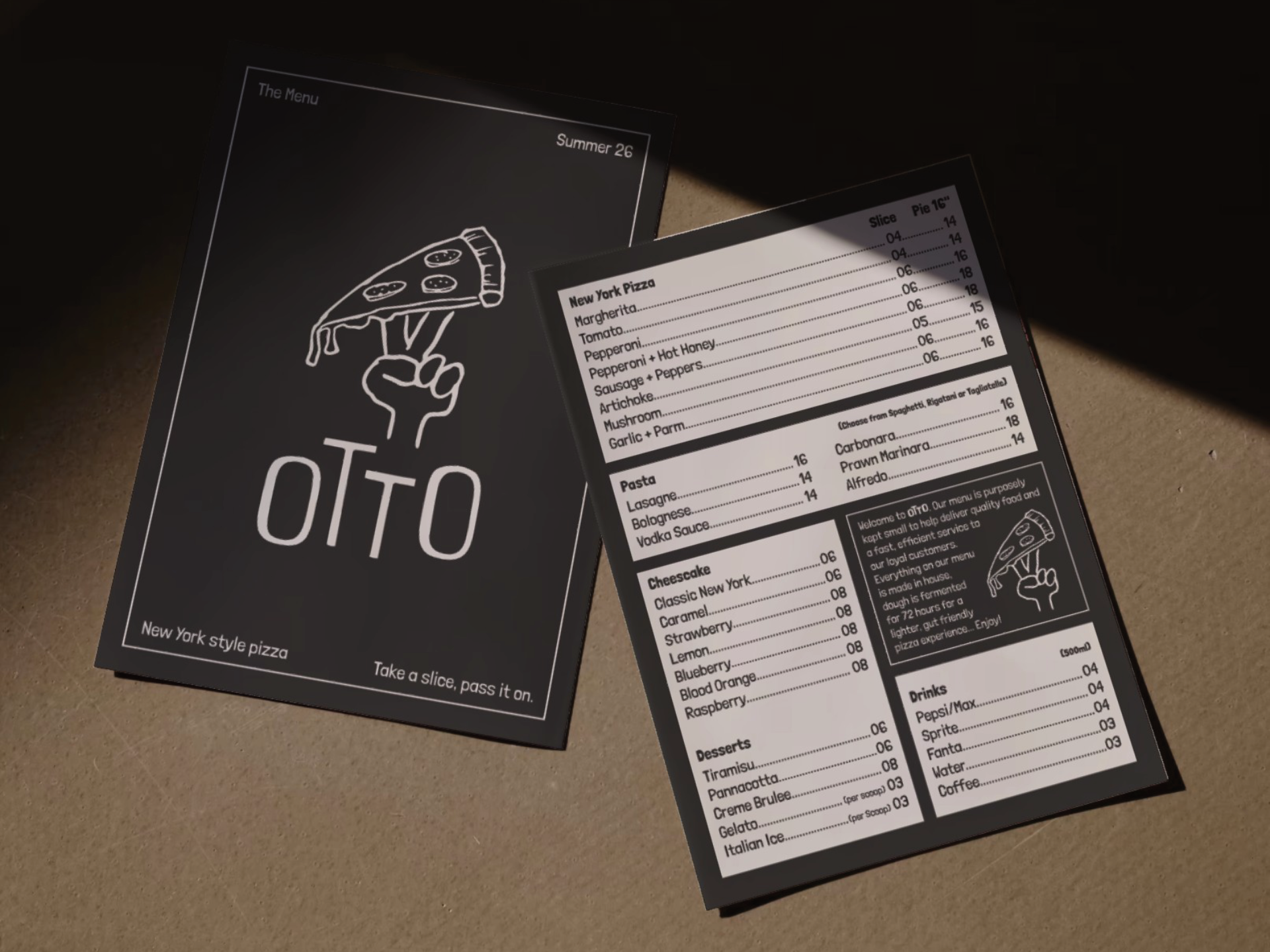
The identity centres on a raised fist gripping a dripping slice, two fingers thrown up in a peace sign, a nod to the generosity that makes independents worth returning to. The tagline “Take a slice, pass it on” anchors the identity into something that’s been made for sharing.
OUTCOME.
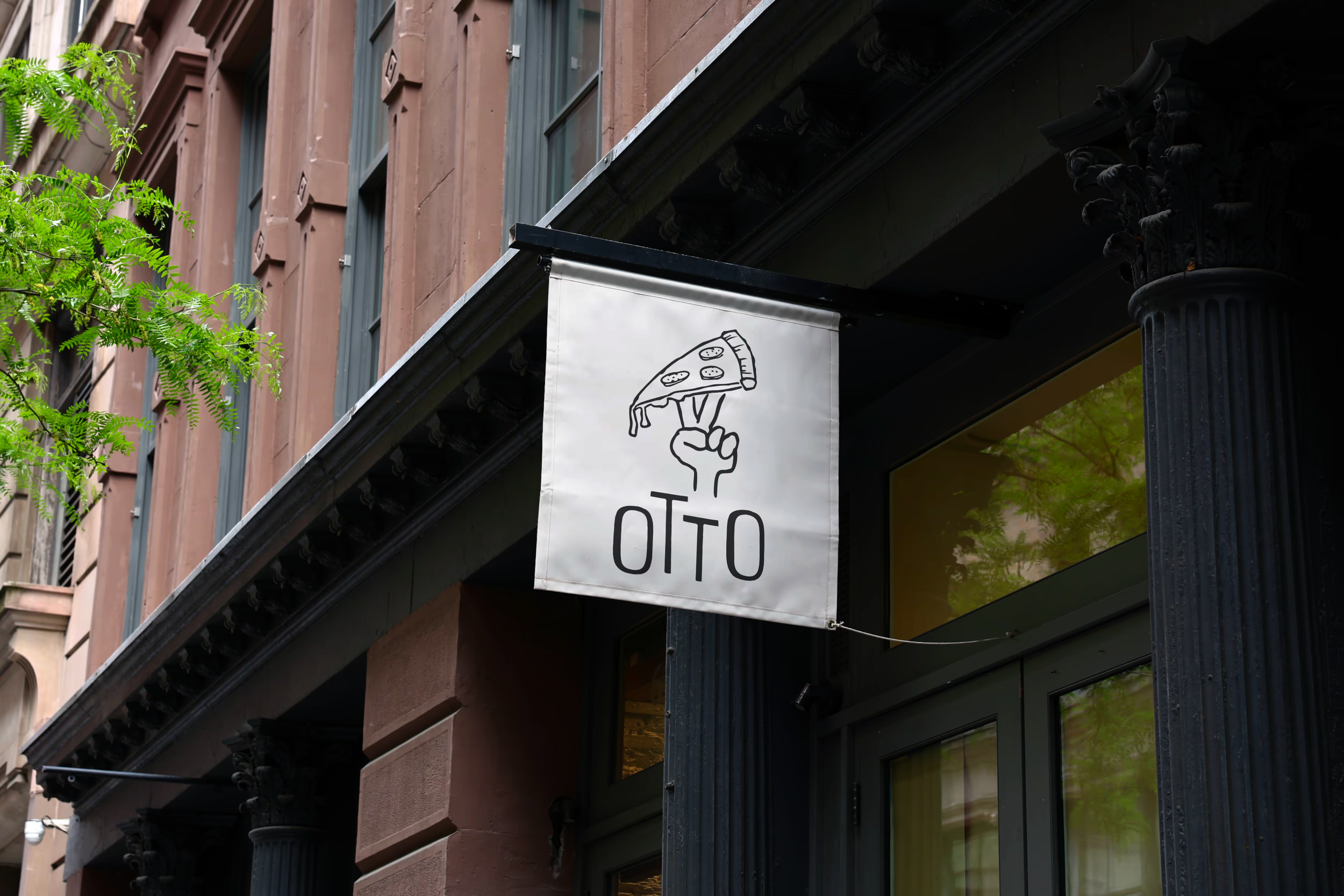
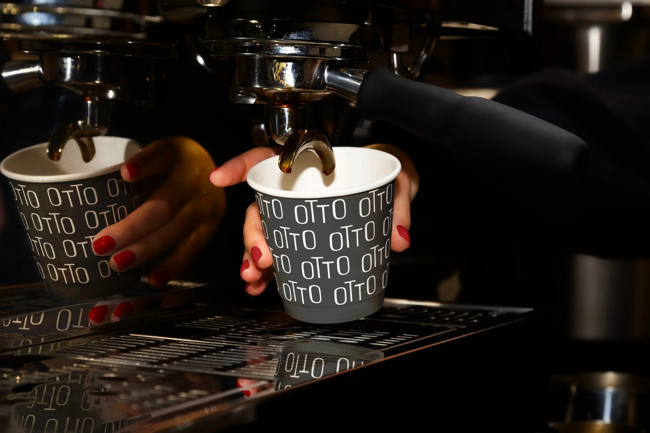
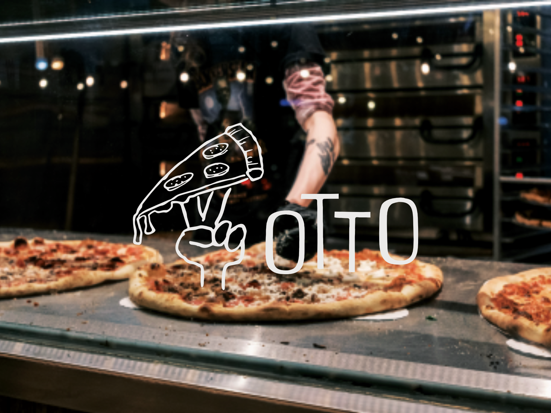
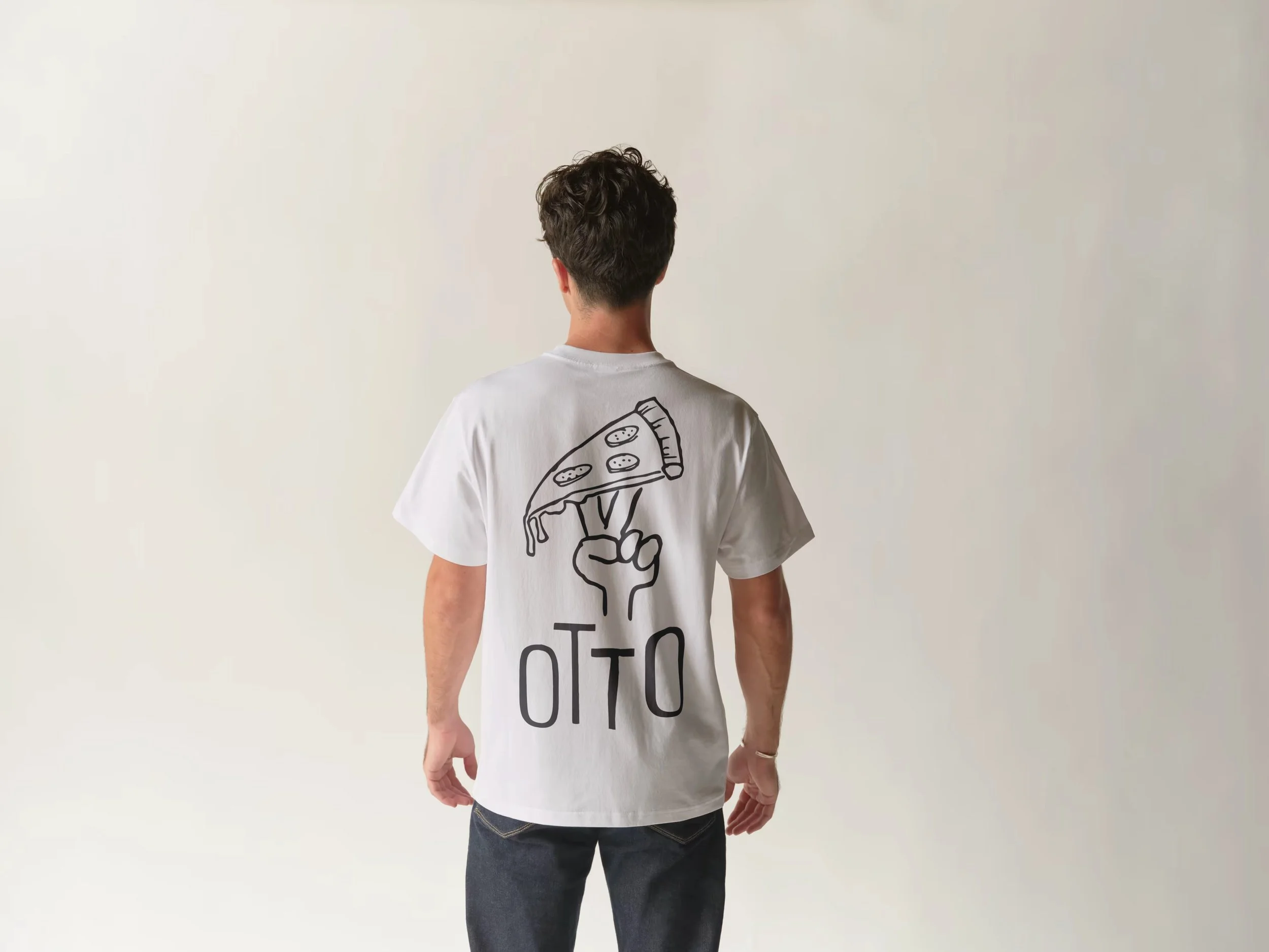
Together, the wordmark and illustration give the brand range, from chalkboard to pizza box to shopfront sign. The system was built to stretch across every touchpoint, from the menu to the packaging to a staff tee, and hold together as one place throughout.