AMP UP
Logo Design
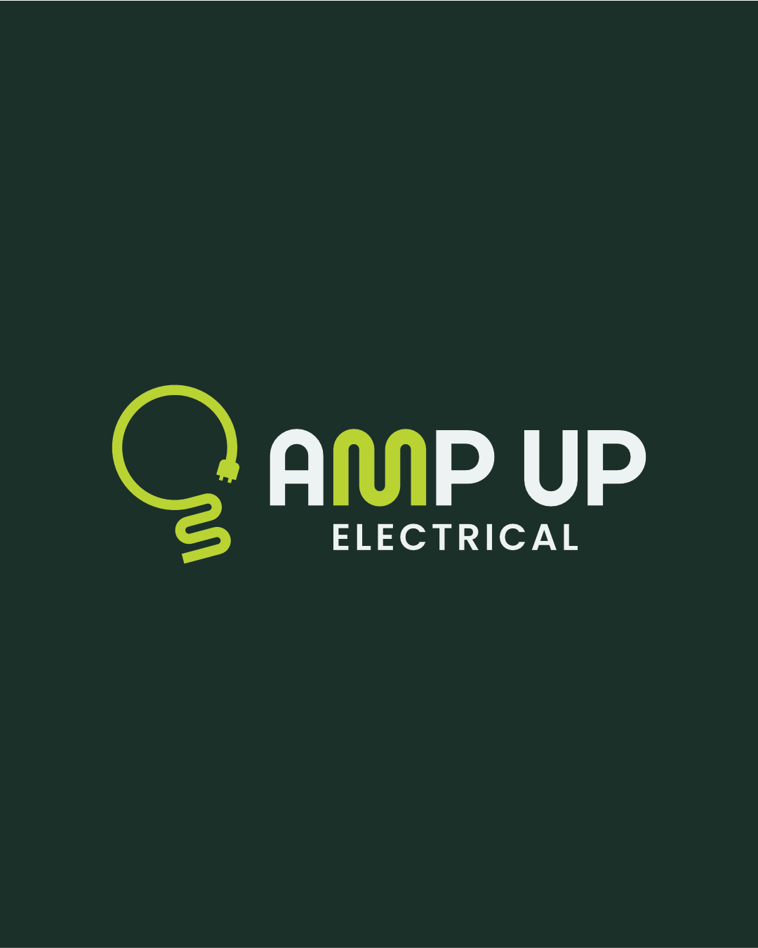
Amp Up Electrical is a newly launched electrical contracting business with a real focus on EV charging and sustainable energy work. Kalvan came to me right at the start, before anything existed, wanting something as energetic and forward-thinking as the work itself.
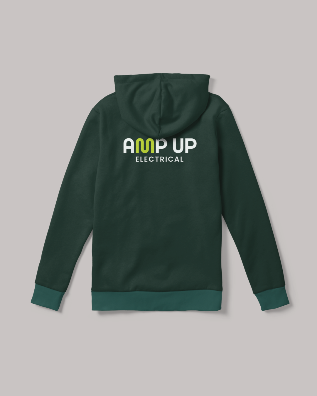
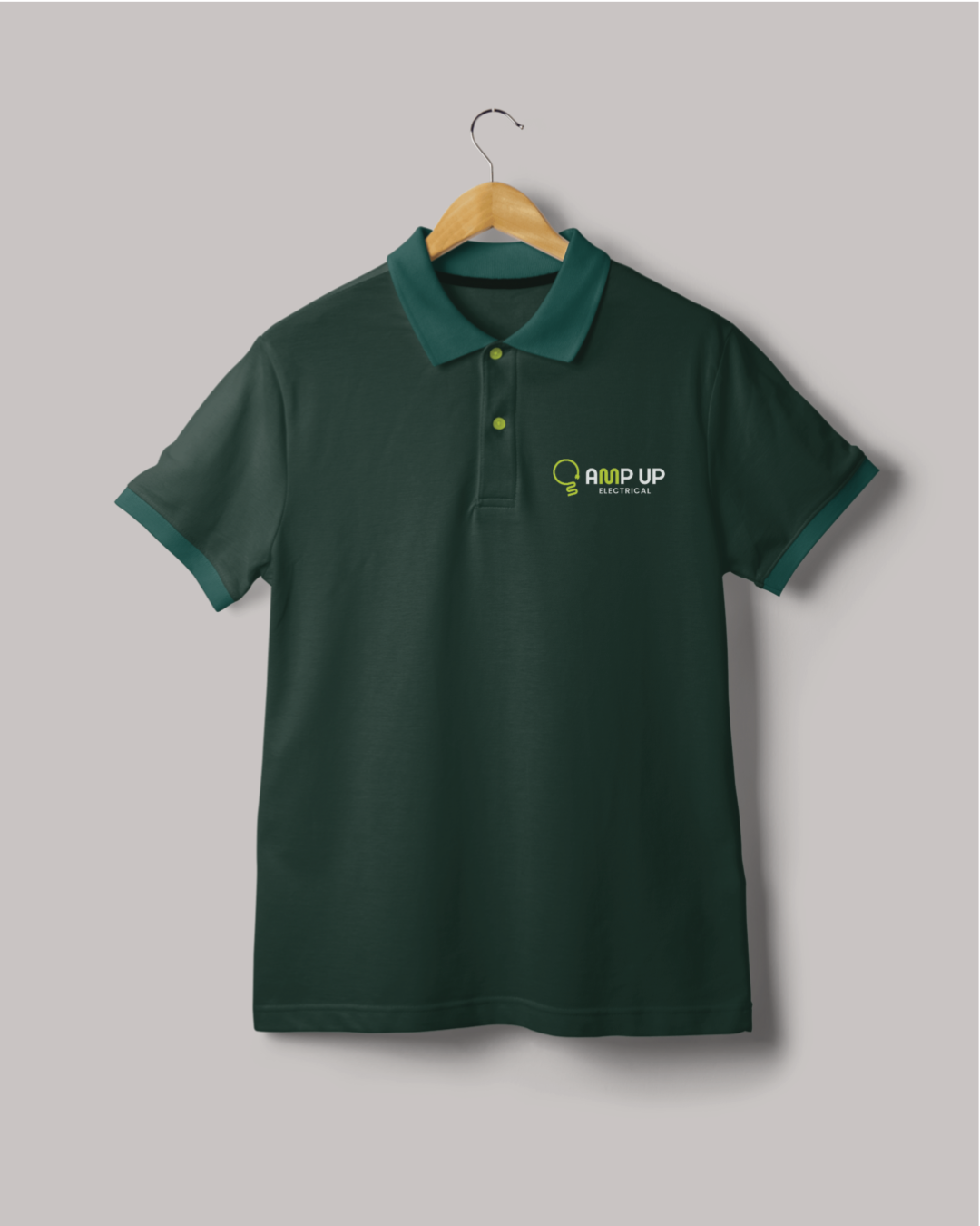
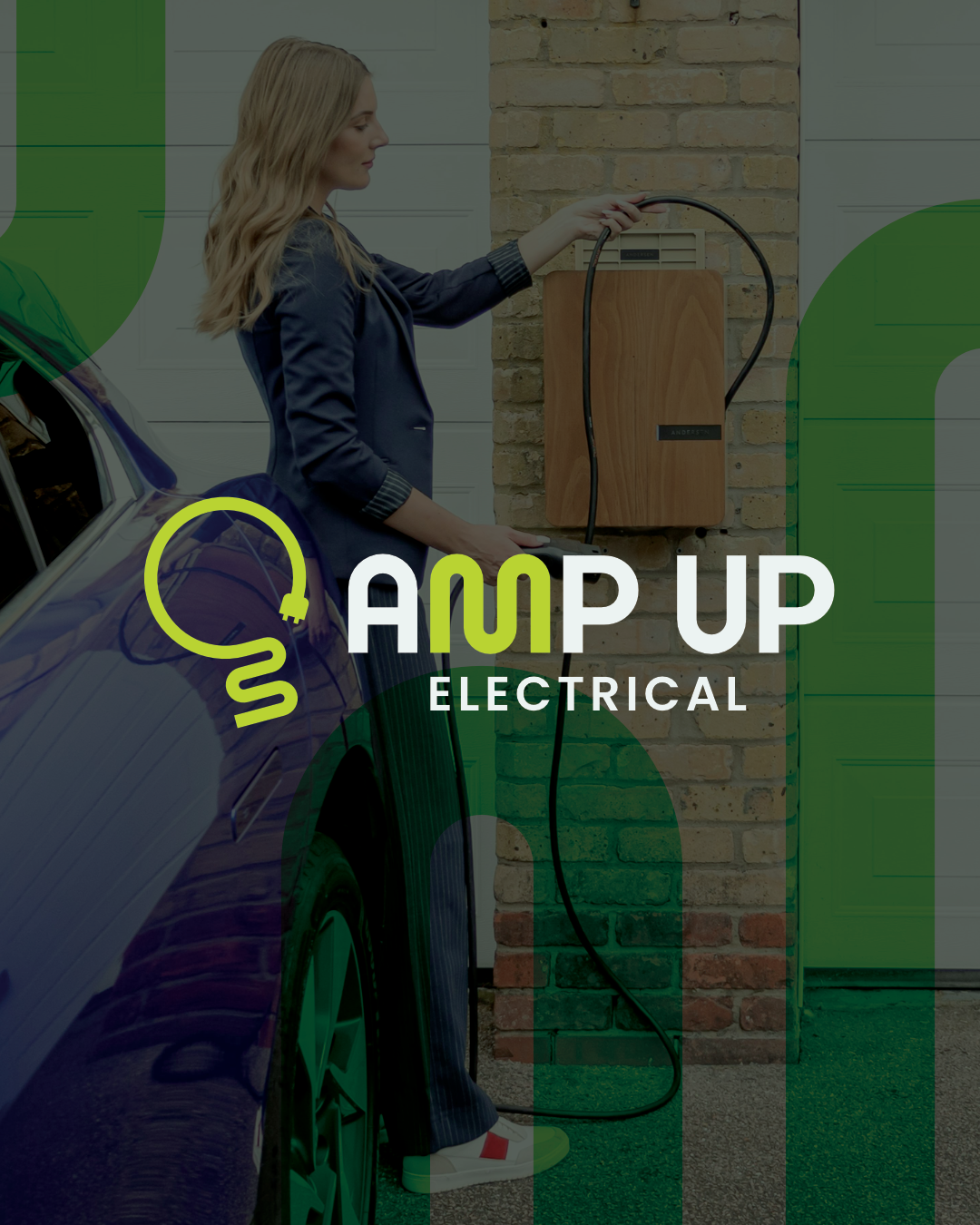
The sine wave became the foundation. The letters AM sit naturally within a sinusoidal wave form, so I built that directly into the M of a custom wordmark, a detail that rewards a second look without needing to be explained. The mark itself coils an EV charging cable into the shape of a lightbulb, keeping the sustainable energy side present without making it the whole story. A bold lime green alongside two deep forest tones carries that undertone through every application.
TESTIMONIAL
“Very professional, easy to work with and delivered a high quality logo for us. We would highly recommend and be sure to use Michael again for future needs. Thanks again.”
Kalvan Russell, Amp Up Electrical