Why the "Boring" Details Matter: Making Your Brand Consistent Everywhere
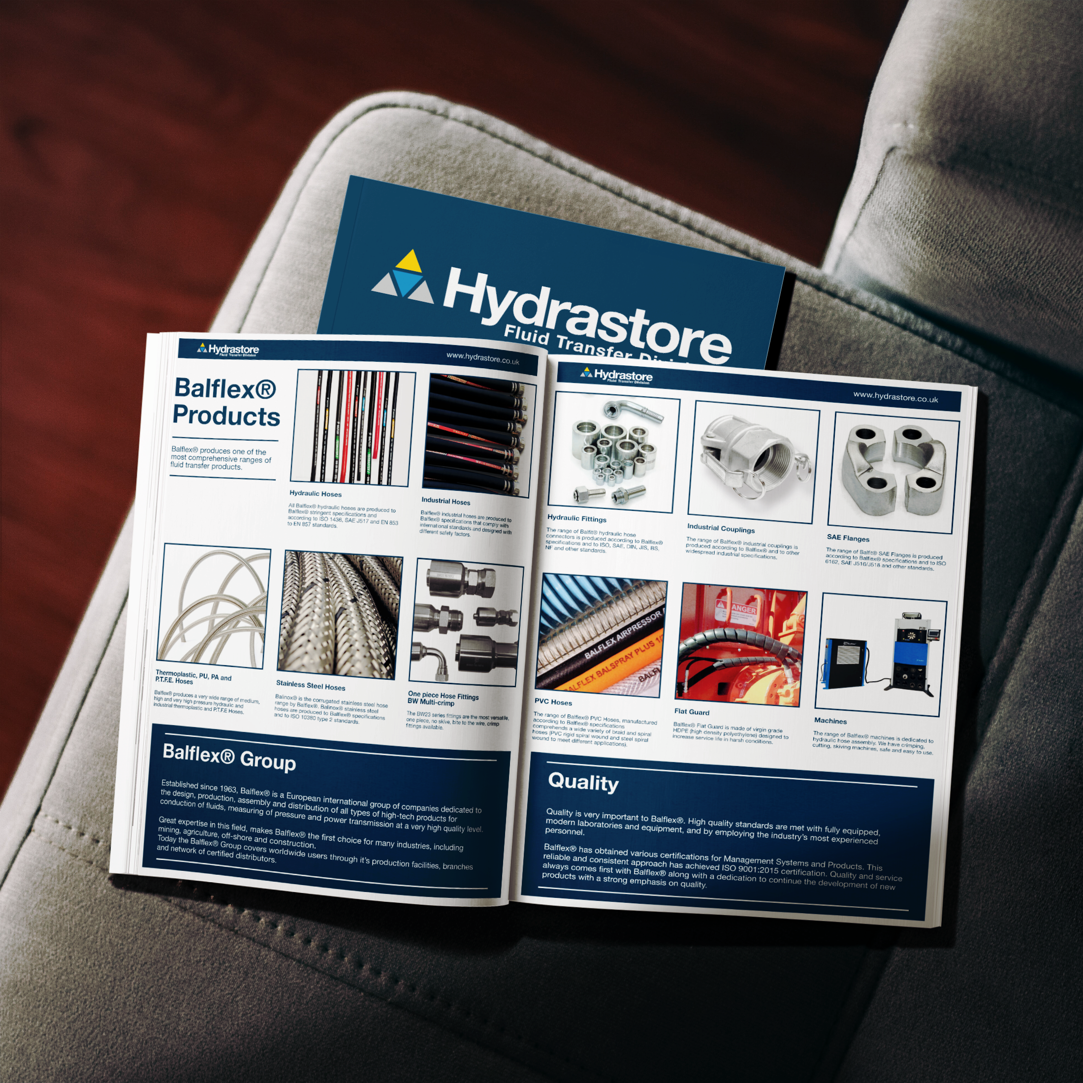
It's easy to think of your brand as your website, your logo and your social media.
Those are usually the first things people think about because they're the most visible. But your brand doesn't stop when someone closes their browser. It shows up in the proposal you send after a meeting, the invoice you email, the business card you hand over, the packaging your customer receives and the presentation you put in front of a potential client.
These things might feel less important than your website but they're not.
A business can have a polished digital presence and still undermine it with everything that happens afterwards.
Your brand is judged at every touchpoint
Imagine a potential client finds your website. It's clear, well designed and professional. The typography is considered, the photography feels right and everything looks like it belongs together.
They get in touch.
You send them a proposal built in an old Word template with three different fonts, a stretched logo and a completely different colour palette.
Nothing about the proposal is disastrous. But it doesn't feel like the same business and that’s the problem.
People don't necessarily stop and think, "This brand has inconsistent typography." They simply get a different impression of the business. The confidence created by the website starts to disappear.
The same thing can happen with a presentation, brochure, social graphic, email signature or anything else that carries your brand.
Consistency isn't about making every touchpoint identical. It's about making sure they all feel like they belong to the same business.
The less exciting stuff is often where the brand gets tested
The glamorous part of branding is usually the identity presentation. The logo is on the screen, the colours are looking great and everything has been carefully art directed.
Then the project gets handed over and real life starts.
Someone needs to create a quote. Someone else needs a presentation. A member of the team needs a social graphic. A customer receives a printed document. A supplier needs artwork for a sign.
This is where a brand either proves itself or starts to fall apart.
A good visual identity needs to work beyond the presentation. It needs to be practical enough for a business to use consistently, whether something is being produced by a designer or by someone on the team who has never opened Illustrator.
That's why the less exciting details matter.
Physical branding still has a job to do
It's tempting to think that print has become less important because so much business happens online.
In some ways, that's exactly why physical touchpoints can be more noticeable.
A well-designed business card, brochure, menu, piece of packaging or presentation gives someone something tangible to interact with. The choice of paper, the quality of the printing, the typography and the way information is organised all contribute to the impression the business makes.
It doesn't need to be expensive or elaborate either. In fact, good print design often works because it isn't trying too hard. The identity is clear, the information is easy to understand and the physical materials feel like a natural extension of the brand.
The same principle applies to digital documents. A well-designed proposal or presentation can carry the same sense of care without needing to be complicated.
Consistency doesn't mean perfection
There is also a difference between consistency and making everything look identical.
Your website doesn't need to look exactly like your business card. Your social media doesn't need to reproduce your brochure. Different formats have different jobs.
What needs to remain consistent is the underlying system: the typography, colour, logo usage, imagery, graphic elements and overall character of the brand.
That's what makes a visual identity useful.
Instead of reinventing the brand every time you create something new, you have a set of decisions that make the next piece of work easier.
This is one of the reasons I put so much emphasis on building identities that work across both digital and physical applications. The identity isn't finished when the logo is approved. That's when you start finding out whether it actually works.
Look at the whole customer experience
If you're reviewing your brand, don't just look at your homepage.
Look at the things a customer encounters before, during and after working with you.
Open your latest proposal. Look at your invoices. Check your email signature. Look at your social profiles. Print something out. Look at your packaging or stationery. Ask yourself whether all of these things feel like they came from the same business.
If they don't, you may not need a complete rebrand.
You might simply need to bring the existing identity together and apply it properly.
The details might be boring. They're also the details people experience when you're not there to explain what you meant.
A considered brand should hold up without you having to explain it. That's the point of consistency.
Get in touch if you’re not sure where to begin.