GOLDEN BY NATURE
Logo, Brand Identity
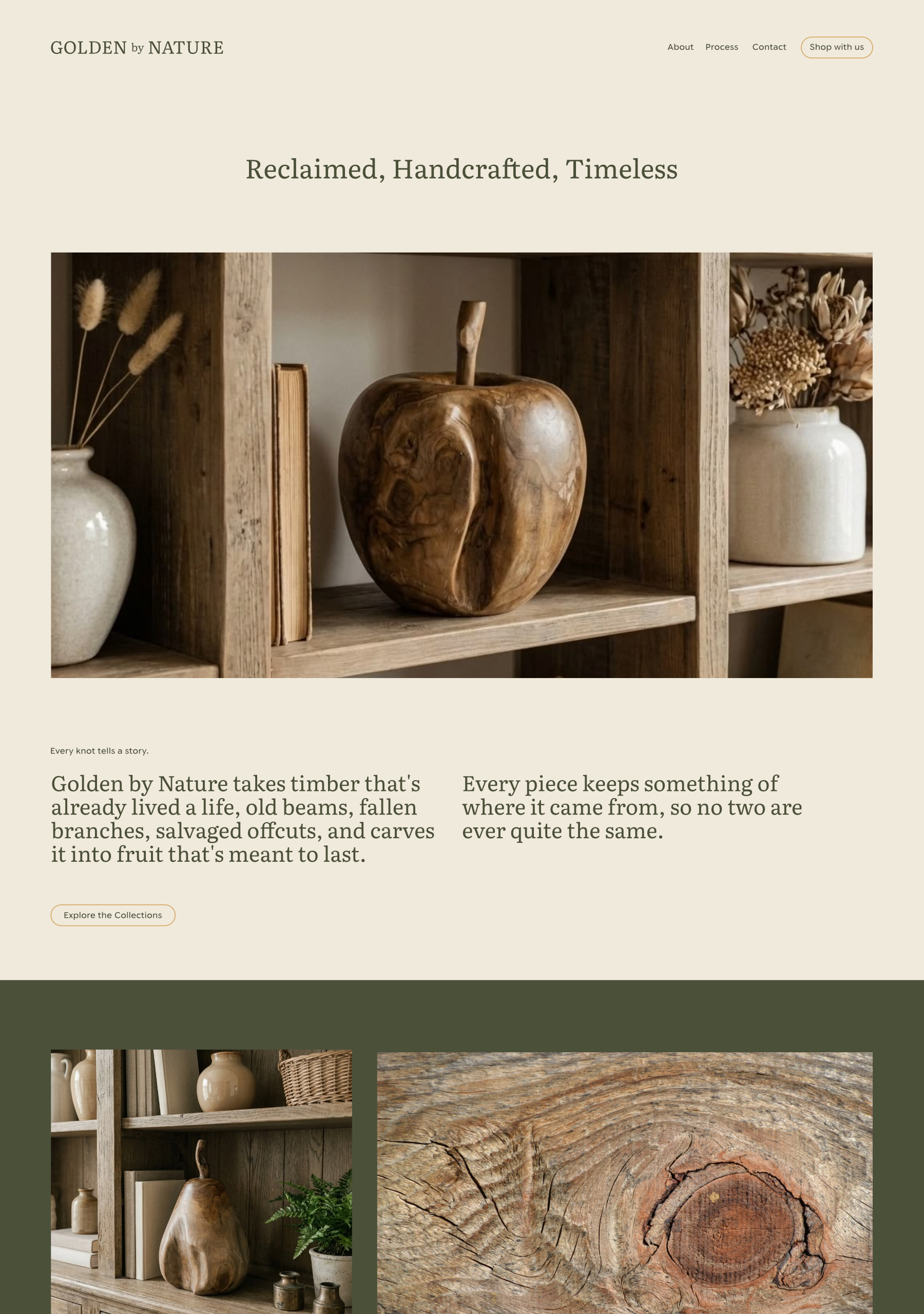
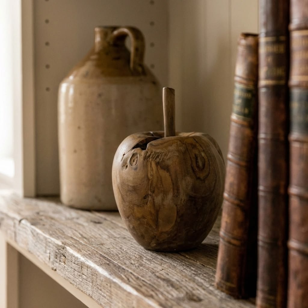
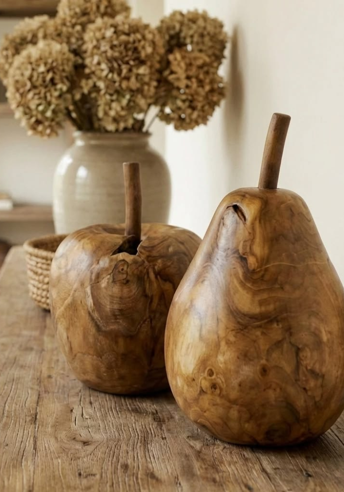
Golden by Nature makes hand carved fruit from reclaimed timber, taking old beams, fallen branches and salvaged offcuts and turning them into pieces meant to be kept rather than just displayed. Nothing goes to waste and no two pieces ever come out quite the same.
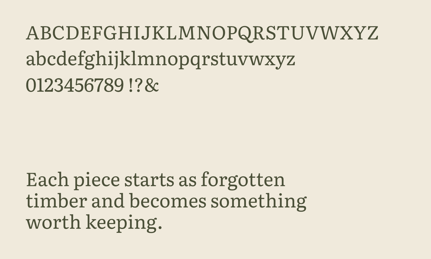
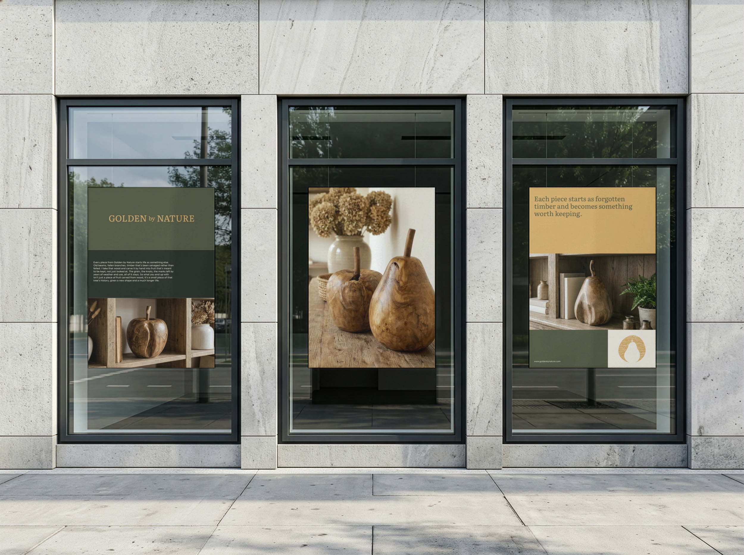
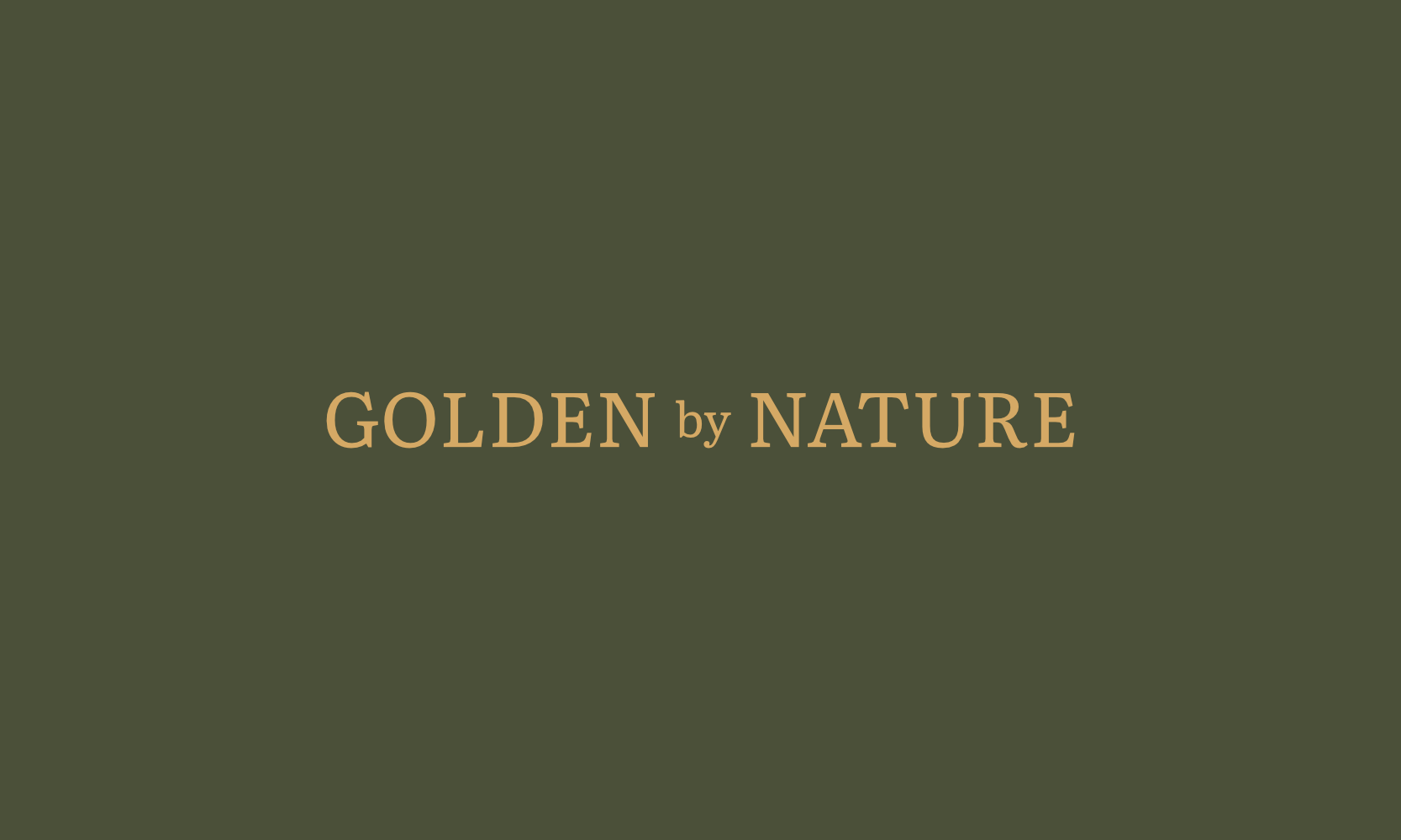
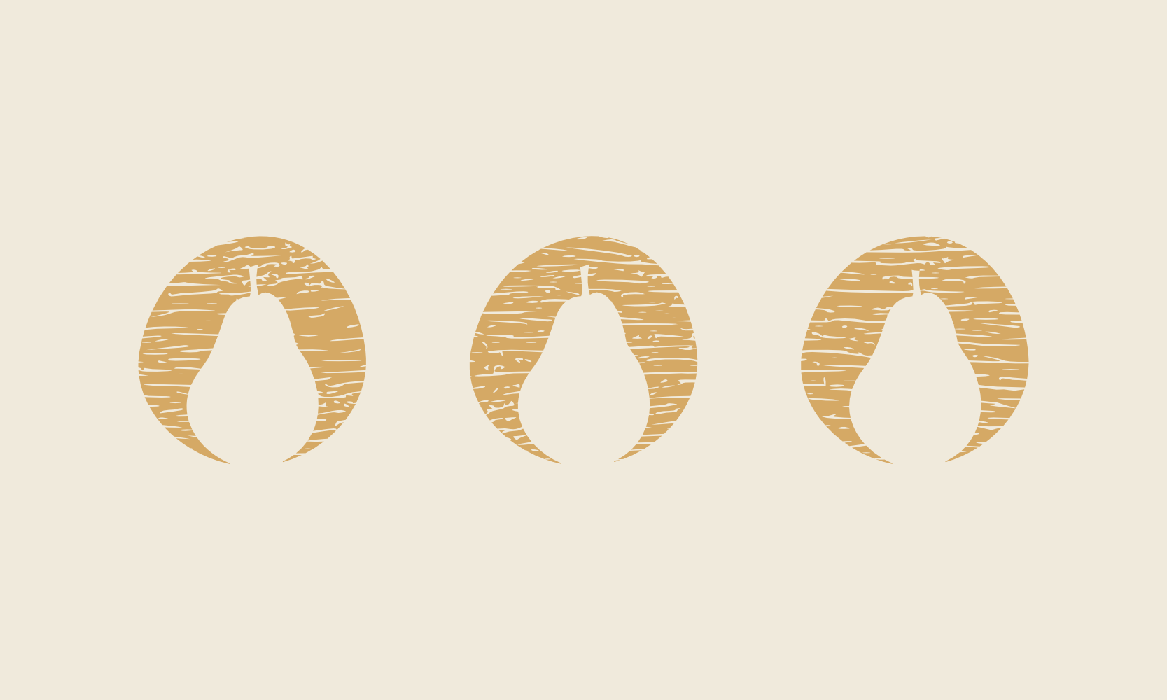
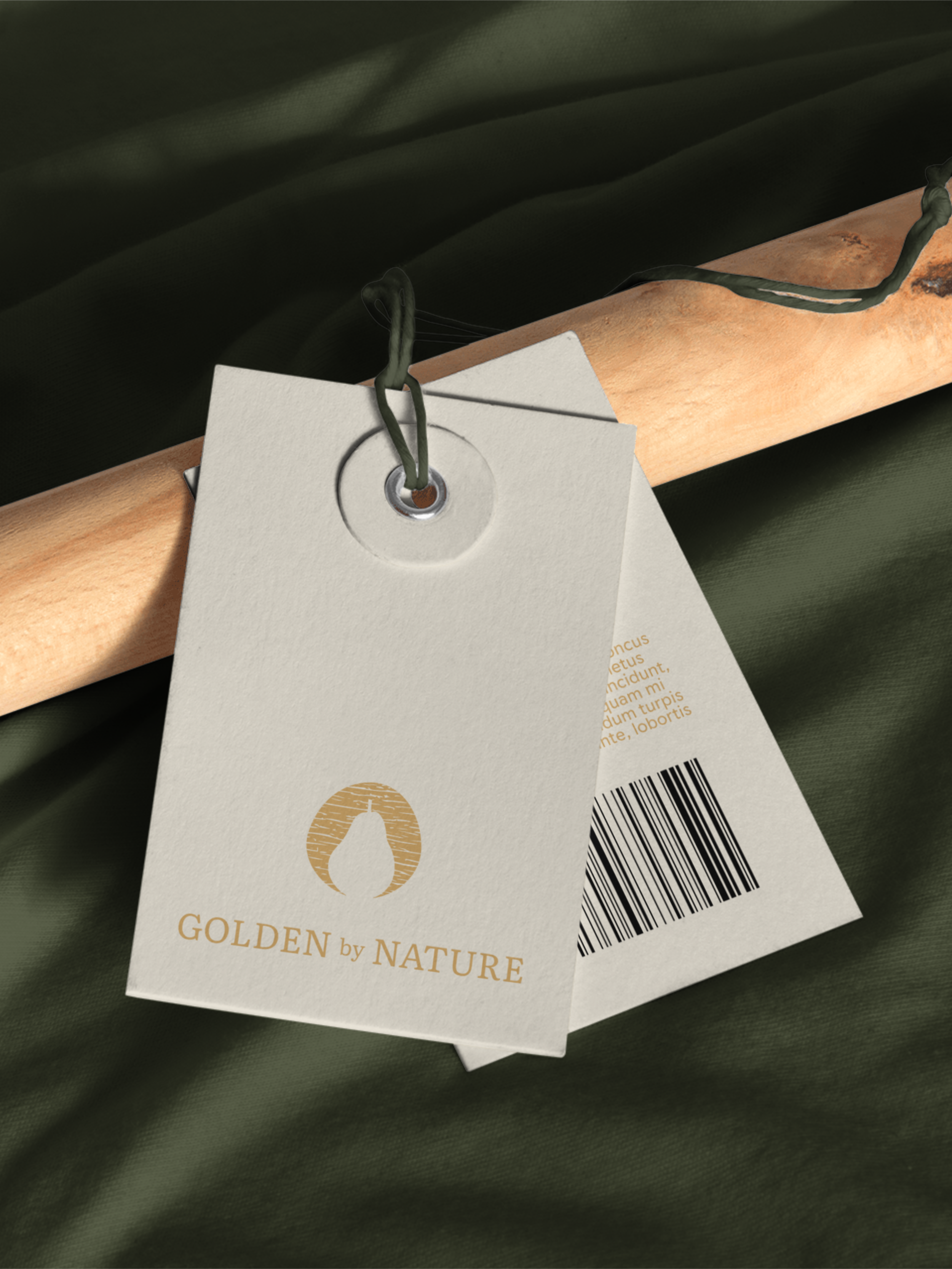
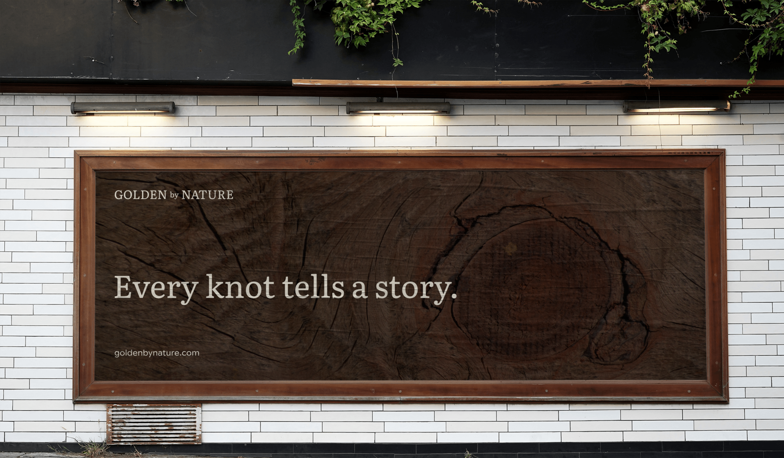
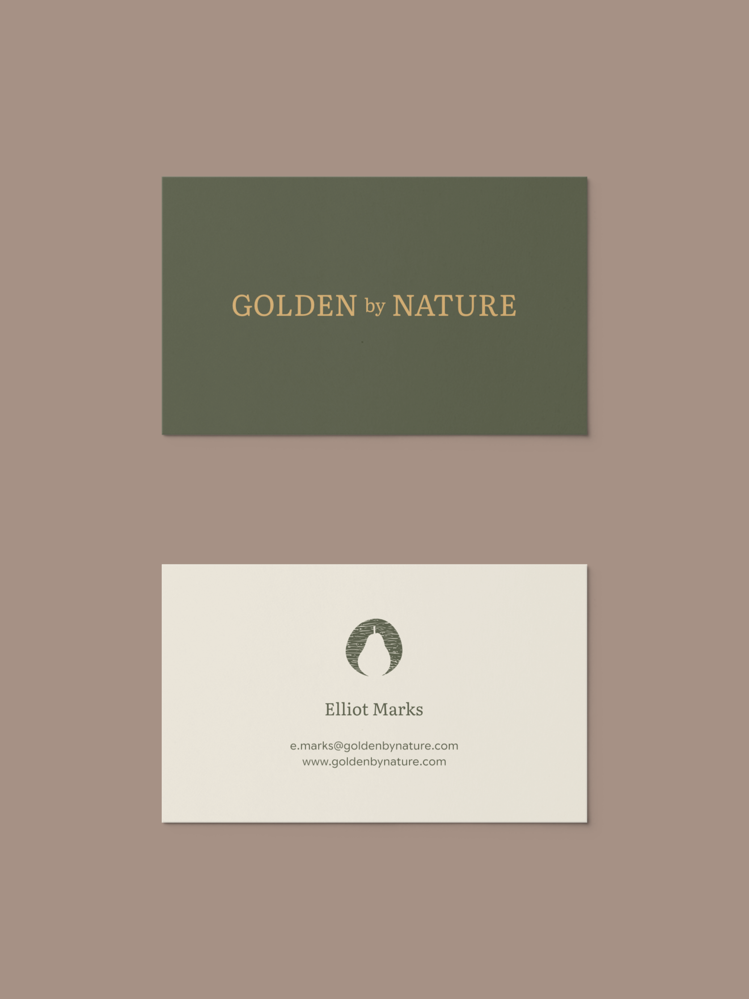
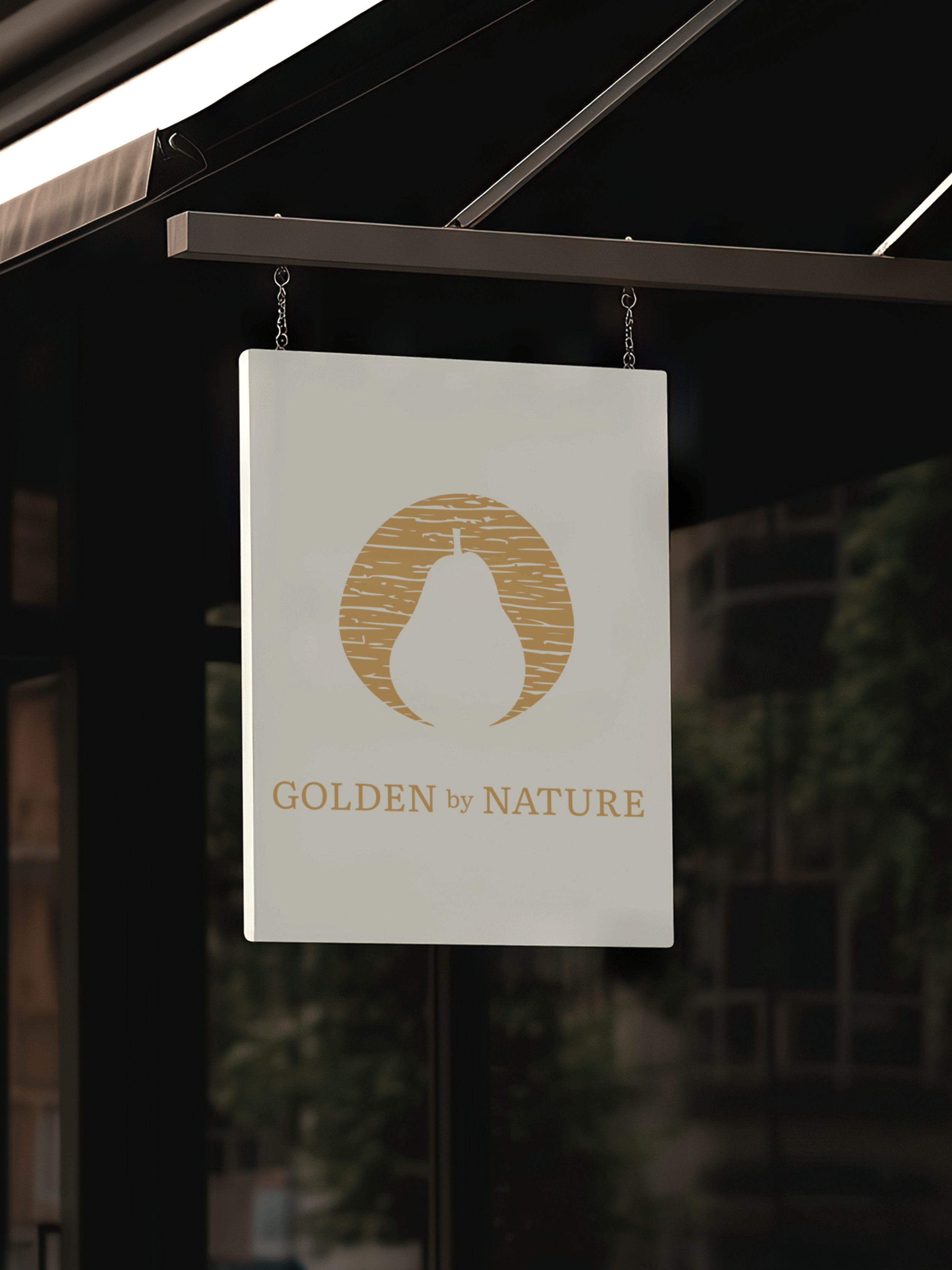
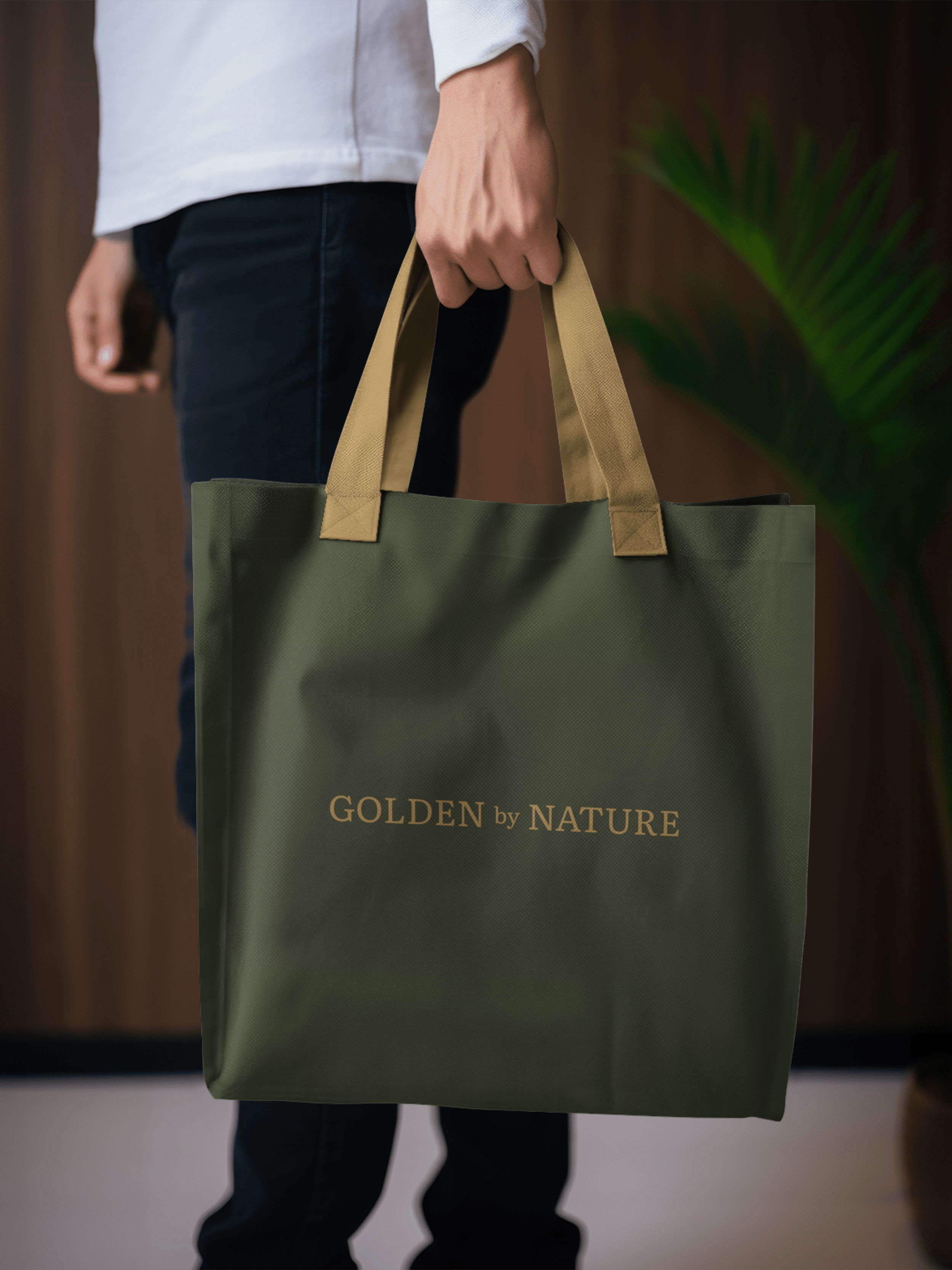
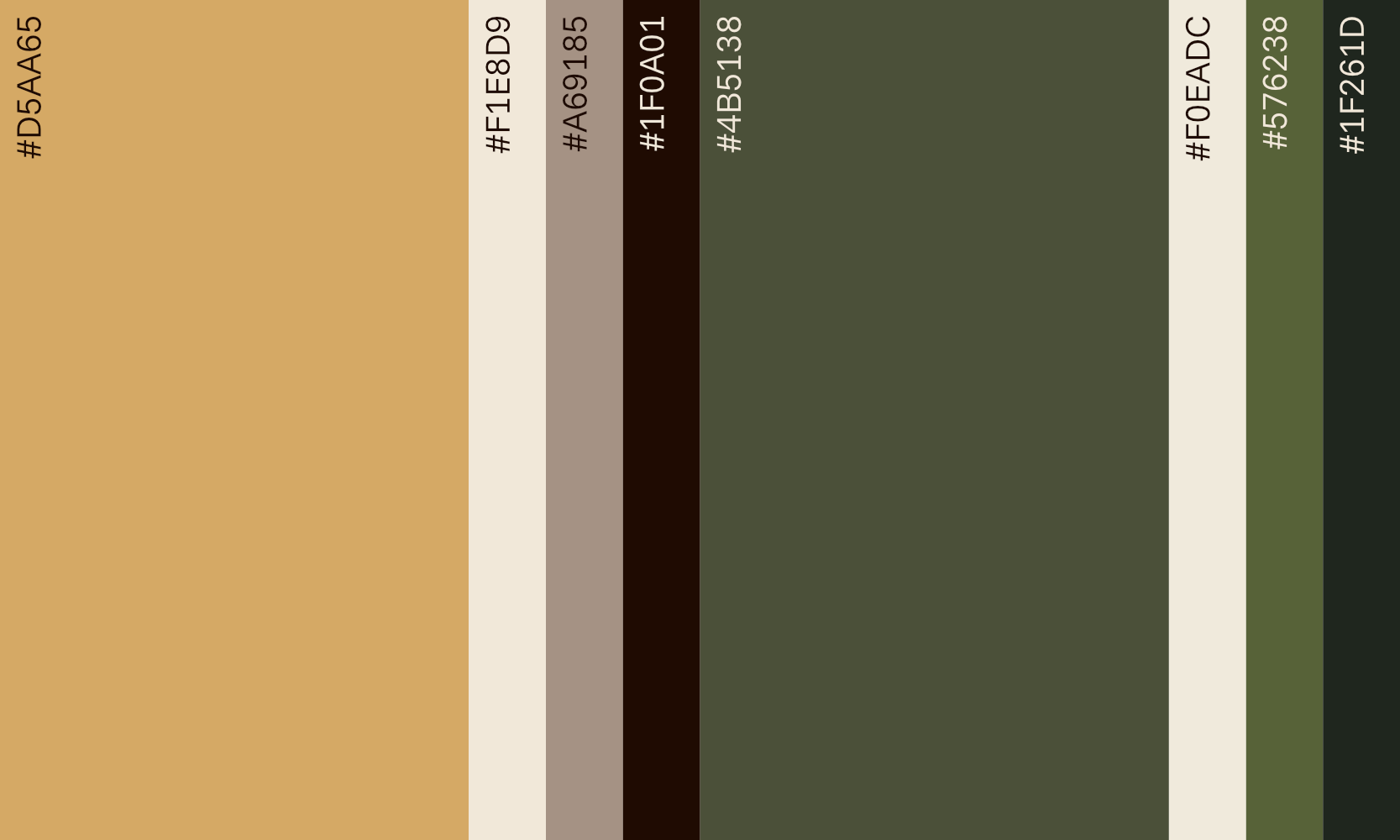
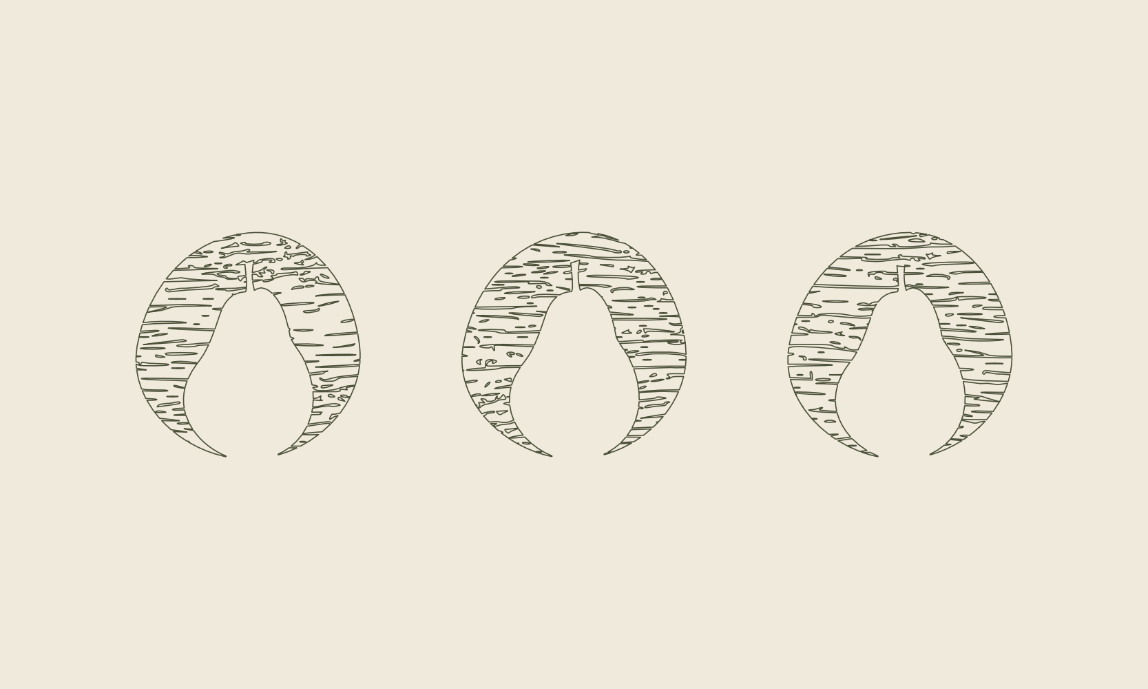
The identity leans into that history rather than hiding it. The wordmark sits in a warm serif that feels considered without tipping into anything fussy, paired with a mark drawn from the fruit shapes themselves, so the timber's own grain and knots stay visible right through the branding rather than getting polished away. A palette of deep olive, aged gold and warm cream carries that same worn, natural feel across everything from packaging to signage.

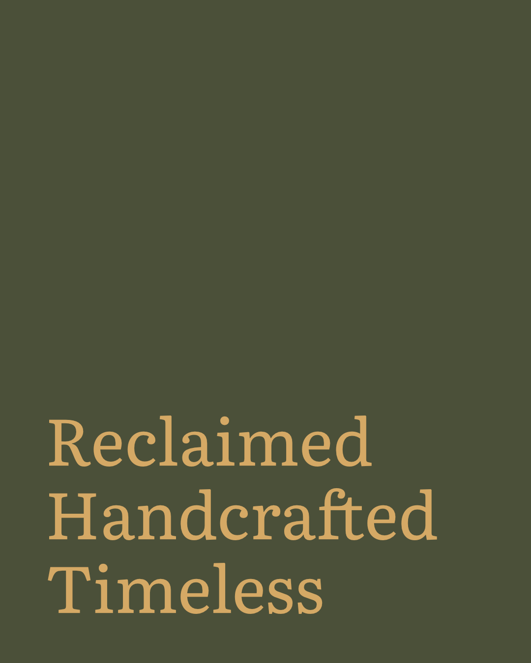
Literata is an old-style serif with real warmth and character, originally built by TypeTogether for long-form reading. That heritage gives it an elegant, literary feel without tipping into anything overly formal or cold, which makes it a strong choice for brands wanting to feel considered and established rather than trend-led.