360 Fiction Editing: a brand for the human in the loop
When John got in touch about 360 Fiction Editing, he had a clear challenge.
He works with novelists throughout the writing process, from early drafts through to the line-by-line editing that happens before a manuscript is ready to go out into the world. But increasingly, potential clients are asking a different question: do they actually need a human editor when AI tools can analyse and rewrite text in seconds?
It made for an interesting brief.
The challenge wasn't simply to create a logo for an editing business. The brand needed to communicate the value of the person behind the service: someone who understands story, reads between the lines and can recognise what a writer is actually trying to say.
That human understanding was the idea worth building around.
There was no existing identity to work from. No established colours, typography or visual assets. Just a name, a business and a clear belief in the value of human editing.
Finding the idea
As with most projects, the process started with my discovery questionnaire.
One of John's answers stood out when he described his competitors.
Against other editors, he was competing on experience and skill. Against AI tools, he was competing on price. But his real advantage was understanding what a client actually wanted and needed, rather than simply responding to what they had asked for.
That felt like the heart of the brand.
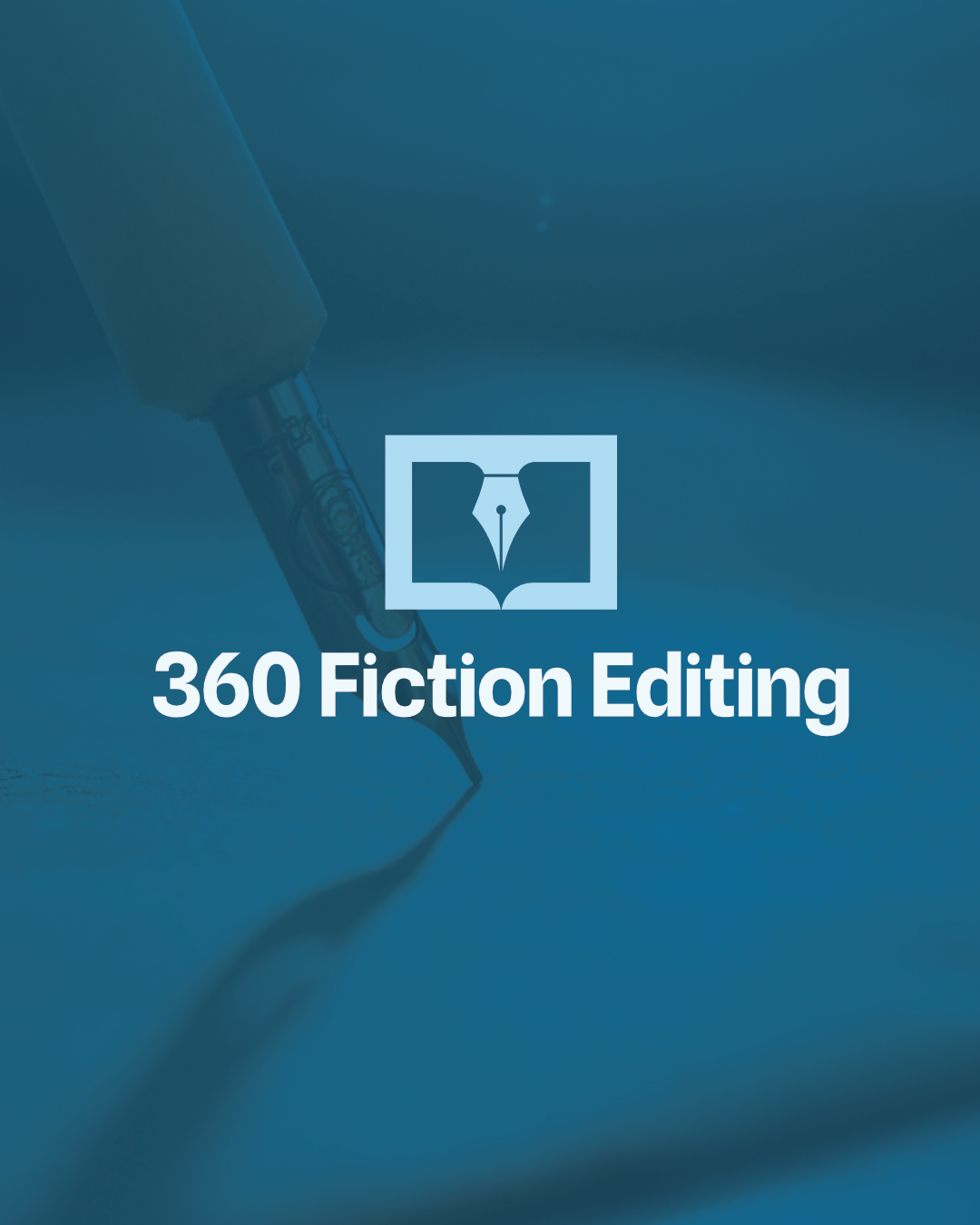
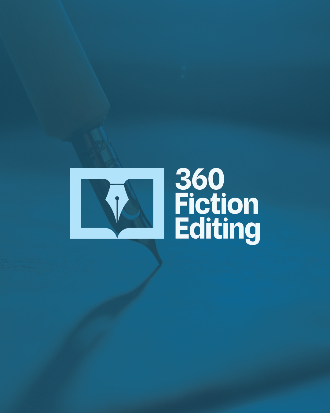
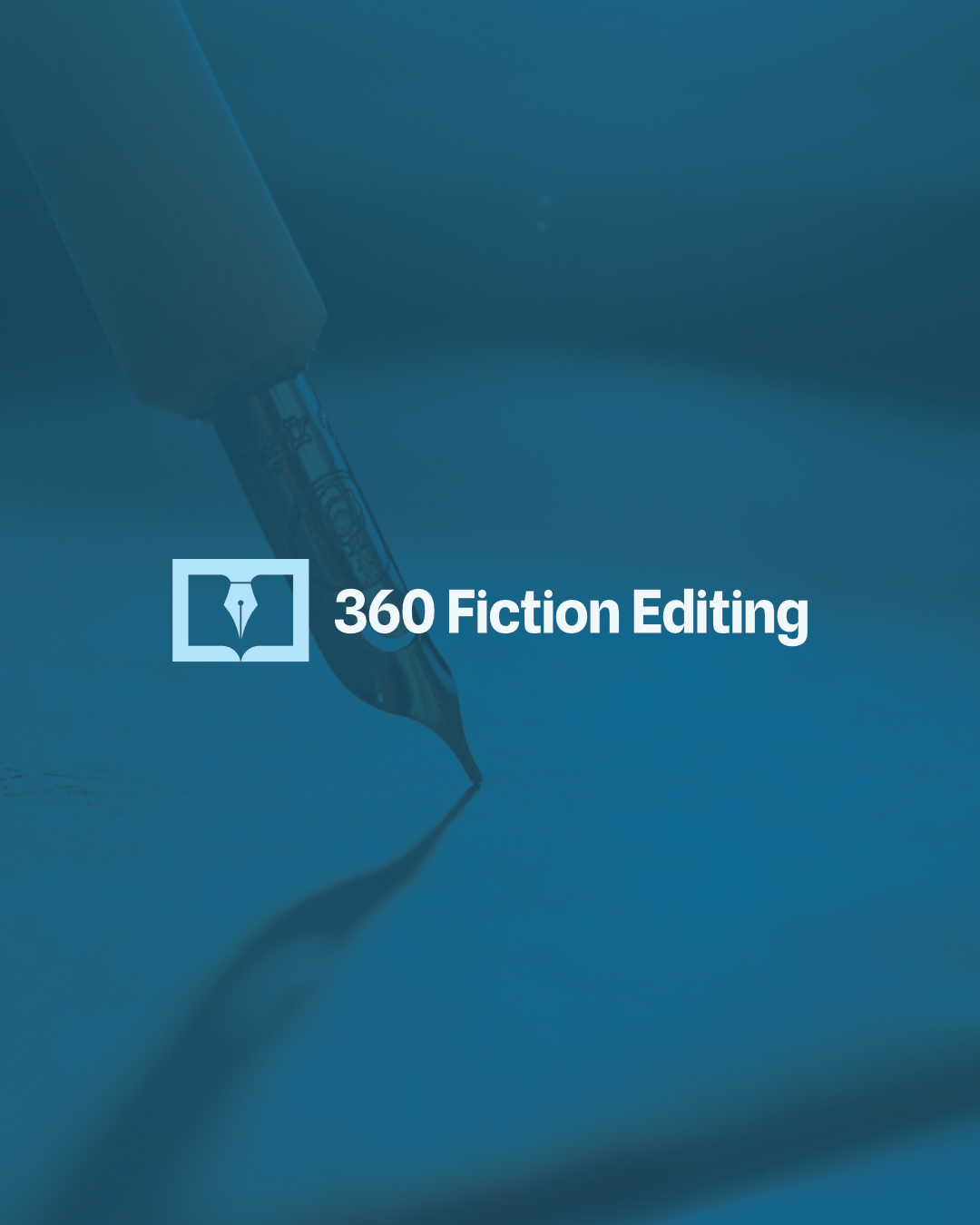
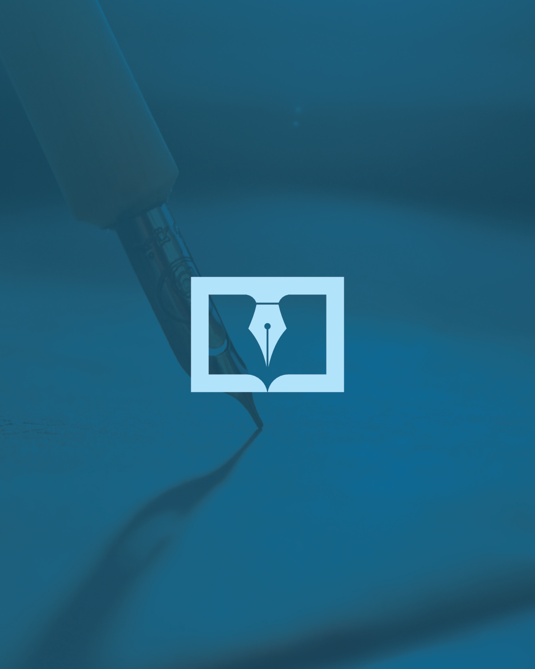
The visual idea went through a number of sketches before it started to take shape. Eventually, a fountain pen nib was brought together with the shape of an open book.
Two familiar ideas, combined into one simple mark.
I liked that it communicated the nature of the business without needing a complicated explanation. The mark suggests writing and editing, while the relationship between the two elements gives it something more distinctive than simply using a pen or book illustration on its own.
The colour palette followed the same thinking. A deep blue gave the brand confidence and an editorial feel without pushing it into overly corporate territory.
Typography was kept bold and straightforward, giving the name enough presence to remain clear even when used at a small scale.
Turning a mark into a system
A logo is only the beginning of an identity.
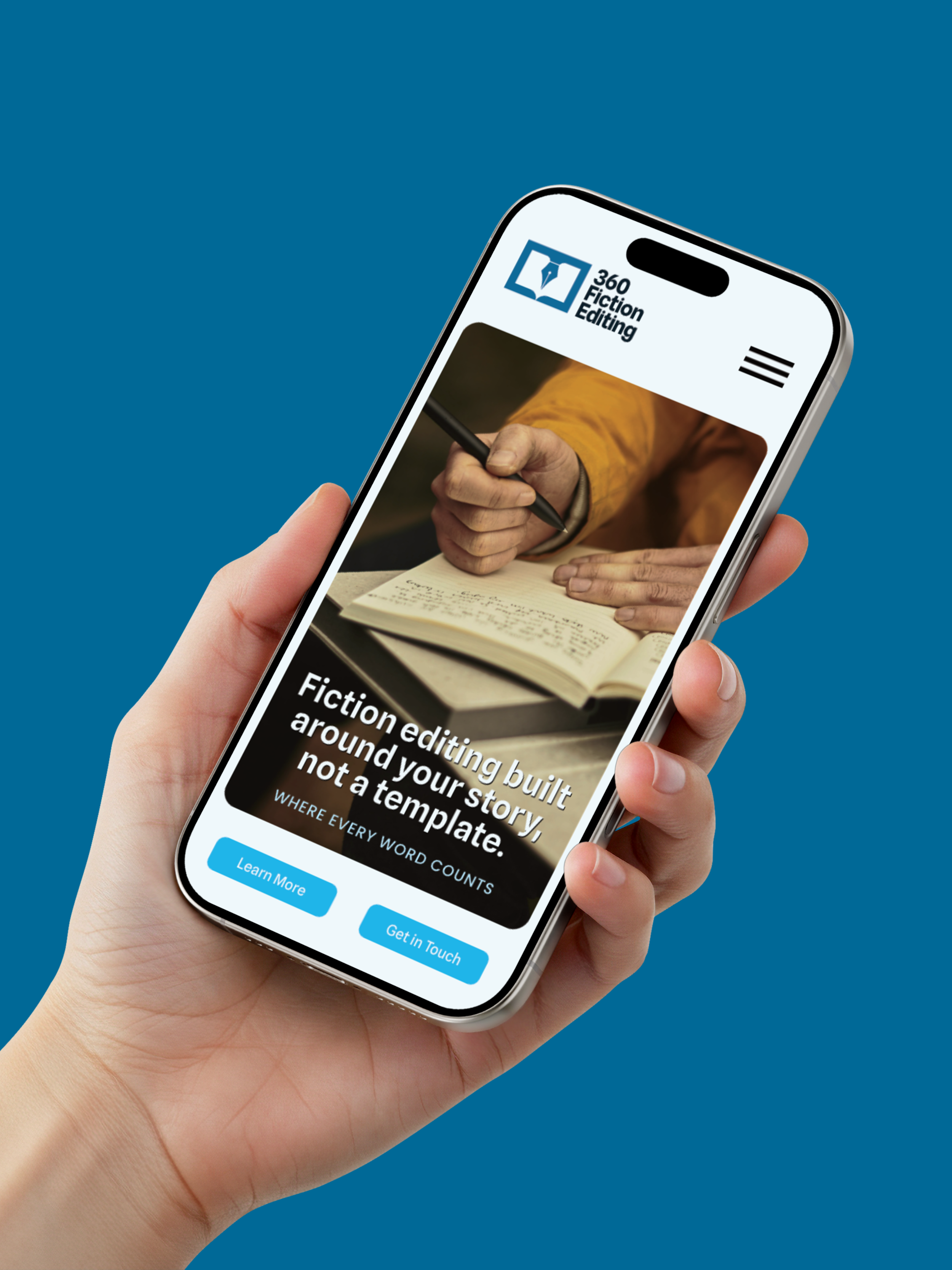
The real test is what happens when it leaves the presentation and starts being used. It needs to work on a business card, a document, a website, social media and all the less glamorous places a brand eventually ends up.
For 360 Fiction Editing, I developed a small set of applications to show how the identity could work in practice.
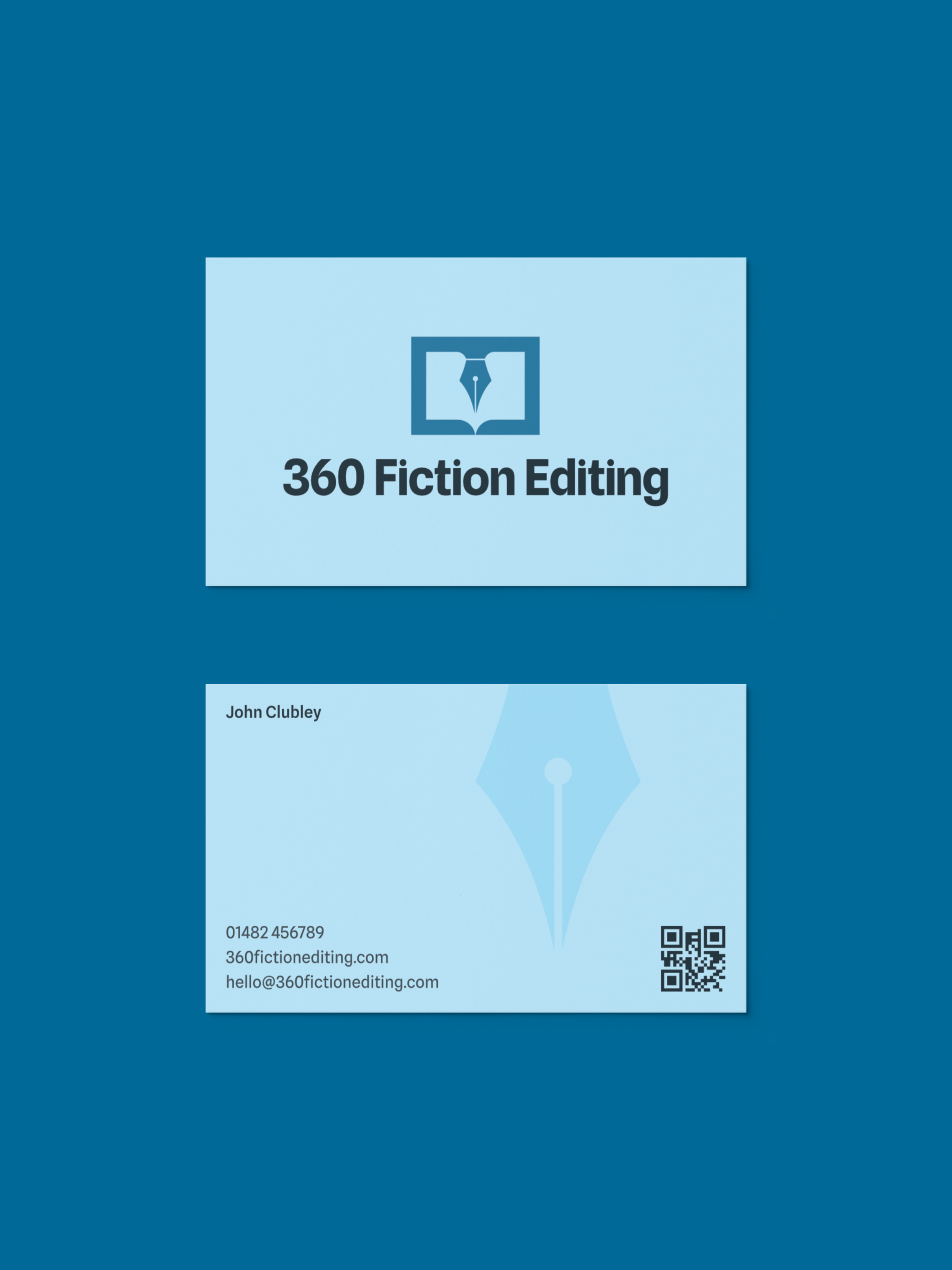
The business card uses the nib as a large, subtle graphic element across the reverse. It adds character without competing with the information.
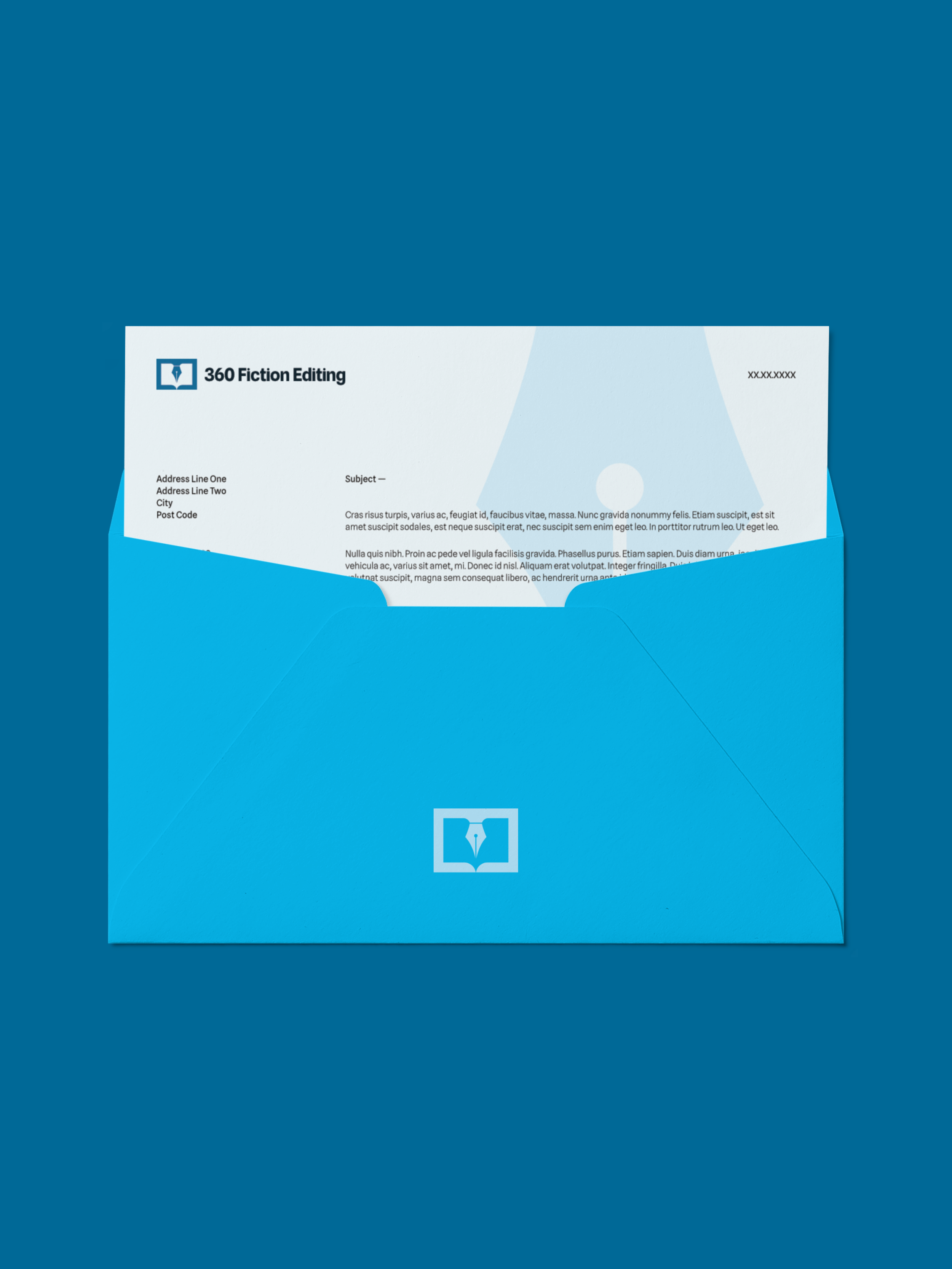
The letterhead takes a more restrained approach, giving everyday documents such as correspondence, quotes and contracts a consistent visual presence.
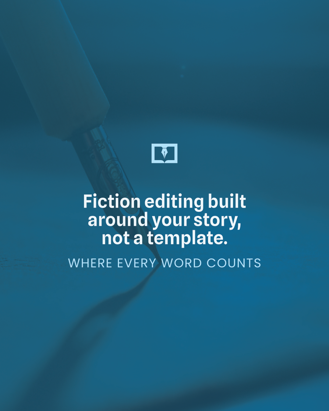
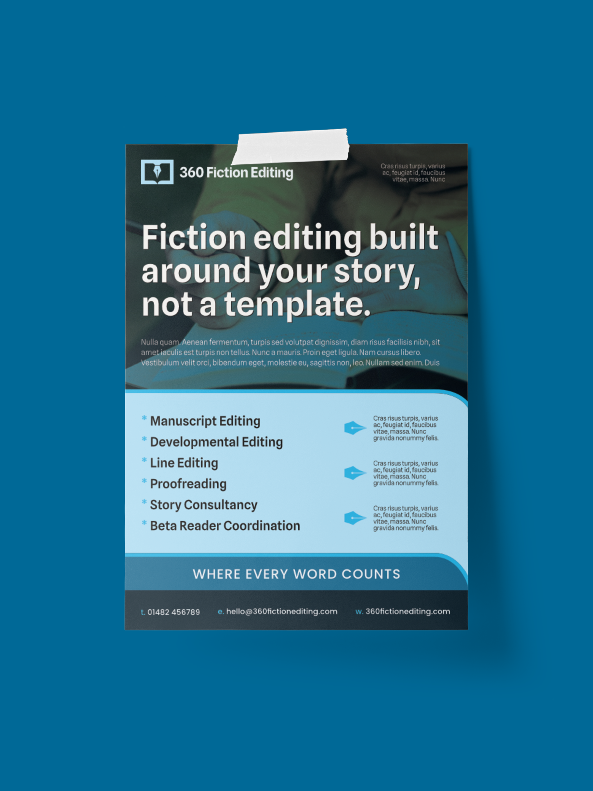
A flyer communicates the services clearly, using “Where every word counts” as a strapline that also reflects the care involved in the editing process.
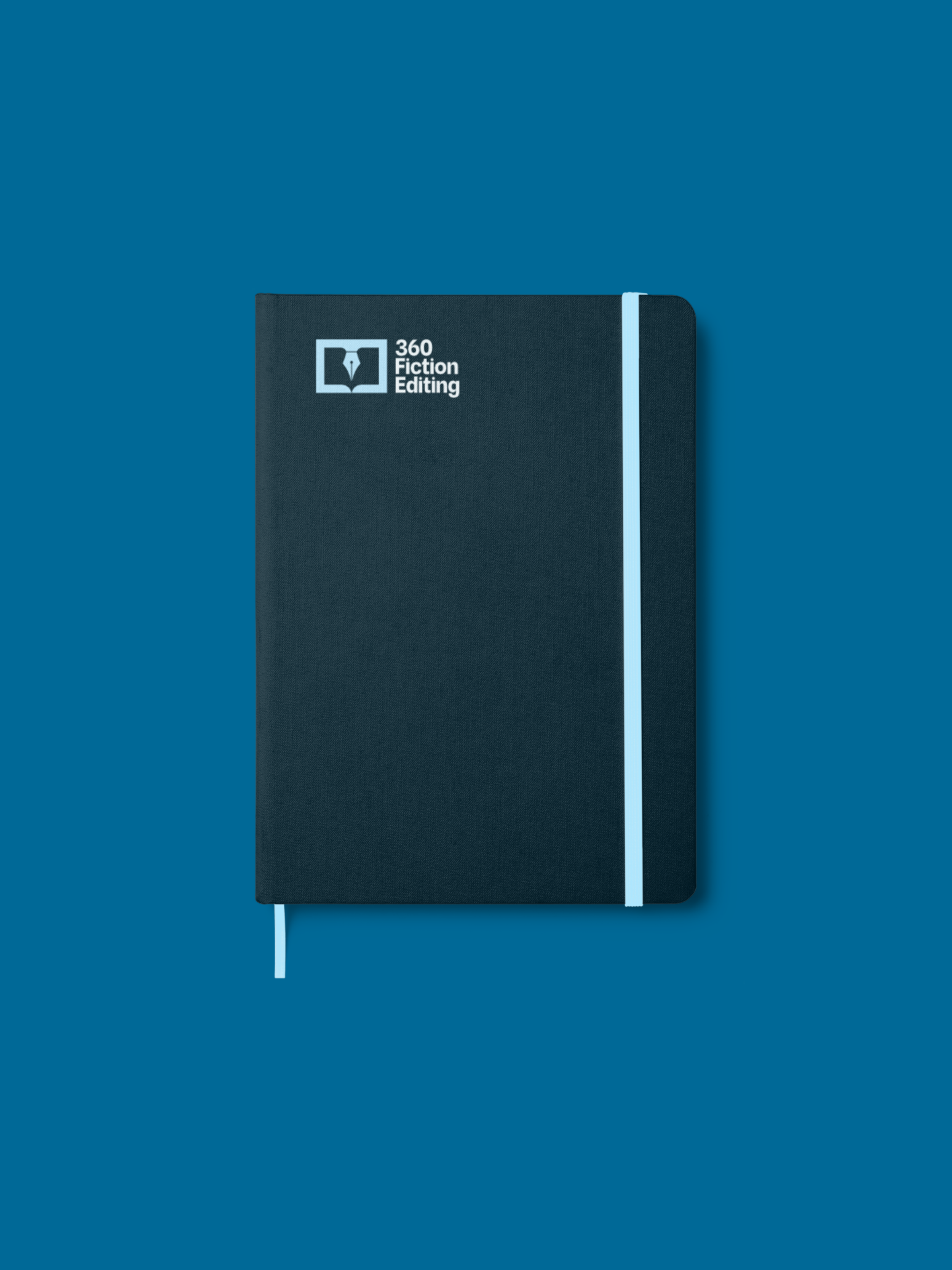
I also developed a notebook and a simple pattern based on the nib shape. These give John additional brand assets that can be used when the identity needs to extend beyond the core logo and stationery.
The point wasn't to create lots of branded items for the sake of it. It was to show how a relatively simple identity could become a flexible system.
Making the idea work beyond the logo
The same thinking needs to carry through into the wider brand.
The identity should support the way the business talks about itself, rather than sitting separately from it.
For 360 Fiction Editing, that meant keeping the emphasis on the writer and their story. The editor isn't there simply to correct spelling or tidy up sentences. They're there to understand what the writer is trying to achieve and help them get the manuscript where it needs to go.
That's an important distinction, particularly in a category where technology can make editing look like a purely mechanical process.
The brand doesn't need to argue against technology. It simply needs to communicate what the human element adds.
What John said afterwards
I'm always more interested in what a client thought about the process than making grand claims about my own work, so I'll let John explain:
“Michael has created a fantastic logo for my business. He provided a quick and friendly service, and the feedback and ideas I gave him were added to the design in ways which were so much better than how I had imagined them.”
For me, that's an important part of the job.
Clients usually know their business better than anyone. They often have a sense of what they want, even if they can't quite articulate it or translate it into visual language.
The designer's role isn't to replace that knowledge. It's to listen to it, question it, find the useful idea within it and turn that into something clear.
That's what happened with 360 Fiction Editing.
The final identity gives John a visual way to communicate what makes his business valuable before he has to explain it himself.
And that was the point all along.
Building a brand around what makes your business different?
If you're starting from scratch or your current identity no longer reflects the business behind it, take a look at my brand identity service or get in touch to start a conversation.