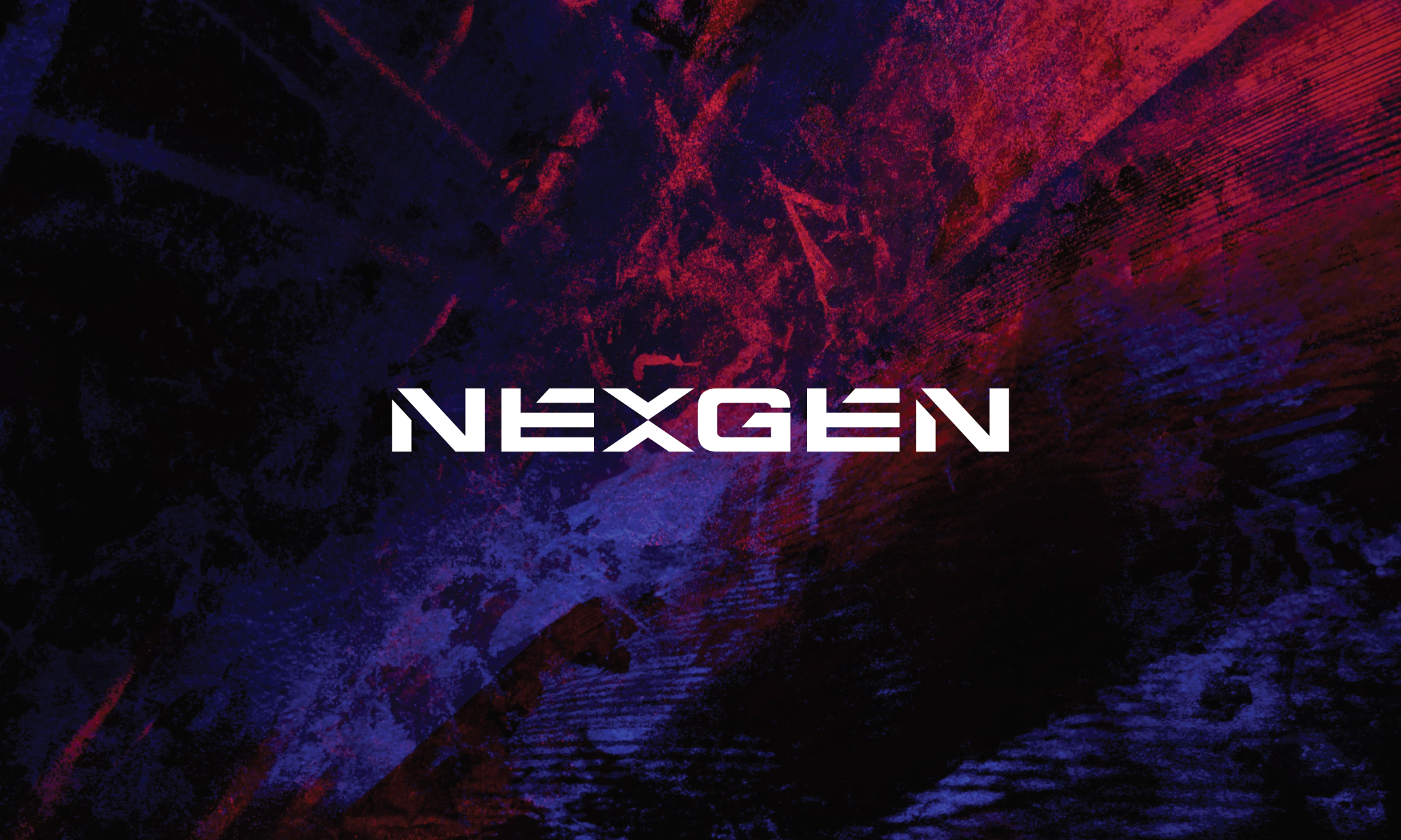
Nexgen
Logo, Visual Identity
Nexgen Solutions is a renewable energy company developing energy-efficient systems for the UK market. They needed a visual identity that could match the nature of the work.
CHALLENGE.
Nexgen’s work is ambitious and forward thinking, and the identity needed to match it without feeling overly complicated. It had to look as clean and considered as the solutions the company delivers.
APPROACH.
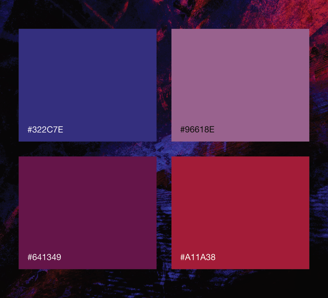
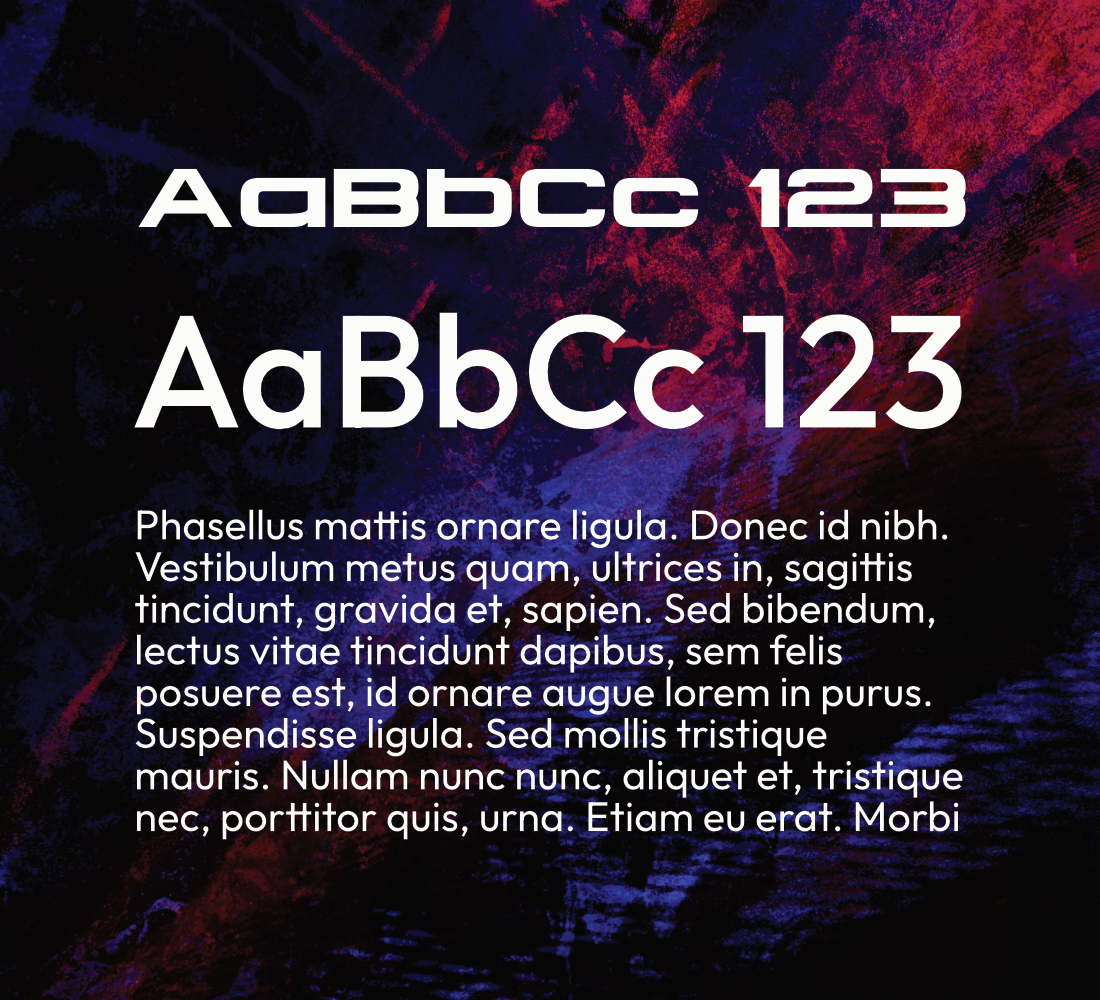
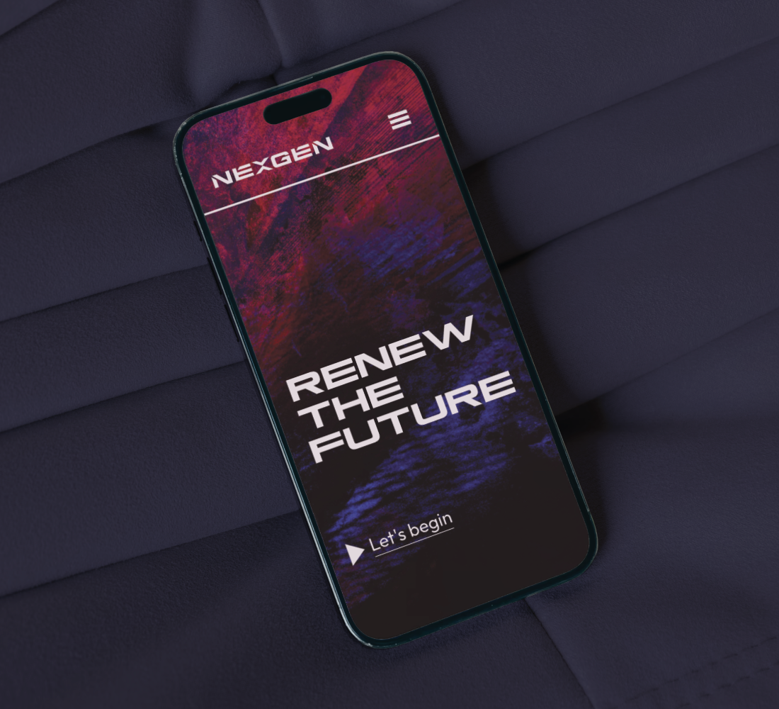
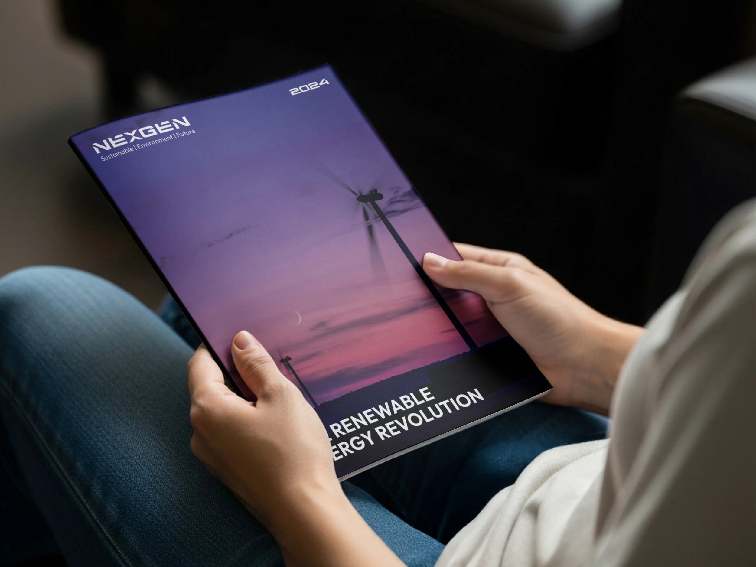
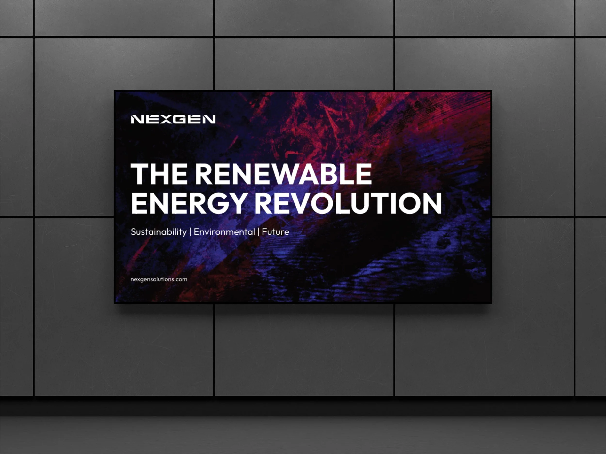
I built the identity around distinct patterns and textures, so the brand has a character people can recognise. The colour palette and typography bring a sense of the future while staying simple and easy to read.
OUTCOME.
White space keeps everything uncluttered, so the details that matter most stay front and centre. The result is a calm, confident identity for a business that wants to be taken seriously.